Updating an old game
Introduction
I have decided to keep a blog because it gives me a lot of flexibility and gives me an ongoing record of the development of my current project. My task is to recreate an old game and give it a 21st century makeover, with a fresh twist for today's young adults. My memory of playing board games when I was younger was a very happy one, I believe board games help children learn numbers, shapes, colours, life skills and facts, all while having fun.The aim of all games is to win, whether it is Chess or Snakes & Ladders and there are always obstacles in the way of this victory. Games such as Snakes & Ladders require luck, whereas games such as Chess require you to be a more skilled player and strategic thinker if you want to win against your opponent. I have most enjoyed games like Monopoly as they depend partially on luck and partially on skill, this is shown when deciding which properties to purchase and when to refrain from buying them.
After reading the brief I am looking forward to developing this project to the best of my ability and producing a fun, working game that appeals to young adults.
What I need to do
Decide on the game I am going to develop (board game/card game)
My choices are to either create a board game or create a card game bearing in mind that the audience is for young adults. I have chosen to do a card game because it is easier to transport and may appeal to the target audience more than a board game. I would also like to have the cards seen as artistic work and made as a collectors item.
However, before deciding upon a card game, I created a more easily transportable board than the typical chess board style, to see how small I could get it.
Firstly I cut out 6 squares, equal in dimensions (6 inches by 6 inches). I did this by using a ruler and Stanley knife.
Then I examined an existing board game and attempted to replicate the folds. This gave me a board measuring 12 inches by 18 inches. The problem with this board is that the seams are too large to be played on and so they may disrupt gameplay.
Lastly I checked that everything folded well and finished in the original square dimension.
Although I was able to create a small sized board, I felt that the end product of a card game would be of higher quality considering my skill set. It would also be more likely to be used ‘on the go’ by a young adult, for example whilst travelling on public transport, at a party, or meeting up with friends.
Further Research
Pokémon card
When searching for ideas for what my final product could be based on, I found Pokémon cards. I love how they look and the detail on each card. The colours are very eye catching and attract the human eye easily. The information on the card is easy to read and looks clean.
Top Trumps
Top Trumps cards look like they have been designed by an artists with a lower skill level than designers behind the artwork for Pokémon cards. Top Trumps cards however are more focused on the information stats of a card, which are vital to how the game plays out. Pokémon cards are more centered around the artwork of each card. Top Trumps are also targeted further towards younger children rather than an older audience which I am attempting to reach with my cards. However, I still believe they look good and do what they should.
When I am creating my game I would like to combine both of these cards together and show elements of either one in my final piece. I could Possibly have art like the Pokémon cards but stats and information like the Top Trumps. I also believe if I did these cards music related it would further appeal to an older target audience as the music artists I would base the cards around make music for older audiences.
Consider the resources at my disposal and use them to my advantage
I will need to consider the quality of the work I produce and my options when printing the final cards off. I want to make sure that I have the best quality print I can afford.
Options available:
- Home printer (not good print quality)
- College printer (investigating print quality + price + presentation, alignment) [good print quality, unable to print double sided having the back of the cards match up perfectly with the front of the card, £3 for A3, £5 for A2]
- Bluestone (closed at time of investigating)
- Chameleon [£24 for 2 double sided A3 prints, aligned perfectly with the back of the card, good print quality, 1 day turn around]
- Lincoln Print & Copy Centre [£9 for 2 double sided A3 prints, aligned perfectly with the back of the card, good print quality, 2-6 hour turn around time]
Quality of paper/card is vital to a good finished result.
Another thing to consider is my skill level and to make sure to challenge myself without over extending and becoming stressed.
I also must consider the financial resources in the project and management.
Investigate materials to be used in the final product
Chameleon print shop gave me advice on which would be the best weight of paper to use when creating my cards, they recommended 350 GSM or 400 GSM. I took this information with me to Lincoln Print & Copy Centre, I then asked about paper weight when I was enquiring information on the print they could do for me; they suggested similar GSM.
I also wanted a holographic finish to the cards to give them a bit of life and a professional look. I was inspired by Pokémon cards which have this effect on certain cards. I searched around for these holographic sheets online and found some which I think will work well with the cards I'm creating. Update - I have ordered 30 A4 sheets from Amazon and need to make sure I do not make any mistake whilst sticking them down onto the card, such as bubbles, as this will ruin the final product.
I was considering going to print my cards on transparent paper, however it added layers of complication and may have led to problems with alignment. I found it better to to stick with the original idea of printing them out on card and then cutting them out.
My Process
The front of the card
I have created 30 cards, 1 of which I will show you the process behind. These were created using Adobe Photoshop.
Base image
I started off with an image I found on Google of music artist 'Future', I found a high resolution image by using the Google image tools to filter by image size. I also picked this image as I thought it would be great to create as a card, there was a luxurious rich vibe which I was instantly struck by. I knew straight away that I could work with this and enhance the opulence of the image.
Stage 1 of editing
When starting the editing process I wanted to add something gold, like treasure. I decided on using coins which I layered up on top of each other around the sides of the canvas to fill empty space and intensify the composition, leading the focus to his face.
Stage 2 of editing
I added light flares on the pieces of jewellery which 'Future' is wearing to add a further sense of 'bling' to the image.
Stage 3 of editing
This version was after I added glows to the image, I added an orangey-yellow glow around the light flares, the coins and a purple glow to his shirt.
Stage 4 of editing
I added motion blurred dandelions to the image to add to the movement and reinforce the spinning effect. Then I used a Camera Raw Filter to enhance the overall picture for the human eye to look at. With this filter I can manually adjust options such as temperature, tint, exposure, contrast, highlights, shadows, whites, blacks, and more.
Stage 5 of editing
Although it is difficult to see in this photo (will be better to view when printed) I gave the piece a painted effect to match the style of the rest of the cards, as I want them to have a distinctive appearance to usual trading cards.
Stage 6 of editing - Final card design
I created a card template beforehand to allow me to copy the design straight into it and change the stats quickly, rather than creating an entirely new template for every card. In the template I added an artist name in the top left, health points in the top right which will show a number related to the artist in some way. I added a few more elements in the top right corner for effect customisation and detail. In the bottom half of the card I added music stats including, production, lyrics, flow, clothing style and song streams. I also added a small amount of information about the artist, which I obtained from Wikipedia. I have a small box in the bottom left corner showing the star rating, my name, the trading card brand name, and the card number. Finally I included a box in the bottom right corner showing my favourite album from the artist. I can use this template for any music artist now, customising the areas which need to be altered.
The back of the cards
Stage 1 of editing - Logo design and rough composition
I started off the design for the back of the card by creating a logo in the middle, I wanted to combine a microphone with a star seen as my brand name is MusicStars. I am quite happy with the final result of the logo as I have asked 4 people what the logo looks to be and they've all said that it looks like a microphone, indicating that it is easy enough to distinguish. The reason I asked these people was because I personally was unsure on how easy it was to see the microphone in the design. After I had finished the logo I wanted to add some text on the top and bottom of the design, for this text I used a free font I found on dafont.com and then modified some of the letters to customise it to my preference. Once I was finished modifying the text I duplicated the layer and then flipped it horizontally and vertically so that it can be read if you are looking at the card from upside down, I moved this layer to the bottom of the design. I aligned these text layers and made the spacing correct, I liked how the typography fit the vibe of the logo in the centre.
Stage 2 of editing
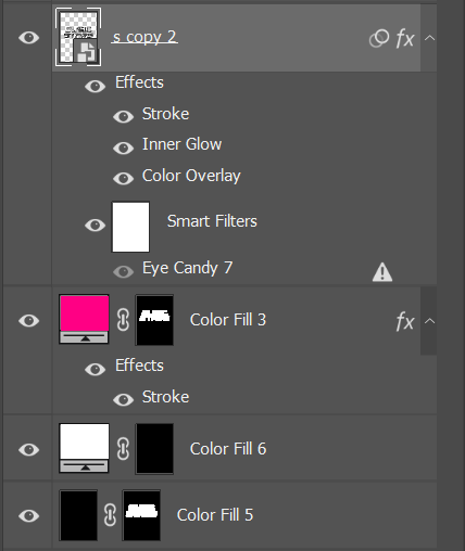
The advancement I made was adding effects to both the typography and the microphone logo. I made these effects by using a plugin calling 'AlienSkin - EyeCandy' to achieve the chrome look, and used a combination of layer styles and new layers to add the glowing layered stroke.
Layers
These were the layers used for the centre microphone logo, I used a combination of colour fill layers and layer styles.
Stage 3 of editing
Next I improved the background of the card by adding grunge smoke textures and using exposure adjustment layers to darken the areas around the sides of the card, this gives a subtle vignette effect. I also added in a neon stroke around the edges of the card to fill the empty space.
Stage 4 of editing
I felt it still looked too empty so I decided to add in four stars in each corner, which also tied into the brand name ‘Music Stars’. I used the same effect on them as the other assets and was happy with how this looked. The logo was easy to make into a pattern after placing it on a transparent background. Then I used this pattern on a solid colour fill and decreased the fill so that it was only the pattern showing, the rest of the layer was transparent. I adjusted this to my liking and then set the pattern blend mode to soft light and decreased the opacity.
Stage 4 of editing - Final back card design
I finished off the back of the card design with a Camera Raw Filter, this allowed me to finely adjust colours to my preference.
Artist Research
I have researched a variety of cover artists behind the albums of a few of the music artists I have created the cards for:
Stephen Gibb
Stephen Gibb is a Canadian artist who was inspired by Hieronymus Bosch and Norman Rockwell in the 1960s, this led on to his successful career later on in life. The reason I am deciding to research Stephen's work is because he is the artist behind the 'LIFE'S A TRIP' album cover. I think that it is a very iconic and unique art style and definitely grabs the viewer’s attention fast.
This is Trippie Redd's cover, 'LIFE'S A TRIP'. I love how the colours are very vibrant and the style of the art almost seems like it is popping out at you. Another reason why I love the artwork is because of the immense detail and meaning behind it, it is crammed full of different elements. Although this is Stephen Gibb's art style it fits perfectly with Trippie Redd's music aesthetic. Another artist who I think would benefit from having one of Stephen's covers is Tyler the Creator as his music is very unique and fits under the genre horrorcore.
This is his most recent piece of art displayed on his website, since 2009 when his first pieces were uploaded to the website he has improved a lot, in almost every aspect (colour, detail, composition, meaning behind the artwork). Below is some of his work from 2009.
Pen & Pixel
Pen & Pixel was opened by two brothers and based in Houston, Texas. The brothers and their staff specialised in album cover creation from 1992 to 2003. They worked with over 8,000 clients and created 19,180 album covers in total.
The company came out of retirement to create the album artwork for the Savage Mode II cover. It is a visually pleasing artwork and brings back the late 90s/ early 00s vibe which 21 Savage and Metro Boomin used as a marketing tactic.
This is an album created by the team at Pen & Pixel in 1998. When you look at this album cover you can instantly see that Savage Mode II has the same theme and feeling to it. Although Savage Mode II has a much better, finalised result. This is most likely due to the progression of technology and the possibility to use more advanced image manipulation tools in today’s world.
Corey Pane
Corey Pane is an artist based in Connecticut, he has done work for many bands and and music related things, as well as for professional athletes and more sport related things. The artwork which allowed me to find Corey was his work he did for Juice WRLD, the 'Legends Never Die' album cover art.
This is the 'Legends Never Die' artwork for an album after Juice WRLD's death, with some of his unreleased music inside of it. It is quite an iconic and unique cover art as it is easily distinguishable from different covers by the colours used and the painted style. The artwork also has numerous details which you made not see at first glance, such as the text on his jacket. MCMXCVIII translates to 1998 from roman numerals, MMXIX translates to 2019 from roman numerals. 1998 is the year he was born and 2019 was the year that Juice WRLD died.
This is the same painting as before however I think that this was the original artwork and it was edited and adjusted to fit the vibe of the album better which ended up looking like the cover art above this image. This can be told by the text which has not been changed to the text on the 'Legends Never Die' cover, and the shirt.
Final Product
All 30 cards are shown below. These took over an hour to create each card, some even took over 2 hours. All in all I am estimating I spent around 40/45 hours creating this full set. However, as I got further into the creation of the cards I adapted to the work flow and completed cards which looked more complex than others in a shorter time. The reason I created trading cards for music artists was because music appeals to young adults, such as myself as many of us listen to music daily and interact with artists all over the world. I personally think that it was a good topic to choose as it also brings out some unpopular artists and promotes then by giving them a custom card.
Improvement
When I had finished all 30 cards I remade 2 of the cards at the start of the set, the comparision between the original card and the remade card are shown below.
The reason I remade these is because I felt like they did not fit the same style as the others and looked out of place. To modify the cards I remade their card image completely and then changed the template overlay colours to accompany the design in the back. I am happy with the results after they were recreated. I also further enhanced the 'painted' style on these new cards as I felt the original ones looked like they were lacking it and appeared more flat. I think that the Juice WRLD card I remade is my favourite card in the entire set as I believe it looks very clean and nothing sits out of place in the image.
This is the base image I built up on to make the Juice WRLD card, this card took about 1 hour 30 minutes to fully complete but I thought this was a suitable time as this is the first card in the set and should intrigue and encourage the players to want to play.
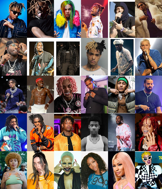
Below are the base images I started with for every card, in the same order as the image above.
Physical Product
I settled with Lincoln Print & Copy Centre as the price for prints were lower and the print quality was still high. After sending the cards (arranged in a PDF) over to their requested email, I left the shop and then collected the cards the next morning. They had been cut out already so that I didn't have to walk around with 2 A3 sheets of paper in my hand, but they weren't perfectly cut to the edges so I will have to cut them down further later in the process.
When I arrived back at home I used A4 adhesive holographic sheets I purchased from amazon to place on top of the cards. I then cut these sheets down so that they were easier to manage. I used my guillotine to cut down the edges on the cards as well as the holographic sheets so that they looked more professional. I also bought a corner cutter on amazon which helped smoothen the corners of my cards and made them look so much more professional.
This is what the cards look like when playing the game with someone and show the effect after the holographic film was added. They worked well and I also tried the game with the my brother.
These are my cards after being scanned in. I have slightly enhanced these two images as they looked quite washed out after they had been scanned.
Reflection
I am extremely happy with how my cards turned out, the cards took upwards of 45 hours to finish creating digitally on Adobe Photoshop. Before getting them printed at Lincoln Print and Copy Centre I had to arrange them into a PDF and send them to their requested email. This helped build a relationship with the printing staff and I am confident in going back there and using their services again. The two things that perfected my cards were adding the holographic finish to them and rounding the corners on each card.
Card Box
I started off by obtaining the measurements of my card stack by using a ruler. After I had this information I went over to Photoshop and made myself a shape net. I used bright colours so that I could be precise when making folds in the paper.
I printed this A4 sheet off on paper and cut the shape net out. I then folded it until it had been turned into the box I was looking for. I was happy with how it looked and I tested whether the cards fit inside the box, they fit perfectly.
I now advanced with the design process of the box and achieved the result above. I carried out the same colour scheme and theme as the cards themselves and used a fake barcode to enhance the box's retail look.
The cards fit perfectly into the box once again and I am now ready to get this box net printed at the same print shop as I had my card set printed at.
I walked to the print shop I previously used for my cards to print the box, they did a great job as I had it printed straight away and the print quality was very good. It cost me £2.40 to get this A4 sheet printed.
I scored the back of the card using a Stanley knife and a ruler so that I had straight, accurate lines to fold against.
The box came out very well after it had been folded, the cards fit well inside. I am very happy with the result, I showed my grandma the result and she thought that it was an actual card game and didn't realise I made it until I told her.
The back of the box.
Unfortunately the folds have made it so that the ink has separated and left areas where the card underneath is shown, which was expected although I wish it did not do this as it leaves a beaten, scruffy look to the box.
Reflection
Overall I am happy with my box but it could have been improved by neater folds, I could possibly do this by scoring the edges of the shape net and then folding the card over these scored lines. However, I believe the print is good quality and makes up for this small mistake.
Game Rules
1. Shuffle and distribute the cards equally between players and face them down on a surface.
2. Players can now pick up their cards and reveal their top card to themselves.
3. The player to the left of the dealer chooses and calls out their preferred stat from the 5 available.
4. The rest of the players check whether they can beat this stat (the highest stat wins).
5. The player with the winning card adds all competing cards to the base of their pile.
6. Whoever wins the group of cards chooses the stat for the next round.
7. The first player to get all of the cards wins!
*HP (health points) is displayed for visual purposes only and does not effect gameplay in any way.
Evaluation
I am very happy with the final product outcome, I believe it went a lot better than I originally imagined it in my head. Many new skills were picked up such as:
- Organisational skills.
- Project management.
- Developed an art style suitable for the genre.
- Picked up a workflow.
- Developed a professional relationship with the printer, I feel confident in using the same people again to complete my print requests.
Whilst creating the cards and now I understand the process if I was to make these cards again. I posted 3 of these on the app ‘Reddit’ and received good feedback. People were even interested in purchasing the cards, I believe I can develop these cards further and try to find a market for them such as on Etsy. However, before I do this I must investigate copyright infringement issues.
One of my favourite things about the cards is the holographic screen over the top of them, I think this heavily reinforces the fact that these are meant to be actual collectors cards for the public to purchase. Another area of the card which I think improves so much for something so little is the rounded corners, they also give the buyer the sense that they are professional trading cards. I used a corner cutter I bought from Amazon to give the cards this finish, here is the link - https://www.amazon.co.uk/Sunstar-Kadomaru-Corner-S4765036-Japanese/dp/B0076FJ7SS/ref=sr_1_5?crid=T2VIMYIINHH2&keywords=corner+cutter&qid=1675866577&sprefix=corner+cutter%2Caps%2C67&sr=8-5
Regardless of the flaws on the folded areas on the box I also think that it went well, maybe not the best it could've gone but now I know how to improve this look for future reference. I also know that I should have asked the print shop to cut around the cards quite a bit larger than just to the boarder as they have cut closer than I would've originally liked them too.
When I was creating the artwork for the cards I was making art for my favourite music artists and I personally don't really listen to many female artists. This resulted in me forgetting to create some female cards until I just finished the 24th card, I felt guilty for this and made sure to finish the set off with some cards for female music artists. I think they added quite a lot to the final stack of cards and also allowed me to add some new coloured cards to the set. My grandma paid me a bit of money to get the 'Billie Eilish' card printed off onto A4 card so that she could frame it and give it to my sister on her birthday - 'Billie Eilish' is one of her favourite music artists.
In total I have spent £39.19 on this project, the money built into this total was from the prints (£13.20), the transparent holographic sheets (£14.99), the corner cutter (£11).
Update:
One and a half days ago I listed all 30 cards on Etsy and I also created a Pinterest to help promote them. I have already had 3 orders, with all 3 orders purchasing 2 cards each, therefore leaving me with 6 cards to create. These are listed on Etsy for £20 per card, I have made £120 revenue in one and a half days.









Comments
Post a Comment