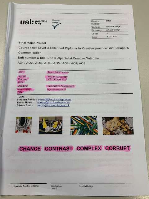
During this project I must plan to produce an effective portfolio to display to university and future employers.
I should create at least 6 unique designs over the 7-week period and must display development and progression of each piece. Regular reflective evaluations and updates are necessary to explain my thoughts and feelings over my work and ideas.
After reviewing my work, strengths and motivations I will be able to start looking at existing work from professionals and other creators to see what I may need to build my own portfolio. I must also produce an online presence on Behance.net and start to network between other online creatives around the world.
Finally I will produce 500+ words reflecting on my work as an evaluation to the project.
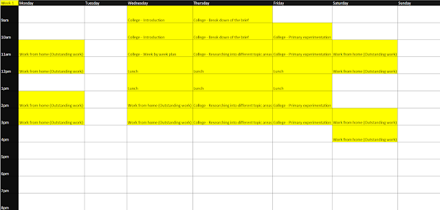
I can use the 'Pomodoro' technique to help me stay on track and not lose while while completing my work. The Pomodoro technique is a time management method where you work for 25 minutes and then take a 5 minute break. After four consecutive working intervals a longer break is allowed, often 15-30 minutes.
Artist Research
I want to start of my artist research by looking at some artists I think could help me when creating my final designs.
Kaz
Kaz is a fashion designer/artist based in Ireland. She specialises in knitting headwear, but also sells bags and digital crochet patterns. I thought that she was be a good artist to look into as I'm interested in creating my own ski mask advertisement/design.
The way Kaz incorporates different elements into a ski mask is very impressive, the design above isn't anything too complicated yet still looks very stylistic and clean. The different cones laid on top of the mask give off a punk/retro vibe and make me think of the liberty spikes hairstyle.
This is my favourite balaclava design from Kaz, this is the product which made her blow up on social media, especially Instagram. The design is based on the character "Shin" from the manga and anime series, "Dorohedoro". I love how creative the piece is and how the shape is very similar to an actual heart.
Here is a simpler looking ski mask which appears to have light blue fluffy yarn wrapped around a plain grey knitted mask. This is much more like how I want to approach my final design, but instead of the fluffy yarn I want to use barbed wire to enforce the riot aesthetic.
I think that the colours in this piece are very themed and make me think of autumn. I love the bright colourful vibe it gives off and the star jewellery featured on each ear. The crochet pattern is very neat and evenly spaced out.
I think that her work is very relevant when it comes to creating ski masks and balaclavas, although for my design I just want it to be a plain ski mask with some small unique details rather than completely changing up the design of the mask.
Alexandre Éder
Alexandre is a social media designer based in Brazil. On his Behance profile he has posted a few mood boards devoted to branding and displays each one in a very neat and tidy way. I chose to look into this artist as I was thinking of creating a carousel layout and this is quite similar to how I want to display my work.
Here is one of my favourite branding designs by Alexandre, he has demonstrated great skills when working with colour and advertising. He's made sure to keep each product appetising by using bright colours and clean elements within the designs. The key to creating these advertisements is to not over complicate them and leave them quite simple with the product image, a title, and a few others elements to build up the appearance of the design.
This is another favourite by Alexandre, I love how he incorporates nature into the designs and creates a magical aura with the different visuals elements such as the sparkles, butterflies, flowers, fairies, mushroom, etc. He still manages to not over clutter the canvas with graphics and keeps it fairly simple. The colour palette helps with the mystical vibe of the theme as purple is a rich colour associated with magic and wealth.
3D Chrome Typography
I wanted to research a variety of artists for this section as I couldn't decide on only one.
Kars Design
Kars Design is a freelance designer based in Indonesia and specialises in clothing design, however he has also posted a few typography designs which I loved so they are the designs I'll be looking at.
These designs were all created in Illustrator and then imported into Cinema 4D or Blender to then extrude and make into 3D models. After that textures and materials are added and the designs are rendered. All post processing is done using the Camera Raw filter and possibly a plugin called Magic Bullet Looks. Every render on here looks very good but I would have to say my favourite is the one in the top right.
These were made the same way and also display amazing colour combinations and materials. On this set of renders I think that Kars has put in more effort and tried to make them more detailed which he has done successfully. My favourite design is the one in the top right again.
Vijay Ram
Vijay Ram is a 3D designer based in Leicester, UK. Most of Vijay's work is involving just 3D models so I wanted to share this design incorporating typography.
I couldn't resist putting this piece of art in my artist research as Vijay has clearly spent a lot of time on this artwork and I think it deserves to be noticed. The typography looks to have been rendered in a 3D software, as well as a lot of the assets around the text. After it was rendered it is evident that Vijay took it into Photoshop and touched it up by adding glows, shines, particles, etc. Overall I think that this is a very busy and adventurous piece of art, for one of my final designs I would love to do something like this.
Edgar Medalla
Edgar Medalla is a digital artist based in Barcelona, Spain.
All of these designs display great use of colour and style. A lot of these use the Japanese language within them, this is often used as a style rather than because the client is from Japan. One of the designs caught my eye straight away and it was the one which says "Chainsaw Man", Edger has replicated a chainsaw within the original typography, lining the word "Chainsaw" with blades and adding handles to the word "Man".
Planning of final outcomes
Before I start working on any of my final designs I want to plan them all out by sketching a rough guide on how they will should look like.
The first design I want to create was a ski mask advertisement design for my 'Riot' clothing brand.
With the second design I wanted to switch it up to something I have never tried before, I want to create a carousel showing and teaching basic colour theory. This can also be incorporated into my research and primary experimentation as beforehand I will need to obtain the knowledge.
For the third design, I really want to create an experimentational canvas with various typography designs being displayed upon it.
Design 1: Riot Ski Mask Edit
Design 2: Colour Theory
Design 3: Typography
Design 4: Desktop Wallpaper
Design 5: Editing A Classmate Into A Zombie
Design 6: Music Tour Poster Design
Mood board for each design
Riot Ski mask
Design 1: Riot Ski Mask Edit
I started off by downloading a free ski mask 3D model at:
I then used a free 3D software called Blender to open the model. I applied the textures and then set up the lighting and altered the camera settings. Below is an image of the full scene.
I rendered the image using both, Eevee and Cycles render engines and decided to use the Eevee render as it looked cleaner on the folds in the material of the ski mask.
This is the final render of the ski mask.
To start off this design I want to add fire inside of the eye area of the ski mask, this is to show the destruction and violence caused within riots.
I wanted to add some burnt edges to the lining on the ski mask, to do this I found some free textures I had previously downloaded to my desktop. I warped them around the edges to give them a realistic shape.
I masked the textures and set the blend mode to 'Vivid Light'.
These are the results after doing this the entire way around the eye area.
I added 'orangey' edges to the burnt areas to give the effect of them currently burning. I also added a small piece of paper being held onto the mask by a paper clip. I added my Riot logo to this paper as it is an advertisement for my brand.
I added a chain to display a sign of wealth to the design. I used puppet warp to wrap it around the neck of the mask.
I added light flares and reflections to the chain to show the value and shininess of it.
I added a background using some textures overlaying each other and a slight vignette to the edges of the canvas. I also added a curves adjustment layer to increase the brightness and sharpness of the ski mask.
The ski mask is currently floating in the air so I wanted to add something to be holding it in place, I thought a pole stand would work fine. I used a rectangle and 'bevel' in the 'blending options' menu to achieve this slightly 3D look. I also used a thin white rectangle and blurred it to add a shine to the pole.
Added more flames around the edges of the eye area and added glows.
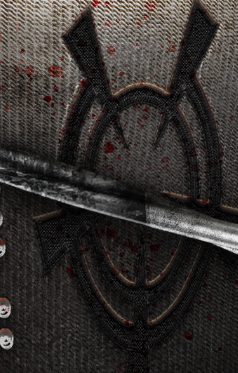
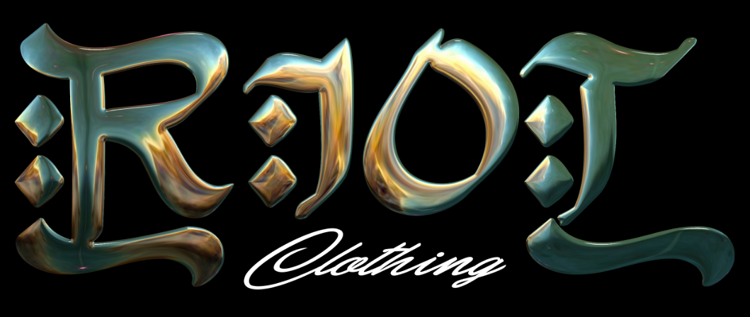
I created this Riot text/logotype using in two different parts. I started off by creating the chrome ellipses using blending options and arranging them in a grid. I then created the O/crosshair using textures and blending options as well. I then placed these together and created the image above.
I warped the design I created onto the ski mask, it needs highlights and shadows to appear like it is actually attached to the mask.
This is how it looks after adding highlights and shadows. I think it looks better now.
I spent a while working on adjustment layers so achieve a better, more 3D look to the ski mask. I added textures to the mask and several layers used to alter the lighting. I added a lipstick mark to the mask as well because it currently looked too empty.
I still thought the mask looked too empty to be the primary subject of the design so I added some barbed wire images to give the illusion that they are wrapped around the mask.
I added textures to the barbed wire to make the metal appear older, shadows were also added below the wire.
The area around the mask looked too boring and bland so I added more flames coming from below the camera. I definitely think this helped with giving the viewer something else to look at in the design.
I added blood splatters around different areas of the design such as on the mask, embraided logo and chain. Things like this help with detail within the final design.
I fixed the rest of the lighting issues and love how much better it now looks.
Finally I added some smoke above the fire in the mask and light rays shining down from the top of the canvas.
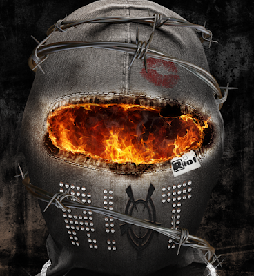
Here is the final image below any further colour grading and image enhancements.
Here is the final image after applying a camera raw filter.
Here is the final image after applying a different camera raw filter. This is my favourite version.
Here is the final image after applying a different camera raw.
Reflection
This is my first design so I am currently unsure how this compares to future pieces in this project. I am very proud of how this came out and wouldn't necessarily say anything needed to be improved or worked upon. However, I believe that this design took too long to fully complete. In total I spent around 15 hours on this piece, this is too much time to spend on each portfolio design so I will have to cut back on it with the subsequent artwork pieces.
Design 2: Colour Theory
Came up with a layout after rotating through numerous different attempts.
Added my name above the 'Colour Theory' heading. Added the correct and accurate colours to the different colour models.
I added colour to the heading and hue bar to enhance the design.
I changed the text heading and resized it so that it would allow text to be placed to the right side of the heading.
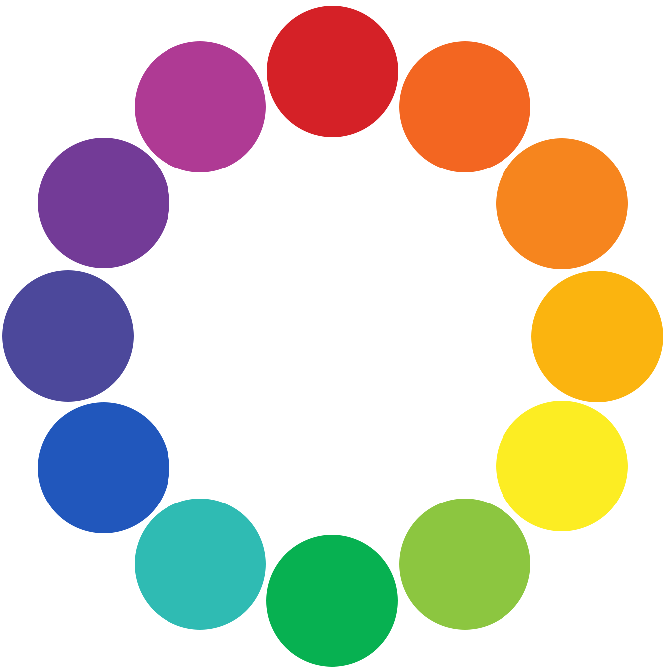
I created a custom colour wheel using accurate colour codes found on a trusted website.
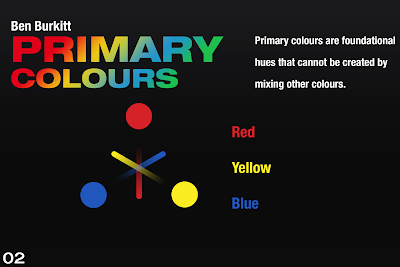
I used the colour wheel I created earlier and hid all of the colours except from the primary colours. I also added text to the right side of the image.
I coloured in the colour wheel image and text.
Finally for this slide I added some more information into the text box on the right.
I created an entire new slide for secondary colours, I repeated the same process of the primary colours slide but with new information.
I created an entire new slide for tertiary colours, I repeated the same process of the primary colours slide but with new information.
Final carousel layout design.
Reflection
I have never created a carousel design before so I am happy with how this came out. There are only four final slides but I think for now that is an acceptable amount as I can expand on this in the future if I have more time nearer to the deadline. The overall layout and appearance of the designs is quite well executed in my opinion. I have also done research on the Colour Theory topic developing my knowledge of how colours can be combined and numerous other pieces of information about the subject.
Design 3: Typography
I want to start off this portfolio design by experimenting with creating different logos, some being built up from fonts and others being completely designed by me.
OPIUM MUSIC LABEL 1
I want to start off with a font so that I can get used to creating a variety of different concept logotypes.
I'm using Photoshop to create this design. I have placed in two rectangles so that I can building upon them to underline the bottom of the text.
I've managed to wrap the rectangles around the letter "P" and am quite happy with how it looks so far.
I realised that using Photoshop for creating this logo might not have been the best idea as I messed up underneath the text, between the "I" and the "U".
I switched over to Illustrator and started from scratch. I added two strokes to the text, one coloured black and the other one larger, and white. This gives the illusion that there is a gap between the text and the white outline. I then used the shape builder tool to subtract the black outline so that the logo design consisted of just the original text and the white outline when shown on any colour background.
I loved how the logo looked but still wanted to try out how it would look if I went back to my original plan, underlining the text. I don't think that this looks as good and I think I will choose the previous stage of the design to display as my final logo.
OPIUM MUSIC LABEL 2
I started off in Photoshop again as I am used to using my drawing tablet on this software.
Reshape. Refine.
A GREAT CHAOS - KEN CARSON
I want to create some designs for the recently released album, "A Great Chaos". This time I want to design some more complex and complicated logos. I want to make it so that it fits the music artists aesthetic and is quite hard to distinguish what it reads, but still legible.
I started off by distorting a fonts perspective and placing a star next to it,
I then wrote over the original text with new typography reading "Ken Carson". This had a pink stroke.
I played around with the location of this text a bit.
I added in a shape I formed using the pen tool.
I changed the colour of the "Ken Carson" text to fully pink and removed the stroke. I also added a stroke to this main text.
This is the final design in white on a black background.
ALBUM TEXT REPLICATION TYPOGRAPHY
None of the typography designs so far have included my clothing brand, "Riot". I thought that I should create at least design one for the brand
Here are some sketches I did using the word "Riot". I wasn't a fan of any of them so decided to investigate further into doing something different with the word.
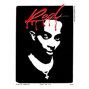
I came up with the idead of trying to replicate the text from the cover artwork of album, "Whole Lotta Red". Below is a picture of the cover for reference.
I started off the design by sketching a rough layout of the design I was going for.
I added trails of liquid sliding down from the text.
I went over my sketch with a brush so that it was clean and ready to be imported into Illustrator.
In Illustrator I traced over the outline I created previously and filled the areas inside the text, such as inside the "R", with a black colour. I then used the shape builder tool to erase these black filled areas so that it completed the logo.
Finally I replicated the colour palette and drop shadow of the reference logo.
CACTUS JACK NEON SIGN TYPOGRAPHY
I wanted to try out some sketching on actual paper rather than my drawing tablet this time. I found it was faster during the actual sketching process but it wasn't as practical due to having to take a photo and transfer it to my computer, whereas if I used my drawing tablet I could just hit save file.
I placed the sketch I did into Illustrator and traced it using the pen tool. Then I tweaked it so that it looked better proportion wise and wasn't positioned at an angle.
I switched back to Photoshop and downloaded a copyright free image of a brick wall then placed it in behind the text.
I darkened the brick background layer by using brightness, colour lookup, and exposure adjustment layers. I also started working on the layer style of the Cactus Jack logo.
I continued to work on the text and made it seem like it was glowing.
I added a small cable and attached it to the lights. I added a small pink glow onto it and a shadow fading in the further away from the light it got.
I made some final lighting adjustments and then proceeded to apply a Camera Raw Filter which improved the overall appearance of the design.
Here is my preferred colour of the final design but I'm unsure of whether this is better looking than the pink variant.
Reviewing Existing Logos
OPIUM MUSIC LABEL 1
I wanted to try a new method out for achieving a chrome kind of style. For this I worked on the blending options of the layer and a new plug I downloaded to displace images. This gave the effect of the image being shiny due to the distortion from the plugin. I would like to do this again later but with a different image.
Here I tried something new by applying an image texture onto the back of the text. It didn't look very good and made it hard to read, to improve this look I will have to add a shadow behind the text in the future.
I went through the same process but used a different base image this time. I love how this time around it looked more shiny and more metal-like.
I tried to repeat the same thing I did earlier but this time add a drop shadow and black coloured outer glow to allow you to distinguish the two assets.
These are multiple different variations of the logotype design, Camera Raw was used to achieve these different looks.
I picked my favourite Camera Raw look from the multiple designs above and finalised it. I used motion blur, glows, particles and added a faint background design as well.
SIMPLE LOGO USING EXISTING FONTS/TYPEFACES
Here was logo a created but didn't think it was fit to show the process behind as I did not
OPIUM MUSIC LABEL 2
I carried on experimenting with different options and sliders which led to these results above.
I picked my favourite text design again, added glows, added some rainbow holographic effects and finally added a Camera Raw filter.
A GREAT CHAOS - KEN CARSON
After playing around with different colours I decided that these were very fitting for the theme.
I added glows to the front text and a zoom blur to the entire image.


.png)
.png)
.png)
.png)
.png)
.png)
.png)
.png)
.png)
.png)
.png)
.png)
.png)
.png)
.png)
.png)
.png)
.png)
.png)
.png)
.png)
.png)
.png)
.png)
.png)
.png)
.png)
.png)
.png)






















Comments
Post a Comment