Introduction
During my last project I used a blog to keep track of my work as it gave me a lot of flexibility in terms of being able to work from any device whenever I want and enabled an ongoing record of the development of my final major project. My current task is to base a project upon one of three words that I have been given: 'distortion', 'destination' or 'delicate'. I decided that I would prefer to create something which ties into a music theme as this is a personal interest of mine and links to my previous project. It would be good to make the theme of this projects final piece somewhat similar to my previous project where I made the set of cards.
The aim of this project is to create a product whilst working inside the brief requirements and producing a good final result. I need to make sure I spend time researching and thinking about which word I should choose, and then the product I create based off that word.
During my final major project I would like to develop new skills, physically and digitally.
After reading the brief I am looking forward to developing this project to the best of my ability and producing a well thought out, final piece which appeals to a specific target audience.
Brief Analysis


Primary Research
We went to Nottingham to look at artwork for the purpose of inspiration in four different galleries: Nottingham Contemporary, Castle Fine Art, Fletcher Gate Art Gallery, Aura Fine Art. Below I will write about some of my favourite pieces I saw whilst I was there.
I loved this artwork as it was so complicated and cluttered with numerous different movie mascots, such as Indiana Jones, Jurassic Park, Jaws and more. I think one of the reasons this piece caught my eye was because it was very vibrant and it appears to be done in digital software, most likely Adobe Photoshop, whereas the others were done by hand. If I was to give any advice to this artist I would tell them to make sure that all of the shadows are in correct proportion as I can spot some objects in the canvas which look as if they have no shadows or that the shadows are not large enough. I would also tell them to make sure to correct highlights on different assets within the image, for example Indiana Jones is quite hard to spot as he just blends into the wall, due to the fact that he is lacking highlights, and the lighting is just wrong overall. However, I understand it may have been quite hard to correct the lighting on the individual characters and items as I assume the artist obtained them from different websites online. Overall, I really like the image - I just think it could have been improved.
This was a very interesting room, it had 3 screens where artwork was displayed. The art style looked like retro video games, they had an 8-bit style to them. They used limited colours: blue, pink, green, white and black. The screens were constantly changing every 3-4 seconds until they finally looped back to the original artwork displayed and then repeated the rotation again. I liked this art as it was different from others in its appearance and fluidity, and it appealed to me as I have seen a similar style to this before. It reminded me of a game called 'Undertale' which I have never played but I have seen the art style and it's almost identical.
This was another really cool concept that I liked. It is a banking card with a custom design as the background. I would like to try something like this for my current project if I have time at the end. The colours are very warm and almost look vintage - the Looney Tunes theme may also help to achieve this look as it is quite old now. The Warner Bros logo caught my eye first, possibly because of the scale of it or the slightly brighter colours used in comparison to the rest of the design.
This painting was eye-catching as it looked as if the artist had dragged paint across the canvas to create thin paint streaks. It looks as though they have then painted in between these lines and filled in the colours of the art. I really like the reflection of the trees and sky on the wet road as it adds a good sense of realism to the piece. Because of the rain on the road and the colours used, it looks like the atmosphere surrounding the image is quite cold, and it looks like sunrise. The sky reinforces this as it shows orangey colours seeping out to the blue sky. The leaves on the trees direct your attention towards the middle of the painting by acting almost like a border.
The colours used in this artwork are very aesthetically pleasing to look at; there are multiple shades of blue used and they project a soothing feeling towards the viewer. Although the colours used in this art are usually to show sadness, I think in this case it is the opposite as it shows the beauty of nature and brings happiness to those who look at it, giving a calming effect. It looks like it was based on a reference photo taken in the Artic and Antarctic circles. The strokes used on the aurora are very powerful as they show very bright and vibrant colours whilst blending into the sky.
What I need to do
Decide on the product I am going to develop
I have three words to work with during my Final Major Project (FMP) which are:
Delicate
DestinationDistortion
My choices are to choose one of the three words and create a physical piece based around this chosen word. I should use the techniques and project structure that I have learnt over the past year at college while developing my FMP and make sure it meets the standards of my previous project or better. Once I have decided on the word I am going to base my assignment around I must explore references and experimental pathways in which to take my work. There is no specific target audience requested for this project so it is solely up to me which age range I choose. My current thinking is late teens to young adults so that I can build in my own personal experience and preferences. The brief for this project is very loose which will allow for a lot more freedom in my thinking, design and production but also more daunting as I am given very little guidance.
I should then submit a UAL proposal document which will confirm my personal idea and direction for my FMP. I will be told to modify my idea if my tutors do not think it is adequate enough for my final project.
SWOT - (Strengths, Weaknesses, Opportunities, Threats)
Created in Microsoft Excel by me. I created the above in Microsoft Excel to help focus my initial thoughts, and to help me build upon the identified strengths and opportunities.
Mind map
I used Adobe Photoshop to create this mind map, exploring different synonyms and meanings for the three suggested words.
Definitions
Delicate
Adjective
1. Very fine in texture or structure; of intricate workmanship or quality.
2. Easily broken or damaged; fragile.
Noun
3. a delicate fabric or garment.
The word 'Delicate' in different languages:
Japanese - 繊細
Chinese (Traditional) - 精美的
Chinese (Simplified) - 精美的
Korean - 연약한
Persian - ظریف
Arabic - حساس
Synonyms:
delicious, delightful, elegant, exquisite, fragile, gentle, graceful, mild, rare, soft, subtle, tender
aerial, balmy, breakable, choice, delectable, ethereal, faint, filmy, fine, fine-grained, finespun, flimsy, fracturable, frail, frangible, gauzy, gossamery, hairline, muted, nice, pale, pastel, recherche, select, shatterable, shattery, slight, subdued, superior
When searching the word 'Delicate' on Google these are the image results which come up, they consist mainly of Taylor Swift's song called 'Delicate' and a few of the images are feathers and dandelions.
This is a small photo collage I put together further displaying images surrounding the word 'Delicate'. The images used are all taken from Unsplash and Google but the original links are shown below:
Feather - (https://www.shutterstock.com/image-photo/white-delicate-feather-closeup-on-black-777329824?irclickid=08gw4ERISxyNUYJx4M21QwUTUkARg31a21XoxE0&irgwc=1&utm_campaign=TinEye&utm_medium=Affiliate&utm_source=77643&utm_term=)
Glass - (https://soundbeat.org/episode/how-high-can-you-go/)
The rest of the images - (https://unsplash.com/)
Destination
Noun
1. The place to which someone or something is going or being sent.
2. Denoting a place that people will make a special trip to visit.
The word 'Destination' in different languages:
Japanese - 行き先
Chinese (Traditional) - 目的地
Chinese (Simplified) - 目的地
Korean - 목적지
Persian - مقصد
Arabic - وجهة
Synonyms:
harbour, haven, station, stop, target, terminal
aim, ambition, design, end, intention, object, objective, purpose, terminus
journey's end, landing place, resting place
When searching the word 'Destination' on Google these are the image results which come up, they consist of luxurious holiday locations and stock images linking to the word.
This is a small photo collage I put together further displaying images surrounding the word 'Destination'. The images used are all taken from Google but the original links are shown below.
Traveling to landmarks - (https://www.shutterstock.com/image-illustration/travel-world-monument-concept-175007894?irclickid=08gw4ERISxyNUYJx4M21QwUTUkARgh2q21XoxE0&irgwc=1&utm_campaign=TinEye&utm_medium=Affiliate&utm_source=77643&utm_term=)
Beach - (https://www.buzzfeed.com/pablovaldivia/encanto-character-combo-quiz)
Road leading to mountains - (https://www.thrillist.com/travel/nation/best-national-parks-europe)
Sign - (https://www.pratacambio.com.br/news/page/2/)
Plane taking off - (https://www.newcastleairport.com/our-destinations/)
Town centre - (https://www.shutterstock.com/image-photo/seville-es-july-26-2017-calle-791291599?irclickid=08gw4ERISxyNUYJx4M21QwUTUkARgkQj21XoxE0&irgwc=1&utm_campaign=TinEye&utm_medium=Affiliate&utm_source=77643&utm_term=)
Flag on map - (https://storyimpuls.de/externe-kommunikation/)
Distortion
Noun
1. The action of distorting or the state of being distorted.
2. The action of giving a misleading account or impression.
The word 'Distortion' in different languages:
Japanese - ねじれ
Chinese (Traditional) - 失真
Chinese (Simplified) - 失真
Korean - 왜곡
Persian - اعوجاج
Arabic - تشوه
Synonyms:
bias, exaggeration, lie, misinterpretation, misrepresentation, misstatement, misuse
baloney, bend, buckle, coloring, contortion, crock
crookedness, jazz, jive, line, malformation, mutilation, perversion, slant, smoke, story, torture, twist, warp
intorsion, malconformation, misshape, tall story, twistedness
When searching the word 'Distortion' on Google these are the image results which come up, they consist mainly of abstract and trippy images.
This is a small photo collage I put together further displaying images surrounding the word 'Distortion'. The images used are all taken from Unsplash and Google but the original links are shown below.
Person with red hair - (https://truckmusic.store/shop/back-catalogue/various-artists-waves-of-distortion-the-best-of-shoegaze-1990-2022/)
Fingerprints - (https://medium.com/@drewlor/on-names-8462dc119ea)
Distorted TV Screen - (https://www.shutterstock.com/image-photo/glitch-distortion-futuristic-overlay-nft-blockchain-2059427264?irclickid=08gw4ERISxyNUYJx4M21QwUTUkARgjTC21XoxE0&irgwc=1&utm_campaign=TinEye&utm_medium=Affiliate&utm_source=77643&utm_term=)
Abstract effect - (https://artelaguna.world/virtualart/nautilus-universe-distortion/)
Space - (https://www.esa.int/ESA_Multimedia/Images/2018/07/Major_mergers)
Distortion party event - (https://ra.co/events/1602394)
Idea Development
Reflecting on the image search, definitions and meanings of the three words, I started to develop my own initial design idea for each:
Delicate
I wanted to mess around a bit on Photoshop to see what I could create for the word 'Delicate' and this is what I created.
Destination
I repeated the process again on Photoshop, but this time for the word ‘Destination’ and with the use of some stock images.
Sky images - (https://unsplash.com/)
Distortion
Finally, I explored an idea for the word ‘Distortion’, again using Photoshop and some stock images.
Following my initial research into different aspects of the three words I think the word I should pick is 'Distortion' as I believe it allows me to venture further creativity wise. This is shown by how the image above compares to the other two I created. However, I will do some further research on the word 'Distortion' and then make a final decision.
Colour Palettes
I created these palettes on Adobe Photoshop after testing how different colours worked together.
The word 'Delicate' includes soft colours which I personally believe represents the word very well. They create a calming mood when used in an art piece. They almost look like pastel sort of colours. They reflect some of the synonyms that I researched such as gentle, graceful, mild, subtle.
The word 'Destination' contained colours that I think represent holidays/vacations such as blue representing the sea and yellow representing the sun or sand. These colours also show relation to the synonyms I talked about earlier such as harbour, haven, journey's end.
The word 'Distortion' shows bright, fluorescent colours which show obvious contrast between one another. When I see the colour palette it makes me think of images surrounding words like 'glitch', 'abstract' and 'illuminated'. Distortion is better achieved by colours which don't normally sit well together. Again, the colours relate to the synonyms I researched earlier on in my blog such as intorsion, misshape, jazz.
The 'Distortion' colour palette is my favourite, inspiring me by the possible artwork I could create with these colours due to their vibrancy. The contrasting colours give lots more creative options.
Album art:
As I am interested in developing my project on a music theme, I decided to explore album covers which link to the three words:
Delicate
(https://din.org.uk/album/singularity-din78)
This album is named 'Singularity' and the artwork demonstrates this well in my opinion. When I look at it I see many thin lines which look easy to snap and destroy, which also correlates with the word 'delicate'. What looks to be a screw in the middle of the canvas appears to represent the word 'singularity' as it almost seems alone and isolated amongst all of the chrome abstract liquid lines. The black and white contrast makes it easy to recognise the different layers within the image. The effect is a little like lace which ties into the ‘delicate’ image.
(https://www.angrymetalguy.com/pounder-breaking-the-world-review/)
I think that this album cover demonstrates the 'delicate' sense partially but not fully. This may be because the viewer knows that earth is not able to be cracked apart like the artwork is showing, but I still think that it is showing the delicacy of the world at the hands of something or someone much bigger attempting to destroy it. Nevertheless I believe that the artwork used for this album is very effective and has a strong artistic style to it.
Destination
(https://music.apple.com/jp/album/final-destination/1047555182?l=en)
I am not familiar with this album but I found it when searching on Google and immediately related it to the word 'destination'. I think the main reason why I thought this was because of the long empty road leading to a large city, perhaps considered as the destination. I realised after that the album is actually called 'Final Destination' which now makes sense considering the effect it had on me and the first time I had seen it. The motion blur on the road also enhances the 'racing' feeling towards the destination or finish line. I can see the shadow of an aeroplane on the road which made me realise that it is in fact a runway which in my opinion wasn't very obvious initially. I personally believe the design process could have been executed better as there are areas which don't do not make sense, such as lightning the lighting? in places and the realism of the artwork.
(https://www.amazon.co.uk/Death-Race-Love-Juice-WLRD/dp/B07P7DY7K5)
This cover was created for Juice WRLD's 'Death Race for Love' album. I think it demonstrates some sense of ‘destination’ in the artwork, as the vehicles look as if they are racing against each other. This could also be inferred by the album name: they are racing for love. The album title also makes it sound as if whoever loses the race for love, dies. I really enjoy the chaotic composition and colour palette used in this artwork; it really reflects on Juice WRLD's grungy style to the music featured on the album. When I look at this album cover, I also feel as if I am looking at an older, vintage cover – perhaps something which was made in the early 2000s, and I think that the appearance of the text reinforces this. Distortion
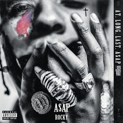
(https://www.reddit.com/r/hiphopheads/comments/35dtod/atlonglastaap_album_art/)
This is an album cover by A$AP Rocky and is a tribute towards A$AP Yams, who passed away. The artwork shows A$AP Rocky covering his face with his hands. An image of A$AP Yams has been placed above him, highlighting his recognisable and distinctive birth mark in pink and purple. This image of Yams is placed so that the viewer is uncertain of what they are looking at to an extent and have to interpret it how they would like. The rest of the cover is coloured in black and white.
(https://alicecooper.com/music/hey-stoopid/)
I have personally never seen this album cover before but I saw it on Google and it instantly caught my eye. I really enjoy the colours in this piece as well as the 3D rendered assets. The light flares add depth and reinforce how expensive everything looks in the artwork. The skull is very unique as it almost looks to be alive, with the eyes and the face paint that rock metal artists have. The vibrant colours also provide a clear contrast towards the background of the image, which is black. The cluttered canvas of colourful jewels and shiny objects brings in the distorted feeling to the design.
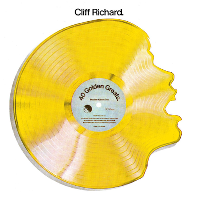
(https://music.apple.com/us/album/40-golden-greats/696775099)
This album cover for Cliff Richard's '40 Golden Greats' is amazing, and it definitely displays the distorted vibe I was looking for. We know in our stored mental image of records that they are circular in order to play them on a record player, this is giving the effect of distortion or ‘distorted reality’ to the viewer. It heavily inspired me to do something similar for my final product, although in which way I am not sure yet. At first glance I though it was just a wavy, melted looking shape but when taking another look I saw that it was a face inside of the vinyl. It also looks very vintage, as it was released in 1977. It is a exceptionally good concept for something made so long ago, although I have researched about this cover and cannot find whether this was made digitally or physically.
After exploring these existing album cover artworks I am quite interested in attempting to create my own as I think that an album cover would be a good final piece to create, as I can design and develop multiple physical concepts/products that would sit alongside it. An album cover is also very important when discovering new music and artists; a good, eye-catching cover artwork brings a larger audience towards the music as it almost represents how the music will sound. I will do further research on other existing art pieces and then see if am I still interested in creating my own music cover artwork.
Further Research (AI)
I wanted to test how prompts would look if I placed them into Midjourney's AI art generator These are the results I achieved and the prompts used. (https://www.midjourney.com/home/?callbackUrl=%2Fapp%2F)
The prompt used for these images was:
"earth combined with a skull, foliage on the skull, overgrown plantation on skull, space background, rocks floating around the background, digital painting, glowing assets"
I think that these artificial images look good but not exactly what I want to achieve for with my album cover design. The main problem with these images is that I wanted them to further incorporate the earth into the skull as I currently cannot tell if earth is referenced in them. My favourite is the second image as it demonstrates moody lighting and brings nature and life onto the skull like I wanted. I like the colours in all three as I think it fits the correct colour palette for the album art that I have in mind.
The prompt used for these images was:
"earth floating in space, small meteors floating around, glowing colors, cinematic, 4k"
Art-wise, I much prefer this collection of images but I am not looking at creating something like this for my final artwork as I would prefer to have a main subject and complicate the canvas with lots of different things filling empty spaces. However, I have definitely been inspired by these and I am going to contemplate adding something like these images into my final artwork. The meteors scattered around the planets are not exactly what I was looking for, but they still bring a sense of filling to the composition.
Idea Board
Having chosen the word ‘distortion’ and a music theme, I started to consider ideas for possible final products I could create.
Some others ideas I considered after creating this board were to add more uncommon items used for aesthetic purposes, such as:
Fake Passport/ID
Fake Cheque
Fake Receipt
Missing or Wanted Poster
Artist Research
Višnja Mihatov Barić
Višnja Mihatov Barić is a freelance graphic designer and illustrator based in Croatia. I like her work as she implements distortion into a lot of her pieces and doesn't over exaggerate it. This is what I would prefer to do with my final piece, adding elements of distortion rather than filling the entire canvas with a distorted graphic.
(https://www.verve.gallery/creator/31/teetonka?vp-page=2)
This is one of my favourite pieces of art from Višnja as I love the contrast between the monochrome colour palette of the woman and the vibrant colour palette of the flowers. I personally believe that art like this is open to interpretation when looking for a meaning within it. To me the flowers represent a powerful, positive mind trying to grow and evolve whilst being surrounded by a dark bland world.
(https://www.verve.gallery/creator/31/teetonka?vp-page=2)
This is another one of my favourite pieces from Višnja, I think it is very clever how the woman looks like she is being filled up like a water tank by her own tears. In my opinion the woman is crying and the tears are being contained inside of her because she has no one to express her emotions to.
After admiring some of Višnja's work I am inspired to do something with a more powerful meaning behind it, relating to the word 'distortion' but in a more subtle manner. I really like the idea of having the artwork appear like a normal, cool looking album cover at first glance but as you inspect it further you begin to see the true meaning behind it.
Sora Aorta
Sora Aorta is 21 years old and is based in Japan; he has been one of my favourite digital artists for a while now as I love the colours and style he uses in his artwork. He has had a rapid increase in popularity within the hip-hop world since he posted to his Instagram in 2020, and he has also worked with many big names such as Trippie Redd, Iann Dior, Lil Tjay, Young Thug and Doja Cat.
(https://foundation.app/@smilecomplexx/foundation/6734)
This piece was made as fan art for music artist Travis Scott's upcoming UTOPIA album, and Sora posted it to his Instagram in February 2021. I think that this represents distortion quite well with the different abstract shapes used and the vibrant colours. When creating my album artwork I would really like to try out this kind of style with my own art. The contrast between the bright colours and the dark background is very pleasing to the human eye and it attracts your view straight away.
(https://fantastichiphop.blog/2021/02/22/trippie-redd-neon-shark-vs-pegasus-album-review/)
This artwork was made for Trippie Redd's album named 'NEON SHARK'. It was a collaboration with another artist who goes by the online handle of 'JleoVisions'. Jleo created the 3D render of music artist Trippie Redd and the shark and Sora illustrated the rest of the design. This is one of my favourite album cover arts of all time as the colours and perspective are very different and unique compared to other existing covers in the music industry. My aim when creating my final artwork is to include vibrant fluorescent colours like in this piece.
Pierre Fischer (GBC PIERRE)
Pierre is a 20 year old graphic designer from France, he works for clothing brand 'Sicko' and has worked with big names in the music industry such as A$AP Rocky.
(@gbcpierre on Instagram)
This is a poster concept design for Lil Uzi Vert's United Kingdom Tour. The reason I wanted to talk about this design is because I think that the colours really pop out and gives it a 'retro-y' look, as well as the textures and process Piere has gone through to add further to this effect. The small white stroke around logos and text in this design really help give it this look and make it seem as if they have been stuck onto the paper and then the design scanned in. Pierre uses two typefaces in this artwork, one being a medieval type and the other being a compact bolder type. Although this is mixing old with modern I feel like they work so well together and do not look out of place.
(@gbcpierre on Instagram)
Yet again we have another colourful poster. This was created as fan artwork for Lancey Foux. The style is vintage just like the first image and carries on the colourful theme, however I think that these colours sit better than the previous artwork. Pierre designed all of the text logos on the left side of the image which are all quite iconic and unique. They also carry the reto style with them; they look like skating/festival logos from 1990s/2000s. Pierre has a custom type on the subject building which reads 'ALL NIGHT LONE' and underneath reads ' LANCEY FOUX'. I think that the composition of the image is quite distorted and uses an interesting camera angle.
(@gbcpierre on Instagram)
This was concept artwork for A$AP Rocky's 'Same Problems?' single. It ended up as the official cover but just with text filling in some of the black area. Over the top of the figure we can see that Pierre has overlaid a CRT monitor effect, he has also made the bright areas brighter and the dark areas darker. The flag is distorted and wrapped over the figures body to represent the country.
Overall I can see what style Pierre specialises in and it works very well. He attempts to create older looking images which seem like they've been scanned in or look like they've been taken on a special camera. In most of his work he uses black/dark grey as the background and bright, well contrasting colours on top to easily separate them from each other. His work uses subtle distorted elements such as camera angles, colours and effects to
Exploring further into a Distortion themed Colour Palette
I wanted to create an expanded colour palette for the word 'Distortion' as it is the word I have chosen.
These are the colours I would like my final artwork to be based around. They are all quite bright and vibrant, but I would also like to make all of these colours more 'glowing' and neon looking.
Final Product
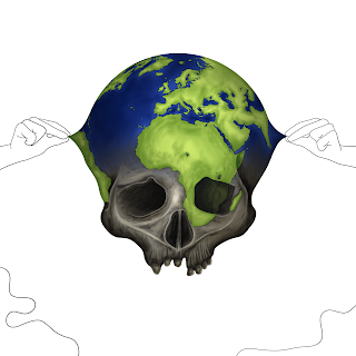
After thinking of different ways I could execute this artwork I ended up using this sketch as the base concept. I like the fact that it is associated with global warming/overpopulation/pollution and has further inner meanings linked to the distortion theme. I also think it will look good as a final piece so I am going to attempt to advance with this sketch.
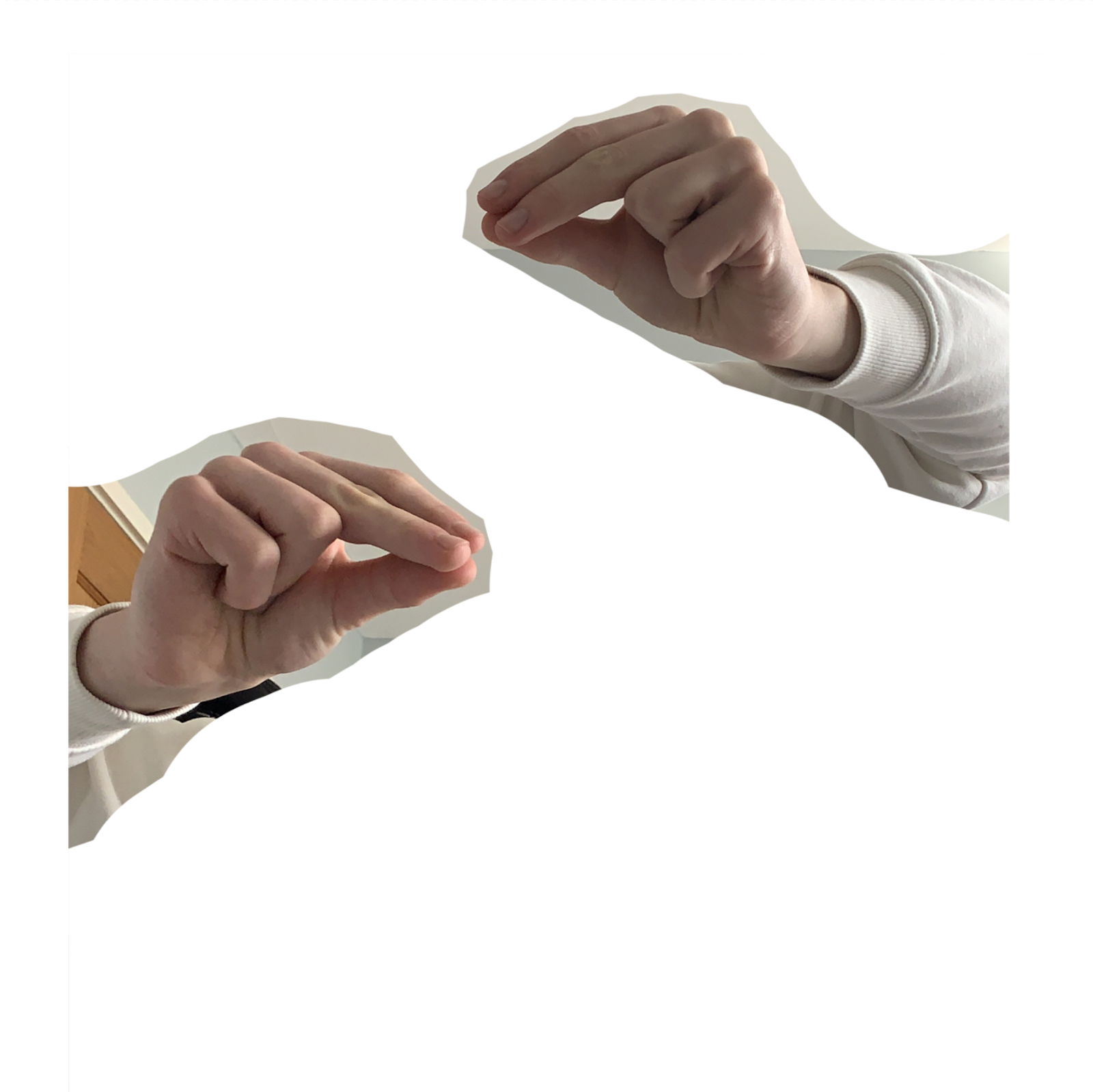
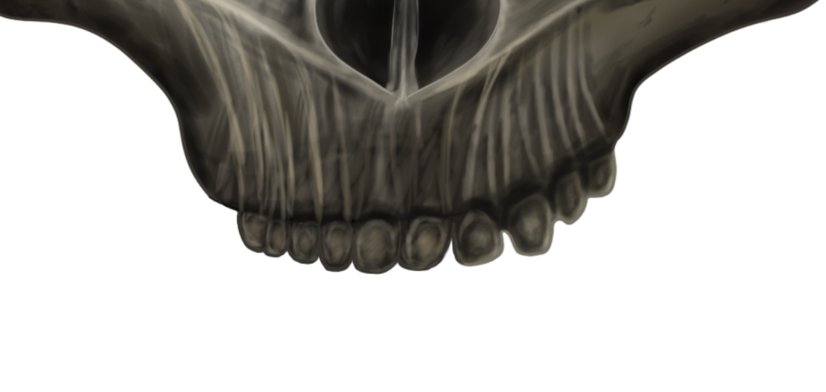
I traced over the sketch and made the line art neater. I used an image of the Earth to trace the mapping. I used reference photographs which I took in college to finalise the shape of the skull, these are shown below. I added hands holding the Earth together to represent the people trying to save the world, shown below. Alternatively, these hands could be interpreted as the effect of humans on the world, pulling and distorting it from its natural state. I also added some 'slime' effects in the bottom corners, which I may or may not use later on.
I coloured the main subject of the artwork and I am happy with how everything looks at this stage. I will colour the rest of the design at a later point.
Now I moved onto the shading of the subject and tried to make the skull quite defined and bone-like. I also tried to make the Earth look more rounded and create the effect of the land standing out from the water.
I decided to change how the jaw of the skull looked as I felt as if something looked off with how it was at the moment, I think it must be the perspective.
I redrew the left side of the jaw and coloured it in again. I now believe that this looks better and further enhances the 3D look of the skull, although I still have to refine this later on in the process of creating the artwork.
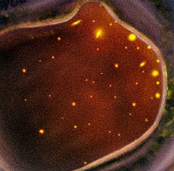
I added some sparks in the eye sockets of the skull. I had the sparks file already saved to my computer from a free stock image graphics pack I found on YouTube. I assisted the sparks appearance by adding an orange glow and also to add to the feeling that the heat is trying to escape from inside. The is supposed to represent the Earth being destroyed and dying from the inside. I temporarily removed the 'slime' line art from the bottom of the canvas to see how I felt about it not being there.
Sparks - (https://www.vecteezy.com/photo/6066911-burning-hot-bonfire-fire-sparks-on-a-dark-background-flying-embers-from-fire-3d-rendering)
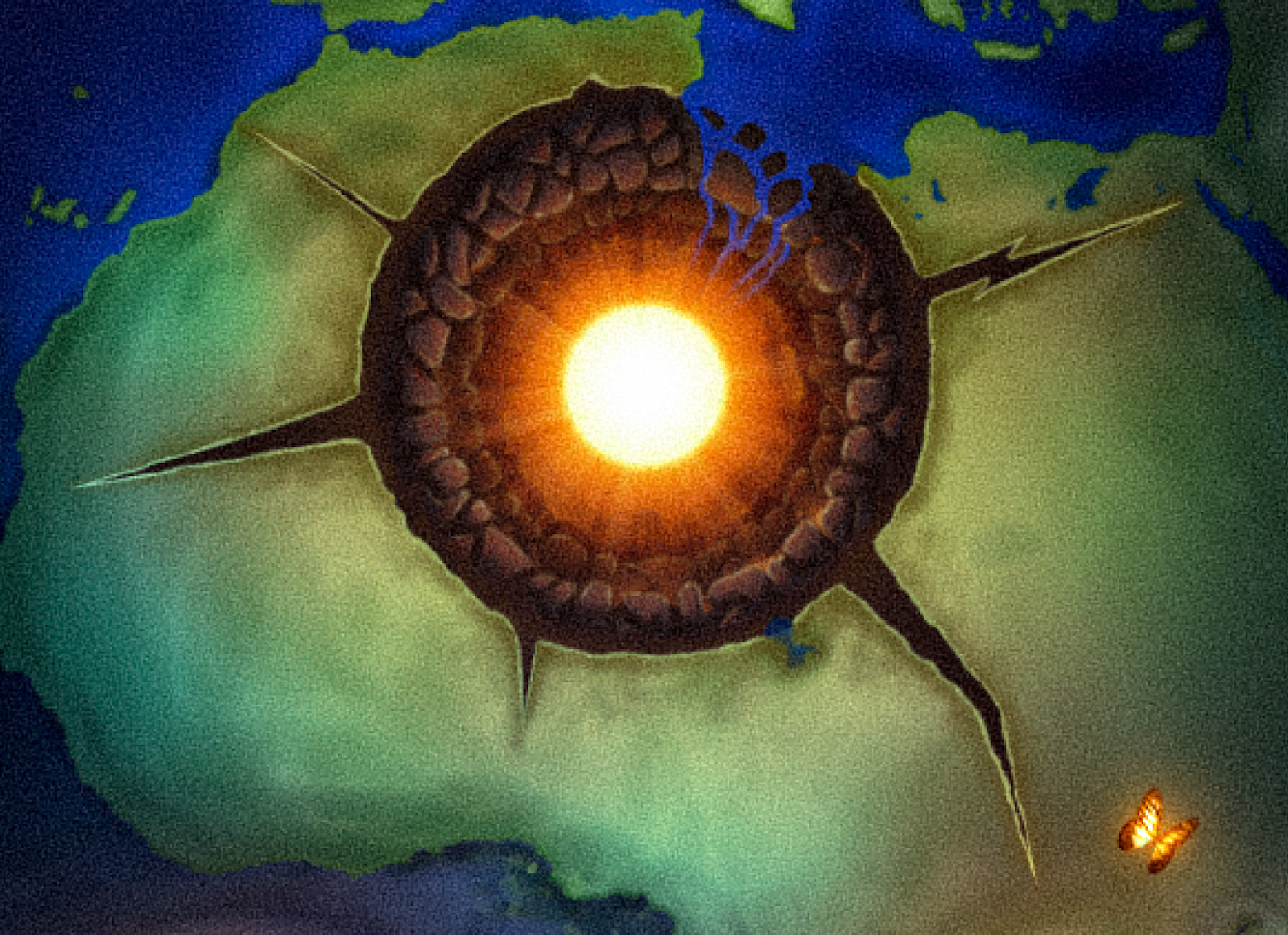
After experimenting a bit more I decided to add some flowers and greenery to the skull as I felt it looked too plain and empty. This could show the existing beauty of the world and help see what may be lost. I used Unsplash to gather these images and 'blend if' to paint the textures onto the skull. I also added the hole to the middle of the subject, to display the Earths core and 'mind'.
Unsplash - (https://unsplash.com/)
I wanted to see whether I could add some cartoon-like clouds to the planet to fill up the empty space. I decided to remove them as I do not think they look very effective.
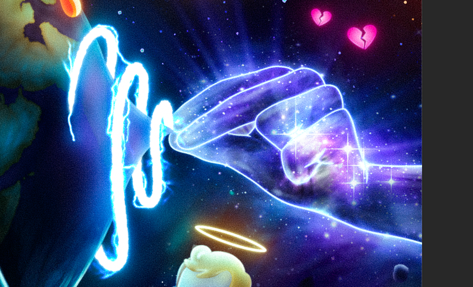
I added the dark blue background to work on the hands holding the world together. I added galaxy textures I found on Freepik and made sure to correct shadows and lighting so that the hands look subtly 3D. I also added another galaxy texture on top of both of the hands to create a glowing kind of effect around them. I also used layer mask to add manual glows to parts I thought needed some, such as the stars and the brighter areas.
Galaxy images on Freepik - (https://www.freepik.com/free-photos-vectors/galaxy)
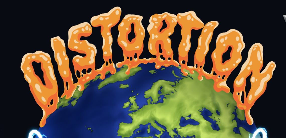
Next the text was added and positioned on the top of the Earth, I added shadows below to display its 3D qualities. On the areas where the subject is getting pinched/distorted there are glows to show how the hands are very bright and how they project their light onto the Earth.
I thought that the flowers on the skull looked too distracting so applied a black and white filter over them and left the leaves green to subtract some of the colour. The 'lightning spirals' are to further emphasise the strengths and power of the people holding the world together. I added another slight effect on the hands, light rays. The curve at the bottom of the canvas is the quick sketch of the foreground in the image, a planet/moon.

I traced the sketch of the planet at the bottom of the canvas and made it cleaner and added craters with green glowing liquid inside, this was because I thought that this colour reflected aliens adding to a further feeling of being located in space. I made sure there were more lightning effects where the spirals are. I also changed how the water looked whilst falling into the hole because it did not look realistic enough before, the perspective was wrong. The reason why the water is falling into the hole is to show it putting out the Earth's life force.
I decided I didn't like how the text was placed and that it lacked interest so I moved it upwards and used the liquify tool to create uneven lettering. The planet at the bottom was also improved by adding a crack in the land and more colour to lighten it up more.
I am happy with how the text turned out but I think I still need to make it blend in with the design better.
After thinking about how I could improve it for a while, I decided to create the effect of the text dripping down onto the Earth. I think that this is an improved look and reinforces the 'Distortion' word that I'm basing my design on.
I added glow onto the text as I want most of the image to end up being bright and glowing.
I obtained multiple galaxy stock images from Freepik and merged them together to create the background. I had to use curves and other adjustment layers to match the colours and contrast of the different images, and I painted a spiral-type pattern in the background on the right hand side. The reason for this was to add variety to the standard galaxy texture.
Galaxy images on Freepik - (https://www.freepik.com/free-photos-vectors/galaxy)
Next, I created a planet and used an existing image of a planet to add the ring around it.
The subject needed to fit the surrounding lighting better so I darkened it but left the middle area a bit lighter, where the hole is. Located at the bottom of the skull there are now dripping distorted liquids pouring out, again this is to reinforce the 'distortion' theme and further develop the use of neon colours from the colour palette I created earlier on in this project. I painted more highlights on the skull as well so that it wasn't completely darkened.
I added further highlights on the skull and brightened up the skull around where the fire should be casting light onto. Glows have been added onto the dripping liquid under the subject.
Next I painted the blue 'fiery' effect above the planet in the foreground, this was to attempt to add a bit of distance between this planet and the composition subject. The text above the album name was from Freepik as I found a letter set and couldn't resist placing them into the canvas as I knew they would look good.
I finished the text above the album title and added a tree which references a specific person, which I have explained further down the blog post.
The tree has been given a glow and some more modifications to alter its appearance. I drew out a rocket ship in the right corner of the canvas and made sure it filled most of the room up around that area. This was to show other life outside of Earth and possibly people escaping the world.
The rocket ship has been completed with shading and lighting, and I have now drawn out a meteor which is located on the opposite side of the canvas. This is to show the destruction of Earth again.
After finishing the meteor's shading and glows I added another reference to a late music artist. These are butterflies located just above one of the skull's eye sockets.
I added more glow to the text and other light sources such as the fire being projected out of the rocket and the meteor. I also added some small assets to fill in spaces I thought looked too empty.
In the lower right corner I added two UFO's. I drew out one, duplicated it, resized it, rotated it and placed it above the original one to make it look like they are two separate UFO's.
I shaded the UFO's and added motion blur to make them appear like they are moving. I also added the green rays below them to further replicate the classic UFO look.
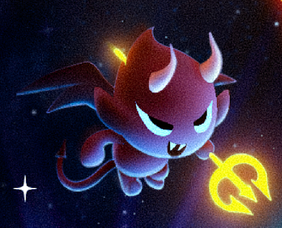
The left side of the canvas was still lacking something and felt too empty so I added some bubbles to represent the fragile nature of the Earth. I traced most of the devil from an image I found on Freepik, the reason for this was that I wanted to have both an angel and a devil in the image and I couldn't seem to get the style to look the same.
After finishing the devil, I then traced the angel, repeating the same process each. The reason for these two being displayed on the canvas is shown further down the blog post.
The angel is now completed, I have added rocks/debris around the image as well. I made sure to add large quantities of debris underneath the UFO rays to add further detail to the image. I have now also drawn green fire in the bottom corners of the canvas to help direct the viewer's attention towards the centre of the image.
To finalise the artwork I added a bit more of a glow on the fire in the foreground and then applied a custom camera raw filter to the entire image. The last thing I did to the image was add a Parental Advisory sticker in the bottom right corner, this helps to make it look even more like an album cover and warns listeners of explicit lyrics inside of the album.
Process Time-lapse
This is a link to a video I created which shows the most important layers being built up and up until you reach the final artwork at the end. (Copy and paste the link into the URL bar).
https://drive.google.com/file/d/1HPByBYAeDLxjydvdXBj3BF85SMoEce72/view
Reflection
I am extremely happy with the final album cover art and think that it is similar to what I pictured in my mind when I first had the idea of using a colourful, complicated, crowded design. The whole cover has all been hand drawn digitally on my drawing tablet which I linked up to Photoshop, and the full process of this cover took around 35-45 hours to complete. However, my workflow increased in speed as I got closer to the end of the artwork as I became more confident in what I was doing and how I was doing it. I am happy with the number of different meanings and references I managed to include within the cover and I am glad that it has these inner meanings as it adds more personality to the artwork, which to me is more important than the actual image itself. The target audience for this album was 15-25 years old, and I think that I have managed to create a design that would appeal to this age range but I don't think it should be limited to these numbers.
Meanings and References
Meanings
The hole in the centre of the world/skull is to display the 'mind' of the Earth, which is shown by the bright yellow sphere. It also resembles a bullet hole as if it has been shot and is dying. The water falling down into the hole is supposed to show how it is attempting to cleanse the world after the gunshot wound (global warming/overpopulation/pollution).
The sparks inside of the skull are shown to further enhance the feeling of global warming within the Earth. I want the viewer to sense the fiery feeling in the canvas which hopefully reflects on the idea of the world ending.
I wanted the hands to represent the people that are trying to stop global warming/destruction of our Earth and that they are holding everything together for as long as possible. I added the galaxy effect purely for visual purposes and not to reflect upon anything in particular. The lightning was to reinforce the fact that they are powering/defending the world by themselves whilst others are destroying it.
The Devil and Angel are to display how the world's fate is constantly being shown acts of both goodness and evil by people down on Earth. These are placed on separate sides of the artwork to show how one side is controlled by the Devil and the other is controlled by the Angel, resulting in good and bad deeds shown down on Earth.
The vibrant neon colours dripping off the skull's jaw are supposed to show how the life of the world is being drained out, and so distorting it, shown by the dripping, distorted effect. The different colours represent the 3 different elements: fire, water and air. I did not include the forth element, earth, as in the artwork the Earth is dying and I wanted to reinforce how there is no life left and Earth is doomed.
References
I wanted to add some small references into my artwork as I admired this technique within the album art research that I did. Therefore I have a few elements which relate to something or have a hidden meaning.
This is a reference to late music artist 'XXXTENTACION', this tree was tattooed on his forehead and was quite iconic. The tattoo was believed to be the 'Tree of Life'. After understanding how to pass white positive and black negative, it is believed that you will be in touch with your pineal gland (3rd eye), which is why his tree tattoo is located at the brow chakra. The tree resembles growth and it is assumed that he was displaying that the/his mind is limitless. As the tree represents growth I wanted to place it in the canvas to show how there is still hope to the distorted, dying world. I wanted to use this in my cover because I believe that if he was still alive he would be at the top of the music industry today.
I wanted to add the butterflied for late music artist 'Juice WRLD' as he was very talented when it came to flow, delivery and freestyling. He had made around 3000 songs (95+% of the songs were freestyled) before he passed in 2019, equaling to around 3-4 songs a day. I personally think that he had a really unique talent and believe that the music industry took a big hit when he died I added the butterflies as they were shown in the 'Legends Never Die' cover artwork and they represent him well.
This is harder to notice but I wanted to reference late music artist 'Pop Smoke' by writing his iconic 'Woo' just above the eye socket of the skull. He created a whole new meaning for the word, changing the definition to the kind of vibe you given and the energy you displayed. I realise that this is not as bold as the other references which was done for a reason: Although 'Pop Smoke' was a great music artist and had an iconic voice I do believe that the other two artists referenced were of greater talent and so I wanted to make these stand out bolder within the design.
Camera Raw Settings
These are the Camera Raw settings I adjusted to my preference for the final artwork.
Idea Development
The next set of images show details of the final artwork for which I have used images found online. The correct links have been displayed linking back to the original image.
Alien in rocket ship. Located at the top right of the canvas.
(https://www.amazon.com/Green-Cartoon-Alien-Vinyl-Sticker/dp/B01NAMIC1K)
'Artist' name on album cover. Located at the top centre of the canvas.(https://www.freepik.com/free-vector/viking-runes-alphabet-celtic-font-with-runic-signs_20873473.htm#page=4&query=rocks&position=33&from_view=search&track=sph)
Devil and Angel. Devil located top left of the canvas. Angel located middle right of the canvas.
(https://www.freepik.com/premium-vector/cute-cartoon-style-little-devil-angel-white-background-illustration_12186256.htm#query=angel%20devil&position=12&from_view=keyword&track=ais)
CD Case + CD
After completing my final artwork I did not want to leave it there, I wanted to make physical products to display. Below are the products I have created.
The front of the CD case.
The back of the CD case.
The spine of the CD case.
The insert and disk.
The insert close up.
The disk close up.
Cost - £19.37 (Including shipping and tax)
After regular communication with a seller on Etsy we finally were able to hit the green light and get the physical product made. The final piece includes a front cover, back cover, spine, insert and a CD. Originally the listing just allowed for a custom name and image to be used on the front of the case but I managed to discuss my visions to the seller and we had all of these different parts of the CD case and CD itself customised to my preference. The CD even has music stored on it and works perfectly fine when listening to it. I wanted the songs burned onto the disk to partly match the vibe of the cover artwork in a way, the cover is very complex and complicated. I added a variety of different sounds within songs to match this, the type of music at the start of track list is quite standard and as you progress towards the middle it changes to more aggressive, hype songs. As you reach the end, the songs seem slower and almost sadder, and the track list finishes with a song which I think has a unique ending and allows the listener to interpret the end of the music as they please. The final track also switches the mood again but to something which has a different sound to the other tracks on the disk. The disk has 20 tracks on it and the full runtime is 66 minutes (the maximum runtime I could have had was 70 minutes). The reason why I didn't add an extra 2 songs to get it as close to 70 minutes as possible was because there were already 20 tracks which was a nice number to be working with when creating the back of the album cover.
Songs chosen to be on the disk:
Superhero - Metro Boomin (Ft. Future)
Surround Sound - JID (Ft. 21 Savage & Baby Tate)
Umbrella - Metro Boomin (Ft. 21 Savage & Young Nudy)
Dior - Pop Smoke
Gl*ck In My Lap - Metro Boomin & 21 Savage
GATTI - JACKBOYS, Pop Smoke & Travis Scott
Save That Sh*t - Chief Keef & Soulja Boy
Miss The Rage - Trippie Redd (Ft. Playboi Carti)
R.I.P - Playboi Carti
Flawless (Ft. Lil Uzi Vert)
HUMBLE - Kendrick Lamar
Matt Hardy 999 - Trippie Redd (Ft. Juice WRLD)
Bad Boy - Juice WRLD & Young Thug
Jimmy Cooks - Drake (Ft 21 Savage)
Split My Brain - Juice WRLD
XO Tour Llif3 - Lil Uzi Vert
True Love - Kanye West & XXXTENTACION
No Coaster - Juice WRLD
Vice City - XXXTENTACION
King Of The Dead - XXXTENTACION
Vinyl Sleeve
I wanted to create a vinyl sleeve as vinyl records have had a huge resurgence in popularity in recent times. They also allow me to display the artwork particularly well as it is a larger print area.
The front cover of the vinyl sleeve.
The back cover of the vinyl sleeve.
Cost - £30.99 (Including shipping and tax)
I also purchased this from a seller on Etsy. Beforehand I made sure to measure all the dimensions of the sleeve and get the correct sizing for me, this was 12''. After receiving the sleeve it had an slight defect on one of the corners; it was creased during the delivery process. I reached back out to the seller to thank them for their work and let them know about the small damage caused in the post but not to worry about it. The seller very kindly offered to replace the sleeve and had this sent out in a couple days. I was extremely thankful and made sure to leave an excellent review for their shop. The print on the sleeve was textured and looks awesome, I am pleased with how both sides of the record cover turned out. As it was just a sleeve I made sure to visit a charity shop and pick up a cheap record to put inside so that it looked more authentic and simulates how an actual finished custom vinyl set would look like (the cheap vinyl I purchased is shown below). The reason I didn't get songs burned onto a record is because I would have had to spend another £20+ and I felt as if it wasn't worth it as no one is really going to listen to the music.
99p vinyl purchased from charity shop.
Bandana
The digital bandana design.
The bandana in packaging.
The front of the bandana.
Cost - £16.31 (Including shipping and tax)
This was something extra I designed on photoshop to accompany the CD case and vinyl sleeve. It was something I saw quite a lot in other collector boxes online, so I thought that I would implement it into mine. I originally purchased a bandana from a website I found, I had to cancel this order as I did not check when it would arrive and it was beyond the project deadline date. I then reordered one on Etsy as I have only had good quality products sent to me so far and I love how I am supporting smaller businesses at the same time. After contact with a seller I managed to have a custom design printed and sent to me. One thing to note is that the bandana pattern was based on an existing bandana I found but has changes such as the skulls and further details inside of it. There are also four stylised 'Distortion' logos which display a skull like on the original artwork I created. The world in the middle is also reference of the subject in my final artwork. The material of the bandana is silky and has a slight shine to it. The back of the bandana is white.
Badges
Cost - £5.35 (Including shipping and tax)
I am happy with the result of these; the colour has been printed well and does not look washed out. The print quality is very sharp which I am pleased about. These were the final products that I purchased but I am glad I ordered them as I now have more to display for my end pieces, helping to create more of a 'collection'. I personally prefer the yellow/orange/red badge as it shows the colours better and also has a more visually appealing design on it, whereas I think that the blue/green badge is less interesting and a little bland.
After receiving all of my physical items from Etsy I can now say that I am very happy with how everything has turned out. I don't believe that anything I purchased was of low quality and all look quite professional to me. The only problem I had with the final presentation was not having a briefcase or the right kind of box to arrange my items inside. I wanted to display these in a collector's box to create the feeling that you have bought everything in a bundle online. I have not been able to obtain the right kind of box as they are either too expensive or just not the right design. This is a little unfortunate and if there were further time and funds available it is something I would have done. Overall I have spent £73.01 on this project and have developed new connections with sellers on Etsy.
Unused Cheque Concept
This was a concept of a cheque which I made before the final artwork as something I wanted to add into the collector's box. However I never ended up getting this printed as I believe it had no purpose and would have looked out of place amongst the other items. It took me 2.5 hours to put everything together which I do not think is reflected in the appearance of the design.
Extra Cover Concept
After finishing my final piece I wanted to create a new cover inspired by the one I originally made (still based on the 'distortion' theme) and thought that a relevant person for this would be Juice WRLD. This is due to him being quite an important face in my previous project and is also referenced in my final cover art in the current project, as well as being featured on the disk. Juice WRLD's label are releasing one final album after his passing and it will be called 'The Party Never Ends', which is the album I have created this artwork for. I incorporated fireworks and a disco ball to further push this album name. On the opposing side to the fireworks I have attempted to recreate the sky of his cover art of album 'Legends Never Die' which his label has released since his death. The album cover is shown below.
At the bottom area of my artwork I have tried to make it look like heaven as much as I could. This is shown by the clouds, bright colours and the Gate to Heaven with Juice WRLD's name on them. As for the subject of the canvas I took a photo of me holding a ball so that I had reference of the hand positioning and drew the rest from my imagination. He is holding the world as it represents his music artist name 'WRLD' and I have referenced his latest album released by his label since he passed by making the land on the world into the shape of a demon. It also displays an arrow which has been shot into the head of the demon, which shows how as Juice WRLD left this earth so did his depression he was fighting. Where the arrow has pierced the head I have also added '999' in the broken up islands. The demon I have drawn is the same one as in the background of this cover art for 'Fighting Demons'.
Back in the top right corner there is a car flying over the moon, this is a Porsche 911 GT2 and is featured on the second album that he released, 'Goodbye & Good Riddance'.
In my artwork there is also a turret on the bonnet of the 911 GT2 which is another reference to an album named 'Death Race for Love' as on the cover there are armoured vehicles with guns on them.
I have added wings on Juice WRLD to further emphasise that he is in heaven, these were one of the most time consuming parts of the artwork but it definitely paid off especially since it is perfect for splitting the top and bottom of the image apart. I made sure that all of his tattoos were correct and sat on his skin well. I finished the artwork by adding smaller details such as butterflies, birds, halo and a parental advisory sticker. I have digitally painted everything on this canvas except for the bird silhouettes and butterflies. As well as being a tribute to an artist lost too soon, I think that my design sits extremely well within the ‘distortion’ theme because of the bright colours, complex elements beyond reality, further meanings, etc.
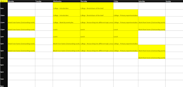
Time table
This shows my journey from when I started the project, week 1, to the when I reached the end, week 13.
Evaluation
I am very happy with the final product outcome, and it has progressed much more positively than I thought it might as the brief was so loose which made it originally quite daunting. Many new skills were developed such as:
- Organisational skills.
- Project management.
- Development of a completely new art style.
- Picked up a fast workflow.
- Development of a professional relationship with the sellers on Etsy, I feel confident in using the same people again to complete my product requests.
I have worked to the brief requirements and completed this project on my own with extremely little help. The main thing I would like to have improved within the final product was a box to display everything inside of, although I stated earlier that I didn't feel comfortable spending the money to buy this box as they were expensive.
After doing my primary and secondary research I was quite confident in the art style I wanted to work in, which was digitally drawing my artwork. However, I wasn't sure on the actual product I was going to make yet but I soon figured that out.
In my opinion the most enjoyable part of the project was creating the final artwork, I was really happy with the final result. The reason why I liked this part so much was because I was able to see the canvas get build up over time until I finally ended up with something I was happy with. I also enjoyed ordering the physical products to be made and then unboxing them when they arrived.
Whilst creating the artwork it has allowed me to understand the process if I was to make cover art like this again. I have never made a cover before where I have completed the full artwork purely by digitally painting everything. I am very happy with the result and I will make sure to try this again in the future.
If I had more time then I would focus on making numerous different artworks, one for each product. For example, I would have had a different cover art on the CD case than the vinyl sleeve cover. Something else I could have done if I had more time was create a better design for the bandana as I feel like it could have been improved. Finally I think that the badges could have been improved because these were made from copied elements of the bandana design. If I had more time it would have allowed me to create special designs for each of these.
I didn't really experience any issue whilst completing this project except from the very minor damage to the corner of the vinyl sleeve. This was solved extremely quickly and I made sure to thank the seller. I also left reviews on all of the shops I had purchased my products from to show my appreciation and to help build up the sellers reputations.
In total I have spent £73.01 on this project, the money built into this total was from the CD + CD Case, vinyl sleeve, bandana, badges, and vinyl from the charity shop. Although this total is quite a lot of money I don't mind as it is the final major project, I have learned lots of new skills and so I believe that it is a good investment.
Overall I think I have done well in this project. I am proud with what I have achieved and the final album cover artwork I produced. I have already noted any improvements I think I could have made but on the whole I think that the project has been a success and I have really enjoyed completing it.


.png)
.png)
.png)
.png)
.png)
.png)
.png)
















Comments
Post a Comment