Introduction/Brief Analysis

.jpeg)
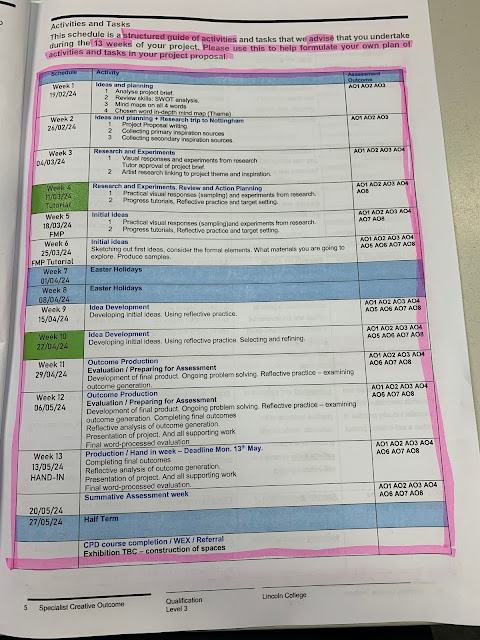
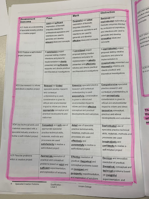
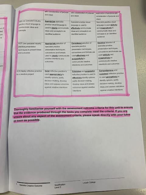
To date, I have completed each project using a blog as a way of documenting my work as it allows a lot of flexibility in terms of being able to work from any device, when and wherever I choose, and enables an ongoing record of the development of my final major project. My current task is to base a project upon one of four words that I have been given: 'chance', 'contrast', 'complex' or 'corrupt'. Currently, I do not have an immediate idea of what I would like to create in this project. I was thinking of potentially doing something music related again as my most successful projects have been when using this theme. However, thinking of something new and original, which I haven't previously produced as a final piece, is quite challenging.
The aim of this project is to create a product whilst working inside the brief requirements and producing a good final result. I need to make sure I spend time researching and thinking about which word I should choose, and then the type of product I should create based on that word.
During this project I must decide on one of four words:
- Chance
- Contrast
- Complex
- Corrupt
My current task allows me to have the opportunity of creating my own self-initiated project. For this project I have a lot of time to experiment and practice before I start my final designs; I have 14 weeks from when I was given the brief. To manage my time correctly I must create an in-depth plan of the project contents and keep to it.
I need to ensure that I research and develop a deep understanding of the target audience, as well as any restrictions to the brief, if applicable. After completing this I can then take up the task of responding to the brief.
During my final major project I would like to develop new skills, physically and digitally.
After reading the brief I am looking forward to developing this project to the best of my ability and working alongside a brief which gives such wide scope for freedom.
Timetable
I can use the 'Pomodoro' technique to help me stay on track and not lose focus whilst completing my work. The Pomodoro technique is a time management method where you work for 25 minutes and then take a 5 minute break. After four consecutive working intervals a longer break is allowed, often 15-30 minutes.
Week 1
Week 2
Week 10
Week 11
Week 12
Week 13
Week 14
SWOT Analysis
Strengths
I personally believe I excel in digital artwork, and that I can confidently showcase a specific style when creating pieces. I love incorporating music into the graphics I create, this is due to the final results usually turning out great, examples of these graphics could be, covers, disks, posters, etc.
I love creating a consistent collection of designs, just like my card project I completed last year. This is because I pick up a workflow after a while and I'm able to display my full potential when designing, having a big collection of designs at the end of a project always makes me feel proud of myself. Another strength I think I have developed recently is the layout and composition of my design work, I am becoming increasingly able to know the positioning of specific elements in my artwork.
Weaknesses
While I have a multitude of different strengths in the design field I can acknowledge areas where I can further improve. When it comes to artwork done by hand, such as drawing and painting, I realise that I struggle with reaching the level I want to achieve. Another weakness of mine is when being confronted with unfamiliar programs and websites such as "Shopify". I usually find myself watching tutorials and searching things up and, as time passes, I can pick up these programs and websites and start to use them out of my own will. I am committed to overcoming these weaknesses and would like to continue to build my skills.
Opportunities
I think what makes me stand out is because I make sure to spend lots of time outside of college hours perfecting the primary design. I try to apply as many new techniques I've learnt as I can during my work process.
Threats
Sometimes I forget to stay up to date with reflections and miss them out, which then results in me being behind schedule.
Occasionally, I find myself becoming inconsistent with the standard of my work, in both design and written work. This is usually because of realising I am running short on time to complete certain tasks. In attempt to meet these deadlines, I sometimes rush through these tasks to get them out of the way to allow me to get everything done.
Mind maps/Definitions
As a group, we made the decision to create a mind map for each word to gather more ideas from everyone involved. The surrounding words have some sort of meaning or connection towards the primary chosen word.
Chance
Definition - "chance" means something that may happen or occur without being planned or predicted. It's about the possibility of something happening by luck or coincidence, rather than through intention or design.
The word 'Chance' in different languages:
Japanese - チャンス
Chinese (Traditional) - 機會
Chinese (Simplified) - 机会
Korean - 가능성
Persian - شانس. فرصت
Arabic - فرصة
Synonyms:
Opportunity, Possibility, Prospect, Occasion, Likelihood, Potential, Probability, Option, Shot, Opening
- Occurrence
- Probability
- Luck
- Surprise
- Opportunity
- 50/50
- Potential
- Possibility
- Ratio
- Accidental
- Off-chance
Contrast
Definition - "contrast" means to show the differences between two or more things. It's about highlighting the ways in which things are different from each other.
The word 'Contrast' in different languages:
Japanese - 対比
Chinese (Traditional) - 對比
Chinese (Simplified) - 对比
Korean - 차이
Persian - تضاد
Arabic - مقابلة
Synonyms:
Difference, Distinction, Disparity, Divergence, Variation, Dissimilarity, Discrepancy, Antithesis, Contradiction, Disagreement
- Identity
- Emotion
- Day + Night
- Stereotype
- Opposites
- Ratio
- Belief
- Opinion
- Alternative
- Similarity
- Colour
- Experience
- Youth
- Age
- Light + Shade
- Change
- Child/Adult
- Personality
- Light
Complex
Definition - "complex" means something that is made up of many different parts or elements, and it's often difficult to understand or explain because of its intricacy or sophistication.
The word 'Complex' in different languages:
Japanese - 複雑な
Chinese (Traditional) - 複雜的
Chinese (Simplified) - 复杂的
Korean - 복잡한
Persian - مجتمع
Arabic - معقد
Synonyms:
Complicated, Intricate, Elaborate, Involved, Sophisticated, Detailed, Multifaceted, Nuanced, Dense, Confusing
- Mechanics
- Time
- Holidays - Buildings
- Labyrinth/Maze
- Network
- Design/Pattern
- Mental Health
- Layers
- Personality
- Structure
- Science
- Detail
- Difficulty
Corrupt
Definition - "corrupt" means dishonest or unethical behaviour, especially by those in positions of power, where they misuse their authority for personal gain or to benefit themselves unfairly.
The word 'Corrupt' in different languages:
Japanese - 破損した
Chinese (Traditional) - 腐敗
Chinese (Simplified) - 腐败
Korean - 복잡한
Persian - فاسد
Arabic - فاسد
Synonyms:
Dishonest, Unethical, Immoral, Deceitful, Fraudulent, Venal, Bribe-taking, Crooked, Rotten, Tainted
- Distortion
- War
- Advantage
- Dictator
- Society
- Soul
- Relationships
- The world
- Gender
- Mind
- Race
- Government
- Destroyed
- Injustice
- Industry
- Power
- Manipulate
- Hierarchy
- Exploit
- Greed
- Church
- Technology
- AI
- Media
- Bias
In-depth mind map of chosen word
The word I want to choose for this project is "Contrast", I think that the array of choices I have with this word is quite wide compared to the other options.
Here is the revised mind map for the primary word "contrast", with words:
- Opposite
- Differing
- Distinction
- Comparison
- Difference
- Binary
- Varied
- Discrepancy
- Divergence
- Duplicate
- Duality
- Conflict
- Antithesis
- Disparity
- Imbalance
- Inequality
- Altering
- Clash
- Duplex
- Counterpoint
- Variance
- Bipolar
- Double nature
- Dissimilarity
- Contradiction
- Tension
- Paradox
- Yin and Yang
- Double faced
Potential project ideas
Having chosen the word 'contrast', I want to investigate some different possibilities for the final products I could create. I'm not worrying about the word "contrast" for now due to the fact that this is more of a theme and doesn't alter the main project I am going to create. Possible ideas:
- Designing a full rebrand for a business
- Designing packaging for a food/beverage product
- Designing a concept social media feed for a brand
- Designing merchandise
- Designing posters
- Designing book covers
- Designing graphics surrounding an imaginary video game
I like the idea of creating graphics surrounding a video game, I will research further into this and see what I feel like I could create.
- Cover artwork (Xbox, PlayStation, Steam, Switch)
- Character concept artwork
- Weapon/Object concept artwork
- Vehicle concept artwork
- Environment concept artwork
- UI graphics (HUD, map, menus, etc.)
Primary inspiration sources
I wanted to obtain screenshots from two Rockstar published games, 'Red Dead Redemption: II' and 'Grand Theft Auto: V'. I thought this would be valuable research because I can really invest myself into how each element has been designed in areas you would usually not acknowledge.
Start up screen
Start up screen. (Grand Theft Auto: V)
This screen is very simple so if I create a concept screen like this for 'Grand Theft Auto: VI' I think I should also try and replicate this style.
Start up screen. (Grand Theft Auto: V)
This screen is actually a new menu added to the game recently. I love how it looks as it's well organised and easy to navigate, the images also corrugate well with the titles of the respective tiles which is necessary in a menu like this.
Start up screen. (Red Dead Redemption II :Online)
This is also an easily navigated menu screen with large tiles displaying exactly what you will be brought to if you select it. It also displays a bit of information on the left side of the screen to further help you with this.
Menus
'Online' menu. (Grand Theft Auto: V)
'Grand Theft Auto: V' carries a simplistic minimalist theme throughout the user interface of the game which works really well in my opinion. It keeps it looking professional and isn't targeting a specific age by being funky or vibrant.
'Online' menu. (Grand Theft Auto: V)
This is after I click on this section in the menu.
Ability loadout page. (Red Dead Redemption II :Online)
This is the menu which allows you to switch out your ability cards, I wanted to take a screenshot of this because I love the artwork displayed on the cards. It is very original and reminds me of older work from the 1800s, which is what Rockstar were going for.
Ability loadout page. (Red Dead Redemption II :Online)
Here is another screenshot of the ability cards, but after I have clicked on a card to switch out. I think it is so interesting how you can level up your cards and I want to see if I can incorporate anything like that into my designs.
Progress menu page. (Red Dead Redemption II :Story Mode)
This is something I'm really interested in doing if I go down the videogame rebrand route. I would love to design a menu displaying these four options and putting my own twist on it.
Pause menu. (Red Dead Redemption II :Story Mode)
The pause menu in 'Read Dead Redemption: II' is very unique as it is almost like a red brush stroke on the left side of the screen, this is very eye catching and could also represent blood. The font used on the text is very vintage and fits the aesthetic so well.
Pause menu. (Red Dead Redemption II :Online)
This is the same pause menu in the 'Online' mode instead of the 'Story' mode.
Benefits, Offers & Rewards menu page. (Red Dead Redemption II :Online)
This screen highlights the different rewards available, they use rich colours such as yellows, oranges, and reds to bring out the sense of luxury among the menu.
Heads-up display (HUD)
HUD display. (Grand Theft Auto: V)
I took this screenshot as I thought I may want to attempt to design my own custom heads-up display. I feel as if these would be very interesting and fun to create, the mini-map is something I would love to design.
HUD display. (Red Dead Redemption II :Story Mode)
This is a screenshot of 'Red Dead Redemption: II' 's extremely minimalist heads-up display. I could also do something like this but I feel like creating something like this would look low effort and almost like I couldn't be bothered.
HUD display. (Red Dead Redemption II :Online)
This is what it looks like when you expand the heads-up display, the game still maintains a very clean and simplistic layout. It is easy to understand and uncluttered.
Maps
Map. (Red Dead Redemption II :Online)
This is something I am very interested in. I would love to create a full scale concept map, a problem with this is that because it is such a time consuming process I don't know whether I would be able to complete this along with other designs before the deadline. I might give it a go and see how far I get before I need to move on, and then I can always come back at the end of the project to complete any outstanding work.
Loading screens
Loading screen. (Grand Theft Auto: VI)
One of my favourite things about the artwork used in the 'Grand Theft Auto' series game is that they always make sure to have eye-catching loading screens when you are opening up the game, transferring from mode to mode, etc. I could try and create my own loading screen but twist it up a bit with my own artwork style.
Loading screen. (Grand Theft Auto: V)
Here is another interesting loading screen where the three protagonists are displayed in a trio. One thing I like about this design is that the characters aren't contained inside of the background image, as if they're escaping the frame.
Loading screen. (Red Dead Redemption II :Story Mode)
I personally prefer the loading screens belonging to the 'Grand Theft Auto' series as they're more colourful and just appeal to me more. However, I completely understand why the 'Red Dead Redemption: II' loading screens are how they are, to provide a sense of vintage and reinforce that genuine old feeling.
Secondary inspiration sources
Icons
If I was going to look into graphics surrounding videogames, I thought that it would be absolutely necessary to look at icons for different in-game items.
Here is another image I found with what seemed to be higher resolution pixel artwork, I preferred this icon set to the one before as it displays more detail on each icon.
For this final set of pixelated icons I thought that it would be good to show a set which carries richer colours as well as keeping more detailed icons so that it was a nice combination between the two. If I want to also try out pixel art icons then I need to make sure to pay attention to these reference images as it is important to know how they were created, for example the outline around the icons.
Here is a set of icons I found which held a more cartoony, playful style to them. However, these look as if they would be used in a mobile game rather than a game to be played on a console or PC.
These icons follow the same mobile game style as the last image I uploaded, although this set seems to emit a more 'alive' look. They carry a lot more detail than the previous researched image which definitely makes them look more professional and just overall more appealing to look at.
Cover artwork
This cover caught my eye above the rest after searching "video game cover artwork" into Google. The reason for this are the bright colours and the addictive artwork style which makes it very clean and professional looking. It also half appears like 'Mario' is riding on 'Yoshi' out of the cover, which is very clever.
This is another cover with its own exclusive style. All of the cover artworks for the 'Grand Theft Auto' videogame series have different styles whilst maintaining a similar layout.
Here are some of the other 'Grand Theft Auto' cover artworks so that you can see how they all share the same base theme and layout but alternate through a different art style each time. This independent art style resembles the different time periods and eras which the games are set in. This immediately brought to mind the chosen word 'contrast' for me, having a similar layout and theme but having contrasting art styles which I find inspiring.
https://www.reddit.com/r/GTA/comments/yiua8z/why_does_all_gta_cover_arts_have_a_helicopter_on/?rdt=53137
I researched into different artwork from the 80s as I was attempting to find the artist behind the 'Grand Theft Auto: Vice City' cover artwork style. I found Patrick Nagel, this is a perfect example of how the 'Grand Theft Auto' series encapsulates a specific art style within the unique game covers. The important thing with 'Grand Theft Auto's' publisher 'Rockstar' is that they will never completely 'rip off' an art style and love to put a twist on it.
This cover artwork for DOOM (1993) personally holds a high ranking in terms of videogame cover artwork for me. Its immersive design immediately transfers you into the chaotic world of mayhem. With its distinct and easily recognisable style, it has collected a dedicated fanbase who can spot it at first glance.
I have never actually heard of this game before but as soon as I saw this artwork I loved how it looked due to the colours and nature of the design. I love how the dismembered figure is located at the bottom of the canvas but it's something you don't instantly notice. The style of the cover looks to me to appear more like a book cover type of artwork, rather than a videogame.
This cover is extremely dramatic and brings a sense of thrill and combat straight to the viewer. The composition is very dynamic and brings the attention straight towards the protagonist in the centre of the canvas, whilst still conveying a mysterious aura. The colour palette used is quite washed out and almost feels gritty, this is perfect for this specific video game as that is a key theme they attempt to push into the game itself.
https://www.amazon.co.uk/Rockstar-Games-Redemption-Standard-PlayStation/dp/B01M6Y1Y4A
This is one of my favourite cover artworks for a videogame, this is due to the very atmospheric and immersive style to the design. It is such a unique and easily distinguishable cover design which results in an ever growing group of people who can instantly recognise it after taking a quick glance. The style of the artwork really depicts the scruffiness and weathered feeling of the game, the colour palette used really reflects on the Wild West setting as well, reinforcing the warmth of the deserts. The Van der Linde gang riding on their horses in front of the backdrop provides a very nice contrast and visual emphasis. On the back of the cover there is a brief piece of information on the story and then several images showcasing in-game screenshots to accompany this information.
https://www.ebay.co.uk/itm/303411619788
This concept "Titanfall" cover shows off its gritty and dynamic nature as a game, portraying the futuristic and intense battles it contains. The chosen colour palette reflects on this futuristic setting and contrasts light hues with dark tones. In the foreground of the front cover the Pilot is positioned to be sat on top of the Titan overlooking the city, which potentially reinforces it waiting to be explored. The back of the cover is simply laid out and easy for the viewer to read and inspect.
https://haileydewitt.wordpress.com/2016/04/22/movievideo-game-cover-design-4-22-16/
The "Call of Duty: Infinite Warfare" cover displays a futuristic space orientated design. The use of the composition of the soldier draws the viewers eyes straight onto the central positioning of the text, this may also relate to how the soldier is the game's protagonist. The colour palette of this cover is carefully chosen to release the feeling of darkness and emptiness of space. The back of the cover is easy to understand and uses a nice simple layout to communicate the different modes inside of the game. Overall the cover really encapsulates the theme of the video game, almost giving a small demo to the potential buyers before they purchase.
https://www.ebay.co.uk/itm/143868945700
This cover takes a more playful approach, keeping the colours vibrant and stylised. Just by viewing the cover you can tell that the game will be set in a cultural place, which in this case is Wumba Islands. The back of this cover is quite simple but this works very well as it is important to not overcomplicate this graphic so it stays easy for the potential buyers and viewers to read.
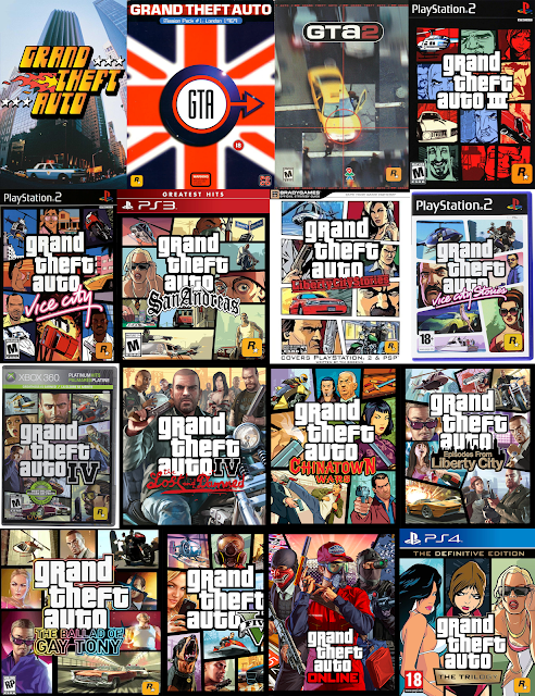
I wanted to put all of the different main "Grand Theft Auto" box covers into a collage. There are some missing, however it is due to the fact that they are just alternative covers for the same game. For example below are all covers for "Grand Theft Auto: III". The main reason I wanted to create a large collage of the majority of covers was because I wanted to see how they evolved over time and to showcase the contrasting styles. I think that it is very evident that they have improved massively from the first three covers, it is also clear that since "Grand Theft Auto: III" they have picked up a layout and general style that they have continued to refine all the way up to "Grand Theft Auto: V". As "Grand Theft Auto: VI" is going to be released in the near future (2025) I expect that the box cover artwork will also use the same layout as these existing covers. The colours of each of these covers generally keeps a vibrant palette and brings attention to the videogame title in the centre of the design by keeping the logo white. When considering the similarities and differences (contrast) between the various covers, I started to think about how the 'Grand Theft Auto: VI' cover artwork might vary from the designs that have previously been released.
All of these covers were found on Google.
Project proposal
I filled out my project proposal and uploaded it to my Microsoft Team's classroom files section.
Artist Research
Roxie Vizcarra
Roxie Vizcarra is an illustrator based in Brooklyn. Roxie spent almost a decade working as Senior Illustrator for Rockstar Games, contributing to titles such as Red Dead Redemption II and Grand Theft Auto V. She also does freelance design work for clients like Google and Nickelodeon, which really showcases her versatility. Roxie now takes the position of being the co-founder and Creative Director at Anthrox Studio, where she creates artwork for major entertainment projects, such as Apex Legends.
All images provided below are obtained from Roxie's website at:
This is how I found out about Roxie, through searching for the artist behind the extremely iconic 'Red Dead Redemption II' artwork style. However, as I explored her portfolios and past work I found out that she has worked on many other projects which I am personally interested in.
Here is artwork from the first 'Red Dead Redemption' game, released in 2010. When comparing her level of work on this piece to her "Red Dead Redemption II" artwork it is clear that she has advanced and developed a more refined style specific to her. The zombie character design above seems as if it is lacking things such as dark shading on the skin areas, this is because of the full black shades she has used on the clothing.
When taking a closer look I think that the problem is actually the shadows on the clothing rather than the lack of shadows on the skin areas. I enjoy looking at the areas which don't have the completely black shadowing on as you get to see more detail and texture, especially on his head.
I think that the amount of detail and shading on the head of the zombie shows how capable and professional Roxie is as an artist. The thing which shocks me is how when you zoom in her workflow is just a lot of scribbling and going over the brush strokes she has previously laid down, but then after this has been done enough times the illustration really comes together and creates something you would have never thought was possible.
The perspective and composition of this design is very interesting as the camera is positioned so that the viewer is almost looking slightly up at the scene. The bottom of the canvas is also very unique as it displays a deceased male who seems to have been shot by the main protagonist holding a shotgun, he is half submerged in water which results in further attention to detail such as the texture underneath the surface where the light is shining through the liquid onto his skin. The colours on this piece are all very grimy and simulate how the scene is set near an area next to the ocean, possibly a port. Roxie has almost made sure to remember small details like the raindrops bouncing off the characters bodies, and water being splashed up against certain scene elements.
Prior to researching Roxie Vizcarra, I was oblivious to the fact that she was the artist behind all of the loading screen artwork in "GTA V". After discovering this I was so thrilled that I could look into her portfolios and other work, considering my interest and admiration for this specific artist.
A common trend in the various different "GTA V" loading screens is the use of vibrant colours, eye catching imagery, and dynamic scenes. When researching further into the different loading screens I have found out that they all depict scenes from inside of the game, often attempting to showcase the game in its best light by previewing beautiful landscapes, action packed scenes, and thrilling moments. The actual illustration style that Roxie uses for these pieces consists of a detailed, realistic composition which she then puts a twist on with the final rendering of the illustrations, creating the distinctive and cartoony style that everyone is familiar with and enjoys.
All images found on Roxie Vizcarra website:
Andy Lang
Andy Lang is a 3D UI Artist working at Sony Santa Monica Studio in Los Angeles. Andy has experience in both 3D UI and environmental design for games, he graduated from Ringling College of Art and Design. I couldn't find any other information on Andy however I really wanted to include him in my artist research as he took the responsibility of creating both 2D and 3D UI in-game art assets for "God of War", as well as working on the 3D UI design on "God of War: Ragnarok".
I was looking into various different videogames UI, and the one which caught my attention the most was "God of War". The UI looked as if it fit the theme and style of the game exceptionally well, it also reminded me slightly of various "Assassin's Creed" games user interfaces. From just looking at the screenshot above the UI looks very professionally composed and organised, there are no sections where it looks too cluttered or empty. Each button has a golden aura around it when you hover over it with your cursor, this is to help the user navigate easily.
Andy continues to carry through the theme onto different pages, such as the skill tree section of the menu. The skill tree is very easily understood and no user should encounter any problems with navigating and comprehending how it works. The typeface choice is the perfect mix between a 'Viking'-style and a modern-looking font.
He has used special symbols behind the skill point to represent its specialty/rarity, I personally believe that details like this are so clever and distinguishes a well made, unrushed game from a rushed, unrefined game.
This is Andy's skill tree design for "God of War: Ragnarok", in my opinion this is better than the skill tree in the original game. I absolutely love how it appears to be retracted or carved into the stone and then carries a blue aura or mist after purchasing a skill point.
If I am thinking about working on some UI design then I will need to spend time analysing various existing HUD designs to familiarise myself with what I should be including in my own.
In the bottom left corner you can see the special move selection, health bar, and stamina bar. Andy has found a unique way of presenting these, I am hoping to also come up with an iconic idea for mine.
All images found on Andy Lang's ArtStation page:
Simon Stålenhag
Simon Stålenhag was born in 1984, he's a globally recognised author and artist known for different works such as The Electric State, Tales from the Loop, and Things from the Flood. His artwork and stories captivate a grungy, sci-fi aura within Scandinavian and American landscapes.
This illustration really reminds me of a location in Chernobyl, due to the clearly abandoned, wrecked machinery scattered around the canvas. I think another thing which makes me think this is because the man seems to be wearing a mask which could imply that they are in a partially radioactive area. The eeriness and silence displayed in the scene depicts the sense of desolation, as if time has frozen in this landscape. The chosen colour palette in this illustration reinforces this theme and further enhances the mysterious and hazardous atmosphere of the design.
This image is actually set in the same scene as the previous image, I only realised this after pasting it into my blog. You can see the same two people in the top right of the canvas. However, in this illustration they have changed location, it looks as if they are passing a shelter of some sort, possibly their own. The display of water in the foreground of this scene creates the impression of a boggy and unwelcoming environment, which further immerses the viewer in the bleakness and almost depression of the scene.
The reason I chose this piece to write about is because of the feeling I get from looking at it. I almost feel on edge and sketched out over the abandoned buildings and large tree trunks. The figures in this illustration are investigating something, maybe a mutation of some kind. There is a dusty mist encapsulating the scene which further digs into the mood, as well as the moon/sun looking as dull as it does.
All images found on Simon Stålenhag website:
John Sweeney
John Sweeney is a very talented artist known for his work in the video game industry. He has worked for famous game studios such as Naughty Dog and Valve Corporation. His style usually includes detailed environments, interesting characters, and stories within the scenes. He is a well respected and loved figure by a wide variety people in different gaming communities.
This is my favourite image John has listed on his portfolio. I think that this might be due to the depth and detail to the scene, but it also feels surprisingly plain and simple. It's difficult to explain but there is something captivating about it. It could be because of the open grassy area contrasting against a detailed background with intricate decaying buildings. John has used mist/fog to further demonstrate the idea of depth.
The environment shown in this render aims to present a feeling of overgrowth and abandonment, showing that it has remained untouched by civilisation for years. The way the sunlight illuminates the fallen tree trunk in the foreground is visually beautiful, and casts a sort of glow. The attention to lighting is also displayed in the background of the image, once again showcasing the exceptional detail and effort put into the game's lighting design. The game uses very high resolution textures throughout, a clear example of this is shown on the 'Parking' sign in the centre of the image. The intricate detail is evident as you can see the moss and peeling paint decorating this sign.
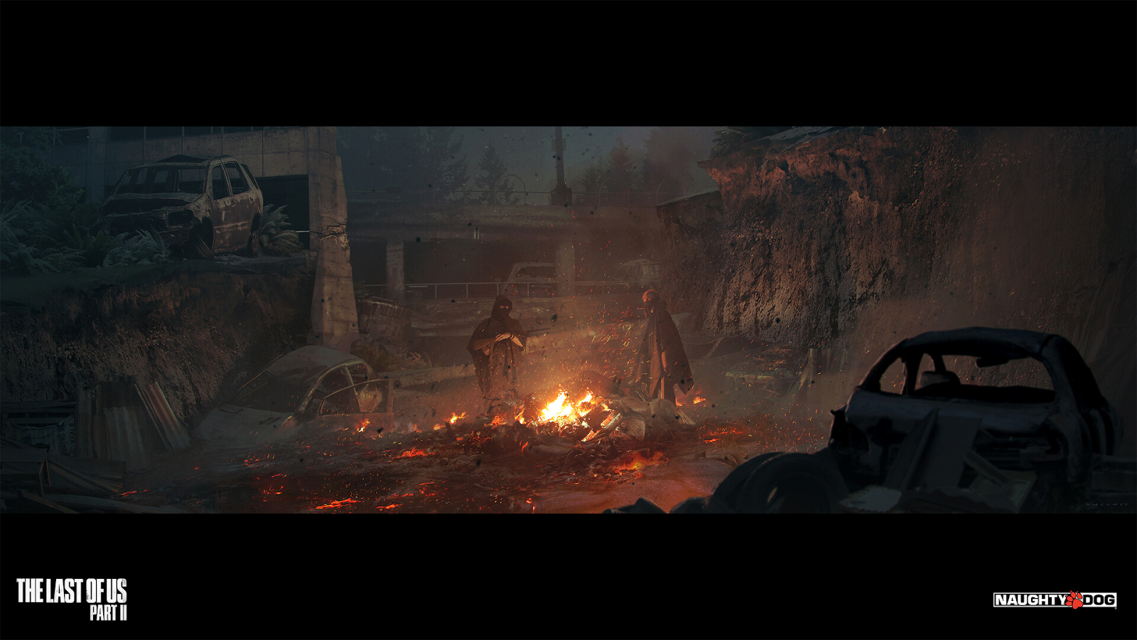
I wanted to speak about this image as it is different from the other two I have spoken about, in terms of atmosphere. It still carries the same theme and art style as the other images however this one uses a darker and more carefully selected colour palette. The camera is positioned at an interesting angle, peeking over the wrecked car and debris, giving the figures burning the corpses the spotlight. The orange glows from the fire echo around the vicinity and cast orange tints on objects and walls.
All images found on John Sweeney's ArtStation page:
Visual responses and experiments from research
Investigating existing assets
I wanted to start investigating existing assets which may be useful when creating graphics revolving around the upcoming videogame.
These were the only files I was able to gather as very little, except a trailer, has been officially released to the public yet. These are findings from myself and other people on platforms such as 'Twitter/X' and 'Reddit'.
Colour exploration
Here I explored the colours within the only officially released artwork for "Grand Theft Auto: VI" as of today's date.
The colours I used are contrasting of one another and are both located on opposite sides of the colour wheel.
The first image is the sky in the background of the released artwork, I picked certain colours from this image and typed out the HEX codes after displaying them; I also made a gradient from these colours to the right.
Below this section I identified the different colours used within the artwork as a whole, I then used these colours to create the splattered paint experiment below to see how well they mix together. The other paint splatter experiment was created using the colours of just the sky, from earlier.
Images from:
These are screenshots of closer up views.
I had a further look into colours surrounding 'Grand Theft Auto: VI', this time I wanted to explore the official logo. I really like the vibrant yet contrasting colours they used for this and think it really reinforces a 'beach' vibe, similar to the contrast of colours between sea, sand, and the sky.
Asset recreation
I felt as if now would be a good time to practice making a necessary asset to be used in the final pieces, as I have already been experimenting with the colours of the existing sky image.
These are the layers of the sky I created from scratch.
This was the final result of attempting to create my own 'GTA VI' themed colour palette sky, I'm happy with how it came out and it reinforces my confidence for progressing through this project. It also reflects the focus word 'contrast' reminding me of some of the target words from the original mind-map: opposite, differing, distinction, varied, and clash.
Here is the sky image I obtained from Rockstar's official website, and the image I was using as a reference.
Logo experimentation
I found this free-to-use image on 'Freepik' to demonstrate what my design would look like with a city skyline placed in the foreground.
It isn't perfect but it's a quick preview of how something like this would look.
Here is an array of different ideas I had for the presentation of the Rockstar logo.
Controller button icons
I began by adding the letter 'Y' inside of a black solid circle.
I added a yellow stroke around the inside of the circle I just created.
I added another black stroke around the outside of the circle.
I did this another three times so that I had all the necessary icons I needed. I resized the icons down to a suitable size to be used on a 1920 x 1080 pixel canvas.
Next I created the 'LB' and 'RB' icons.
I created the 'Left stick' and 'Right stick' icons.
I created the 'D-Pad' control icons.
Recreating the 'Grand Theft Auto' logo
I started by finding the typeface used in the 'GTA' logo, this was 'Pricedown' and the license is 100% free to use.
I typed out the words 'grand theft auto' and positioned them in their correct places as well as possible, this already resembled the official logo quite well.
I fixed parts of the font so that it replicated how the actual logo looks.
I changed the fill colour to white and added a stroke around the edges, this helped to build on the actual look of the official logo a great deal.
I joined the letter 'r' up so that it now sits just above the 't'.
This was the final result of recreating the 'Grand Theft Auto' logo myself, tracing the existing logo as close as I possibly could. I like the contrast between the use of white and black with the text, reminding me of the words opposite, distinction, antithesis, and yin and yang from the mind-map.
These were the layers used to complete this activity.
GTA VI logo experimentation
Logo 1
I brought an unofficial 'Grand Theft Auto' logo into Adobe Illustrator and started experimenting with different typefaces for the 'VI'. This is one I wanted to use and bring into Adobe Photoshop, so I added the same sized stroke as the 'Grand Theft Auto' logo. I changed it to a pink solid fill, this will hopefully allow me to modify it easily in Adobe Photoshop.
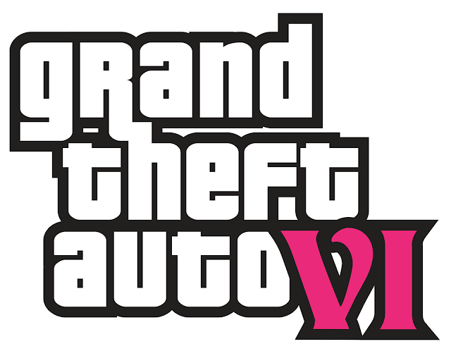
I cleaned up two parts of the logo after bringing it into Adobe Photoshop, small details like this are vital for making a polished final logo.
I added a gradient onto the 'VI', this is supposed to resemble a sunset, emphasising the beach and just Florida as a whole; where the video game is set.
I added in some palm trees to further enhance this beach aesthetic.
I added an ocean to see how it would look, and while I think it looks alright, I'm not convinced it looks better with it. I also added a stroke around the edge of the logo.
I fixed the stroke and removed the ocean, I think it looks better when reverted back to how it was before.
This is the final logo. The numbers 'VI' in their vibrant beach colours provide a perfect contrast to the black and white simplicity of the lettering.Logo 2
I did the same as before, I designed the logo in Illustrator to then take it over into Photoshop to modify further.
I played around with layer styles and came up with this clean design.
I didn't want to lose the original circles on the 'VI' so I put these back in place and added a glow to them to make them appear as if they are lights.
I added a layer style preset onto each of these layers to give them a more circular, 3D look.
I experimented with a 'Hue and Saturation' adjustment layer for a while and then decided to split them up, one with to a pinkish-red colour and the other in a cyan colour.
This is the final logo after tweaking the colours slightly.
Logo 3
This is the version created in Illustrator, ready to be opened in Photoshop.
After trying many different solid and gradients colour overlays, I applied this one to the 'VI' logo. This again, supplies that feeling of being at a beach whilst the sun is setting and offers great contrast to the black and white text.
I added a thick light stroke onto the inside of the logo.
I like the colours on this logo, however I have realised it looks as if it says 'V1' instead of 'VI' which I dislike. I didn't want to overcomplicate it but maybe I should have added some silhouettes or something of similar kind.
Logo 4
This is the logo I created in Illustrator, I went for a more vintage look.
I overlaid my custom sky image I created earlier on in this project. I made sure it covered the borders of the main logo and the 'VI' logo as well.
This is the final logo after adding a banner onto the 'VI' logo.Book binding presentation
As I am still looking for ways to present my final pieces I wanted to investigate making a booklet. Potentially, this could be a good way to showcase my work.
I started by stacking 5 pieces of A4 paper on top of an A4 piece of card, I then made a fold down the middle.
Here is what it looks like when looking at the outside of the book.
I punched three holes through the paper and card, one in the middle and the other two 2.5 centimetres from the edge.
I threaded the string through the holes I previously punched.
This is what the other side of the booklet looks like.
Here is a closer look at the knot tying the book together.
Sketches
As I move onto new ideas I will sketch out the base concept and keep adding them into this section.
Start up screen 1
Start up screen 2
Map
Heads-Up Display
Radio Selection Wheel
Gun Selection Wheel
Menu - Map Screen
Menu - Progress Screen
Box Art
In-game Website
Start up screen 1
I began this 'start up screen' by placing the official 'Grand Theft Auto: VI' logo in the centre of the canvas.
I then placed two palm trees in the background of the canvas, I also changed the colour of the background.
I darkened the palm trees so that they appeared more like silhouettes, offering more contrast between logo and background.
I then added a gradient onto the background to reinforce the branding of the game.
I added the text and button icons I created earlier on in the project.
Finally I added a glow to the text and logo.
I wasn't completely happy with the 'final' result so I continued to tweak the design until I liked it more, I think that this version looks more visually appealing and not as bland.
Animation Experimentation
I want to see if I can animate anything within this start up screen, I am going to attempt to make the 'Press A To Start' button fade in and out like an actual video game would have.
I arranged each of these layers so that they are all equally spaced out.
I added a fading in and out transition to all of these layers.
Here is the full timeline for this concept experiment.
CLIP OF FINAL CONCEPT:
Start up screen 2
I now want to attempt to create another screen for after passing the screen I just designed.
I started off this design by using a part of the officially released image. This can later be altered so that I can illustrate my own design and place it here. The official image ties in perfectly with my chosen theme of 'contrast' by showing the opposite sex, yin and yang, a comparison, distinction, duality, possible inequality, and contradiction to name a few of the appropriate words from the mind-map.
Earlier on I created a concept sky image based off the one used in the officially released image, I thought now would be the perfect time to give it some use.
I started to customise the canvas to fit the idea I had in mind. I begun this by darkening my sky background and added a purple gradient to the bottom of the canvas, to cover up the cut off in the protagonist image.
I added in another gradient on the right hand side of the canvas to allow me to place tiles here and keep a good contrast to the background.
To create the tiles I firstly laid them out as 6 separate squares, 8 pixels distance from each other. Then I added images to each one depending on the names of each panel. After this I added layer styles such as the white stroke and gradient at the bottom of each square. I then slanted these boxes so that it fit next to the protagonist image better.
I made some more modifications by darkening the other boxes and only keeping the 'selected' tile full opacity, I also added a glow onto the 'selected' tile. The final thing I did at this stage was add a slider bar at the top so that the user knows where they are when scrolling through the different game modes and playlists.
I added the official 'Grand Theft Auto: VI' logo into the top left corner.
I then added an option to switch from 'Story' to 'Online' in the top right corner.
Another detail that I thought necessary was to display a small amount of information about the selected tile to the user, so placed this text above. This also helped to fill in more space in this area as it is definitely too empty as of right now.
I added some button controls in the bottom right of the screen, using the icons I previously designed.
This is what the design looks like at the moment. I like it however I think the area above the tiles is still too empty, I will try to develop the design more so that I can extend the tiles further upwards and see how that looks.
I much prefer how this appears, this uses all of the space and overall looks more visually appealing to users. I also added the profile username down in the left corner.
Map
I want to create a concept map for the game, as we know it is based in Florida and have proof of this from the 2022 leaks and official trailer. When researching more about the 'Grand Theft Auto: VI' map I found that members of the community had been working together to create different ideas and concepts on how they think that the official map will end up looking like. I did more research into other things such as using Google Maps.
This is the bottom of the state of Florida in the United States. The reason I have left the top of the state out of the screenshot is because we have no evidence as of yet that the map will include that part of Florida. The map will also be compressed from actual Florida into a much more conveniently created and compositional map for a videogame, so that you don't have to spend hours travelling; obviously.
Here are some currently available concept maps for 'Grand Theft Auto: VI'.
I started off by drawing this bottom section of the map.
I continued to build up the map.
I switched to my mouse to do smoother parts of the map, for example the aircraft carrier and rigs located in the water.
I kept adding to the map to expand it and bring it further towards the actual shape of Florida.
This was the final landscape of my concept 'Grand Theft Auto: VI' map.
Now I wanted to start with adding the roads to the map.
It's starting to come along as I continue to add more roads.
This is the final roadmap of the island. I now want to add buildings as a contrasting feature to the roads.
Laid out the different sizes of buildings I think that I will need, I can always go back and add more later if I need to.
Created a selection and then converted into a work path.
Finalised creating the brush preset. I repeated this 3 more times for the other buildings.
I arranged them into a group so that it was easier for me to find them when reopening my work.
I made the mistake of starting the buildings on the same layer so I had to delete these and use a different layer instead.
I am now starting to add buildings into the places of civilisation.
This is how the map is coming along, I think I still have to place about 70% of the buildings.
All of the buildings have now been placed after spending many hours on the process.
I started off the water by filling in the background with a solid fill.
I then started planning out the rough colours of how they will look surrounding the island.
I then started painting on the water around the land, I did this by using my XP PEN drawing tablet and layering down brush strokes on top of each other, using a low opacity and flow brush.
I then extended this process further to give the water more texture and life.
I felt like the water still needed something else as it looked too flat, so I painted another greenish colour around the close vicinity of the island.
The final thing to do with the water was to add a murky area where I wanted the swamp biome to be located at.
I already love how the black island looks against the water but I want to experiment slightly with the colour of the land before I call it a day.
I painted some rough areas where I wanted grassy areas to appear.
I then acted on these areas and gave them even more surface area.
I continued painting green areas.
I gave the swamp area a bit of shading as it was looking too flat and didn't contract with the water very well.
I wanted to make sure the roads were clear and well contrasted so I went around them with a dark orange brush giving the effect that the roads have been driven on and worn away.
I gave the sandy areas more depth and shading.
I coloured these areas grey as they contain a lot of pavement and grey materials.
I added different shades onto the grey areas as I felt like they appeared too flat.
I dulled the swampland further to add to the fact that it is dark and murky in those areas.
I added a snowy biome at the top of the map and made the swamp area darker and I lowered the saturation. Therefore, I have now finished with the colouring and texturing of the map, I could spend longer on this to make it perfectly shaded but I have already put 30 hours+ into this piece alone.
This is my finalised 'Grand Theft Auto: VI' concept map after some post production editing on Photoshop's Camera Raw Filter and applying a watermark in the bottom right corner. I am extremely happy with the contrast between the different areas of the map, reminding me of the words distinction, varied, altering, and variance from the mind-map.
Heads-Up Display
This is the placeholder image I am going to use for this HUD concept.
I typed out the objective text at the bottom centre of the screen and applied a subtle layer style.
I altered the colours of the important words, contrasting them from the standard text to allow for a further attraction to the player's eyes.
I made the coloured text bolder and added glows to them. This is the final objective text I settled on, I think it looks pretty good and fits the aesthetic.
I added six wanted stars to the top right corner, the reason I have added six instead of the usual five is so that resembles the sixth installment in the "Grand Theft Auto" series.
I picked the current amount of wanted stars I required, which was four, I then altered the layer styles of these.
Finally, I added the player's money and ammo counts underneath the wanted stars.
It's coming together, I love how it looks right now because of the simplicity and realism. However I still need to add other elements to develop it further.
A little detail I thought about which will be very important in the final game is the loading icon in the bottom right corner. This is very important for players so that they know when their request is loading or if their game is saving. I started by adding an ellipse, setting the Fill to 0% and adding a white stroke.
I then erased part of the ellipse with a soft brush, then with a hard brush, and then I fixed one of the sides so that it gave it the visual effect of spinning around in circles.
I added glows to it and finalised it, I like how it looks as it fits the theme I was intending.
I added the in game location in the top left corner, I repeated the layer style I was using earlier by copying and pasting it across.
This is my desired shape of the mini-map.
I marked out where I want the health, armour, and stamina bars to be. I turned the original shape into a stroke.
Now that the shape is mapped out I think I'm ready to start filling in the actual map and matching the surrounding area of the screenshot.
I painted the road and landscape within the vicinity of the player.
I moved onto creating the elements to be put onto the mini-map such as this arrow. I will try my best to make this fit the same style as the rest of the HUD so that it fits in well and doesn't look out of place.
I'm so happy with how the final mini-map turned out.
This is the finalised HUD for my concept "Grand Theft Auto: VI" branding. There is one more thing I want to do before I finish this image and it is altering the placeholder image behind, to show more vibrancy and shine which will enhance the visual appeal of my HUD I created. I will use the Camera Raw Filter inside of Photoshop to achieve this, as well as adding any necessary glows in Photoshop itself.
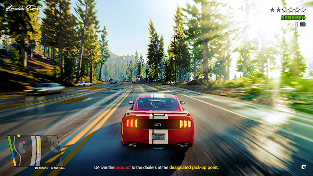
This is my final HUD concept for "Grand Theft Auto: VI". I tried to stick to the original style and look of the previous HUD for "Grand Theft Auto: V" as it's iconic and does what it's supposed to do very well, whilst also holding a simplistic look to not over complicate anything. I think I also did a good job with keeping my concept quite straight forward and very user friendly.
Radio Selection Wheel menu
I took this screenshot on "Grand Theft Auto: V", this is going to be the placeholder image behind the Radio Selection menu.
After some modifications to the screenshot (Camera Raw Filter and Photoshop) my image is now able to be used as the placeholder for the Radio Selection menu.
I used the polygon shape tool to draw an octagon, I want to showcase eight different radio stations.
I then used the star tool to create this shape which helped divide each section up, I added a subtle glow to this.
These are the logos I designed for each radio station. I used AI to help generate the names for the different stations as I thought it would be the perfect opportunity to incorporate it into my workflow. I then took these names and created a unique icon for each one. This was quite a lengthy process but it was definitely worth it as I would have had to use existing logos instead, which would have been someone else's work. I settled on a black and white colour palette to display these logos to tie in with my 'contrast' theme. The fonts and styles of each radio station are contrasting from one another to show the different types and styles of music played by each.
This is going to be the currently selected radio station, which is why I have written "Press 'X' to share" underneath. The other slots will only have the icon and nothing else. The active playing song is displayed under the wheel.
I modified the wheel further by lowering the opacity on the black base and highlighting the selected station further. I also placed the "no station" icon in its ellipse to the top right.
I positioned all of my logos into their correct spots and then applied their layer style, along with decreasing the opacity to 60%.
I added the HUD elements from the previous design. I changed the mini-map location to fit the in-game screenshot.
I made the wheel slightly smaller, I think that this concept is about finished now.
After many revisions this is the final Radio Selection screen. I'm very happy with the final design and I am glad to have spent the time on creating the eight separate contrasting radio station logos rather than using existing ones to save time.
Gun Selection Wheel menu
I took this screenshot on "Grand Theft Auto: V", this is going to be the placeholder image behind the Gun Selection Wheel menu.
After some modifications to the screenshot (Camera Raw Filter and Photoshop) my image is now able to be used as the placeholder for the Gun Selection Wheel menu.
I moved the wheel across from the previous Radio Station wheel I created. However with this I added a circle in the middle which will later be used to contain stats on the specific weapon you have equipped.
Like the Radio Station Wheel, I started on the bottom centre slot and used this as the selected slot.
I then filled in all of the other contrasting weapons, displaying different attachments on each one. I also had the ammo count and a small circle containing a number to show how many active attachments are equipped to the specific weapon.
I then added the stats inside of the ellipse in the centre of the wheel like I talked about earlier.
The wheel is now finished and I just need to add the missing HUD elements.
I then copied the HUD elements across and changed them up to add uniqueness, I didn't alter the mini-map as I felt it was unnecessary to keep doing this and is a bit of a waste of time. If I have time at the end of the project I may go back and change it.
I typed the controls text out on top of a rectangle in the top left corner, I lowered the opacity of this rectangle to 60% and applied layer styles to the text.
I added in the icons I created earlier on in the project into the desired locations.
This is the final Gun Selection Wheel menu. I think that this may be my favourite concept I've done so far as it looks quite refined and as if it could actually be in the game.
Menu - Map Screen
I took a screenshot from the official trailer for this design.
I edited it in the Camera Raw Filter inside of Photoshop.
Then I blurred it as it is going to be the background of the menu and shouldn't take away from that.
I drew a rectangle and lowered the opacity to 60%, this will be used for the bar to switch to different screens in the menu.
I've now written all of the correct text and made sure they are all evenly spaced out, I also placed arrows on either side of the bar.
I created the selector and made sure to highlight the 'Map' section.
I drew another rectangle and placed this in the bottom left corner of the canvas.
Then I added the text and controls icons I had previously created earlier on in the project.
This is what the design looks like so far.
I made a 0% fill rectangle in the centre of the canvas, this is where the map will be displayed. I added a white glow to the stroke.
I added a section of the map I created into the area, I gave the background inside of the rectangle a pinkish tint.
After some more adjustments with colours of the background and altering how the map looks with all of the icons I think I have completed this design.
Finally, I added a smaller 'zoom' slider in the bottom right corner.
Menu - Progress Screen
I started this concept by using the same template that I previously created for the 'map menu screen'. I moved the purple selector over the 'Progress' text.
I then arranged four different rectangles and slanted them to a 15-degree angle, I extended the ones on the far right and left to maximise the fill of the canvas. I then typed out the names of each section.
I used the protagonists from the officially released artwork to sit in the first box.
I wanted to use the official artwork for each of the different sections, however I was lacking in the content I could use. I added the car but I am unsure about what I can do for the other images as I have no subjects that I can use as it is yet to be released.
Using AI to help with the placeholder images
As I was running out of ideas and time I finally came up with a solution. I thought that now would be a perfect time to use AI to help me generate images, especially as they are just placeholders anyway and would have a professional artist specifically hired to create that type of artwork.
The best AI image generator in my opinion is Midjourney, which operates on a Discord server. I paid a monthly subscription of $10 and got to work with testing out different prompts.
After continuously playing around with the results I could achieve, I finally had a good prompt for generating a similar artwork style to the one used in the official 'Grand Theft Auto' loading screens, very similar to Roxie Vizcarra's artwork style. I was happy to use this in the 'Challenges' section.
I continued using Midjourney's AI to attempt to generate a potential image for the final section. I really liked how the image above came out but it doesn't fit the exact same style as the image I generated for the other section. Therefore I want to keep going until I find the right image to represent the 'Total Completion' section.
Nevertheless, I still tried out these images in their respective places. I didn't like how the 'Compendium' and 'Total Completion' sections looked like.
After a few hours of experimenting with AI, I finally found the two other images I was happy with, and they both fit well with the names of their unique sections. I added a subtle purple gradient onto the box but I'm not sure if I will keep it like this as I want to transfer the text to the top of the sections.
I altered the typeface and layer style of the text. I also lowered the opacity of the gradient and made it more pinkish. I am happy with the final selection of images and feel that they offer excellent contrast to separate out the distinct parts of the game, reminding me of the words distinction, varied, differing, conflict, altering, dissimilarity and tension from the mind-map.
Box Art
Front cover
I started the artwork off by obtaining the correct proportions of the front, back, and spine of the box.
I wanted to create the front cover of the box first as this will be the design I base the rest of the designs on.
I spent 3 hours using Midjourney again, trying to generate the best placeholder images I could whilst still fitting the 'Grand Theft Auto' art style and having relevance to the game. I organised these among the lines I had drawn earlier, the black lines allowing good contrast between the different images.
I then allowed the images to peek out of their tiles at certain places by using layer masks. This increased the idea of contrast even further by placing the different, contrasting images almost in touch with one another, making me think of the words conflict, disparity, clash, counterpoint, contradiction and paradox from the mind-map.
I wasn't happy with the helicopter image in the top right corner so I generated a new image and thought this fit a lot better.
This is the final cover but it still needs to undergo post-processing editing. I added the 'ESRB Rating' sticker and the Rockstar logo in the bottom corners.
I experimented in the Camera Raw Filter for a while until I achieved the results I wanted. I love how this artwork came out.
This is how the box artwork cover would look like inside of an Xbox disk box.
I wanted to create a real life mock-up using my cover artwork but first I need to make a disk design. This is what I came up with.
I obtained a free online mock-up from:
I love how it looks as an actual product.
Spine
As I have now created the cover I now have an idea of what the spine and back cover should look like.
I applied a black stroke to the text and logo.
I then added another stroke around the black stroke, this time I made it a gradient rather than a solid fill.
I then added the Rockstar logo and the necessary text.
Back cover
Now that the front cover and spine have been designed it's time to move onto the back cover.
I started off this design by drawing a rectangle and lowering the fill to 0%, then applying the same gradient stroke as on the text on the spine design.
I moved on to creating stickers as I want to fill up this large rectangle I just drew.
I then started using my template I just created to display the desired information.
I did this six times and think they look quite well together.
I then obtained all of these logos besides the 'GTA' and 'GTAO' images. I had to create these myself as I couldn't find any high resolution version after searching through many different websites and search engines.
The final thing I needed to add for this top row were the two different Rockstar logos. I had to create the blue one myself based on the yellow logo, as I couldn't find a high resolution version online.
This is what the top area of the large rectangle looks like.
I created all of these different stickers myself on Photoshop except the barcode which I obtained from this link:
These are all located in the bottom right of the large rectangle.
I then created my own 'ESRB' sticker and placed this in the bottom left of the large rectangle.
Then finally I added some 'Lorem Ipsum' placeholder text for where all of the information about the game and licensing would usually be written.
This is what the full bottom half of the canvas looks like.
I added a screenshot from the trailer to the background of the cover.
I then added a black gradient to the bottom of the image so that it fades from the black solid fill below it.
I finalised the upper half of the back cover, overlaying a 90% opacity black solid colour on top of the image.
I added three images, two from the trailer and the motorbike one from a YouTube video showcasing 'Grand Theft Auto: VI' graphics mods.
I added the same gradient stroke to all of the images.
I then edited each of these images using the Camera Raw Filter inside of Photoshop.
To finish the back cover off I added the relevant text.
This is the full box art, the front, back, and spine. I'm very proud of how it turned out. One mistake I made in this artwork is the fact that I used two different 'ESRB' stickers by accident, I used a 'Mature' rating on the front cover and an 'Adult' rating on the back cover. I will try and remember to come back to this and alter it later.
Linking back to all the GTA covers, I have created a cover artwork which uses the same logo in the centre but I have added to the theme of contrast through the individual style, in this case a beach theme. My cover is located in the bottom right corner of the image above.
'ClickClock' TikTok parody in game internet website
'ClickClock' Logo
I started with an ellipse, removed the fill and added a stroke.
I added another ellipse in the centre of the other one.
I then added a shape which can be recognised as a clock hand or a speedometer needle.
I then added either the time marks or the speedometer dial.
I replicated the same effect that TikTok uses on their logo.
As the logo was complete it was time to start the actual in-game website.
I placed the logo down and realised it looked too plain so I typed out 'ClickClock' and applied the same effect to it. As I'm almost at the end of the project I chose to use icons found on:
This is because I don't want to waste precious time on things that I know I am capable of doing if I had more time. I then typed the text out next to these icons.
I coloured the icons and text, I used two separate colours as the contrast looked better than if they were both red or blue. I also added a subtle glow to both of these.
As I want to maximise my Midjourney subscription I purchased, I thought that now would be another good time to put it to use. The prompt for this image was:
"crazy old lady on dirtbike doing a jump off a ramp, recorded on smartphone, humorous, gta 6 gameplay, 3d models, videogame graphics, palm trees in background, florida neighborhood, --ar 9:16"
I was so happy with how it came out and thought it was so perfect to be used in a 'ClickClock' video.
I altered the sky slightly and then got to work.
I added a rectangle at the bottom of the image.
I added the necessary text and then a share and emoji icon.
Next I implemented my own playback slider and the duration text above.
I added three large icons to the right side of the screen, one is a like button, one is a comment button, and one is a favourite button.
Then I drew an arrow in the corner of the canvas, I added a slight black gradient at the top of the image so that you can see the arrow better.
I then created another 'video' and placed it underneath the first one I created to act as a scrolling feature.
I then added the usernames of the accounts who have posted these 'ClickClock' videos.
I wanted to add more to the website as it still appears way too empty for my liking, so I thought a 'Sign up' and 'Log in' button would be perfect for filling space in the top right corner.
It's coming together more now, I added a rectangle to image an advert being there to see if it fit well. I quite like how it looks so I will look into creating an in game advertisement.
I generated another image, this time of a burger, I loved how it came out and then thought it was a perfect opportunity to make an advertisement for 'Burger Shot', an existing parody of McDonald's previously seen in the videogame series.
This is the final product, it was such an interesting design to create and I'm so glad I created it as I was very hesitant to start this.
Final Designs
I wanted to upload all of my final designs to a Google Drive link so that they can be seen in their full resolution and aren't limited to being viewed on my blog.
These are the final designs placed together in a carousel.
Physical Product
Planning
Before I start my physical product I want to plan it out in Photoshop to allow me to know the layout I should follow and the sizes of the designs I need to print. I want to try and somehow present my final pieces on a cork board as if it is a heist planning board, this heavily links in with the 'Grand Theft Auto' theme.
This is my rough plan for how I want the physical product to look like. I also want to use pins to hold the images in place and then attach string linking different pins to each other.
To give the board more of a purpose and story I also added two pictures of Lucia and Jason (the 'Grand Theft Auto: VI' protagonists shown in the official trailer and released artwork), using screenshots from the official trailer. I then used Photoshop's Camera Raw Filter to give them a grainy, monochrome effect. I thought that this really shows the contrast between the two protagonists within these two images, the black and white colour palette also highlights the contrast.
Process
I started off by getting my images printed off at 'Lincoln Print and Copy Centre', I have used them since my 'Cards Project' last year, they have always done a very good job and I have no reason to change to a different place. It cost me just over £18 to get all of my designs printed out, but as some were smaller I was able to have more than one on a sheet of paper. The paper/card used was 250 GSM and was perfect for what I wanted to use it for, as it doesn't need to be tough but it shouldn't be flimsy.
I started using my guillotine to cut out each image, this took quite a while as I wanted to be as accurate as possible but I'm glad I spent longer as they look better this way.
I started moving them into position on a cork board that I had previously ordered earlier on in the week. The cork board was £15 from Amazon and I think it is absolutely perfect for what I want.
I put all of the cut out printed designs into their respective places according to my plan, I'm so happy that everything fits perfectly and nothing is too small or too large.
I placed pins in the corners of the images to make sure that they don't fall off and to increase the 'heist plan' look to it.
This is the final physical product. I really love how it has come out and the only thing I would change is the pen I used because I didn't want it being so thick originally. It doesn't matter too much, it just annoyed me when I couldn't write properly as it was too thick.
Weekly Reflections
Week 1
I began this week by reading through the brief and highlighting anything I thought I should make sure to focus on. Afterwards, I created my time plan for all of the separate weekly activities that I should try to stick to as best as possible. I finished off the end of the week by completing my SWOT analysis and my mind maps for the four different words.
Week 2
I travelled down to Cambridge on a coach with my classmates at the beginning of the week, where we spent the morning looking around The Fitzwilliam Museum and then around the Botanical Gardens for inspiration in the afternoon. I loved how beautiful the gardens were. On Thursday I filled in my project proposal which took near enough the full day. Then on Friday I started collecting my primary and secondary research. I did this by taking screenshots on games such as ‘Grand Theft Auto: V’ and ‘Red Dead Redemption: II’, I then spent the rest of the day using search engines to find the artwork I wanted to include in my secondary research.Week 3
I began writing about the images I obtained for my research on Friday. Because I had now done two of my three types of research I thought it would be a good idea to move straight onto my artist research so that I could get it completed quite early on in the process. I then moved on to start my experimentation which took me up until late Sunday. I also spent some more time at the weekend adding further to my artist research.
Week 4
I spent this this full week continuing my experimentation as I felt as if it was lacking substance before, I made sure to try out different colours, logos, and even physical book binding.
Week 5
I spent this week just going back and filling in any spots I felt like needed some more work. I primarily focused on my secondary research as that was particularly lacking in information. I also took more screenshots of videogame user interface to give me a broader idea of what I could create if I decided to go down this route.
Week 6
I began this week by sketching out ideas that I thought would work well as final pieces. I also started creating samples that I could possibly use in my final portfolio of design work for this project. The designs I completed this week were the ‘Start up screen 1’ and ‘Start up screen 2’.
Week 7
I went abroad and couldn’t complete work during this time period.
Week 8
I went abroad and couldn’t complete work during this time period.
Week 9
I started to develop the initial ideas I had with the start up screens, I kept tweaking them until I was happy with the final results. I still think that they don't fit the style of Grand Theft Auto as well as they could have but at the time I needed to progress in my project so decided that if I had time towards the end then I would come back and try to improve them.
Week 10
This week I started refining my new ideas and getting them ready to be made into final pieces. I carried on with this until I thought I was ready to start my full scale concept map. I worked on this map until I went back to college the next week. It still hasn’t been completed so I need to go back and work on it for longer at a later date.
Week 11
I carried on working on creating my different final designs, I have been working in college and at home for most of the night before I go to sleep. This week I have worked on the concept HUD, Radio Selection Wheel, and the Gun Selection Wheel. I will be working on more designs over the weekend.
Week 12
I am now currently working on my menu designs, the box artwork, the in-game parody TikTok website, and the full scale map. I’ve also planned my physical product.Week 13
I have now completed my menu designs, the box artwork, the in-game parody TikTok website, and finished off the full scale map. I’ve now created my physical product, and written my evaluation.
Evaluation
I am very happy with the final 'Grand Theft Auto: VI' branding designs, and they have progressed much more positively than I thought they might as I set myself a lot of work for the given timeframe which made it quite daunting. I still wish I could have created more designs than I have, however each piece takes quite a long time and this is all I could manage. Many new skills were developed and improved on such as:
- Time management.
- Experimentation with completely new art styles.
- Experience with new tools and methods in different software (Photoshop, Illustrator)
- Typography
- Problem solving
- Consistency (making sure to keep the same branding throughout the project)
- Experience in the corporate world
I have worked to the brief requirements and completed this project on my own with no help.
In my opinion the most enjoyable part of the project was creating the box cover artwork design. I was looking forward to creating it as I knew that it was going to be the piece I would excel on as I have past experience with concept game covers and it was more 'down my lane' than the other designs. The reason I prefer to create cover graphics is because it is possible to bring out a vibrant, more eye-pleasing colour palette. You are also advertising the game by trying to sell the cover to people so I love making it as attractive to the human eye as possible, which I think I have done well with as it runs off the cover style that everyone knows from previous titles yet brings a new vice city aesthetic along with it. For this reason I think that I have tied in the theme word 'contrast' very well - continuing the same, well known style yet creating a vibrant, new, contrasting design which I think would appeal to the target audience. It has been exciting creating the next design products in the games upcoming timeline, almost using detective work to predict what these products might look like when they are released in 2025. I am really happy with the final result and one of my favourite parts of this box art cover artwork is how the images used in each tile are AI generated yet generally maintain the same art style. This took me so long to master even though to look at it seems so easy.
Whilst creating the different user interface designs they have allowed me to understand the process of different ways to incorporate graphics into the real life world. I have never created any type of user interface design, created a project of this size relying so heavily on consistency whilst also building in the theme word 'contrast', or even created an in-game map for players to roam before. I am very happy with the results of the various unique designs and I will make sure to try similar again in the future.
I didn't really experience any issues whilst completing this project except for the deadline which didn't allow me to fully display my potential on each of the designs. I did lose 3-4 hours worth of work on shading for the in-game map after some kind of technical error on my hard drive. I'm not sure if this occurred because I accidentally removed it from the USB socket before it had finished saving or not. Nevertheless, this wasn't too much of a problem as I re-did the missing segment faster the second time around, and it also reminded me to make sure to leave my hard drive plugged into the computer for at least 30 seconds after the document has been displayed as saved.
Overall I think I have done well in this project. I am proud with what I have achieved and the final designs I have produced. I have already noted any improvements I think I could have made but on the whole I think that the project has been a success and I have really enjoyed completing it. I might even post the products online and see what feedback I get from fans of the game!


.jpeg)


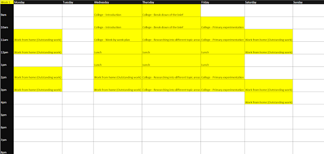
Comments
Post a Comment