Business Product Project
Introduction
During my last project I used a blog to keep track of my work as it gave me a lot of flexibility in terms of being able to work from any device whenever I want and enabled an ongoing record of the development of my final major project. My current task is to create products to eventually be displayed on a website next term.
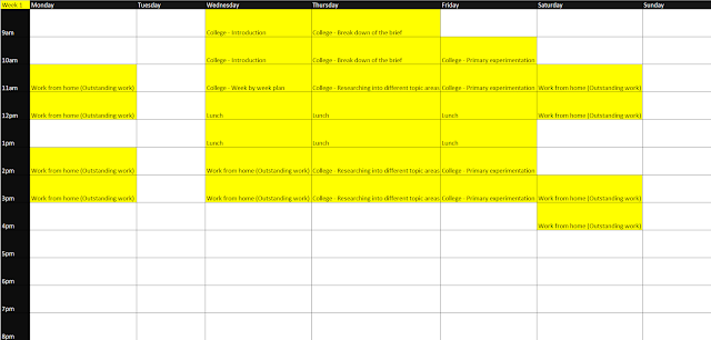
Week by week plan
Brief Analysis
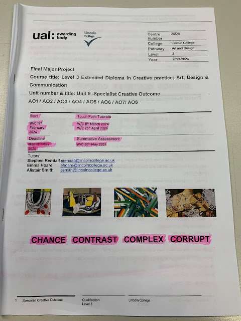
For this project I need to create my own products of choice to create digital concept designs for and later advance to displaying these products upon a website and attempting to sell them next project. My deadline is 19th October and I need to make sure to tick off the learning outcomes as I advance in the project so that I can stay on schedule. It is not mandatory to blog about your project but could be a creative way to document work. The final submission can be submitted in Sketchbooks or Digitally.
Primary Experimentation
Energy drink brand design
This is a potential website which manufactures custom can labels. Although they do not create labels which wrap around the entire can so I will have to contact them to ask if they can create a custom label for me.
This website is perfect as it will help me with having a rough idea on how the can label design will fit onto the can itself. I can quickly load up an image and place it onto the 3D model which simulates how the final product will look like.
Clothing line
https://www.freepik.com/free-photo/white-t-shirts-with-copy-space-gray-background_15667327.htm#query=t%20shirt%20mockup&position=0&from_view=keyword&track=ais
I simply put some text into a box and placed it upon the front and back of the shirt.
I really like these t-shirt designs as they are simple colours and all follow the same style. When I saw these designs they inspired me to make a collection of clothes, not necessarily lots of T-shirts but different garments instead.
Researching print on demand websites
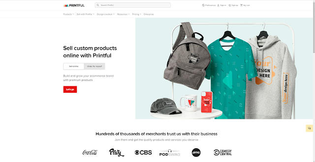
Printful
Printful offers lots of different options when it comes to printing custom designs onto products, they range from clothing to AirPod cases. The prices for custom products aren't very high which leads to lots of successful sellers on Etsy/Amazon/eBay/etc using Printful to supply their business. Printful doesn't just create the custom products but also ships them straight to the sellers customers doors, leading to an extremely smooth experience for sellers who use the website and have it connect to their online shops.
Printify
Printify is very similar to Printful but has an increased catalog of custom products (800+). Printify allows sellers choose from a global network of printing partners which means they can find the right producers and team up with local manufacturers to speed up the process.
Apliiq
Apliiq offers more customisation on apparel, such as pockets with custom designs printed on them and custom tags. When looking at Apliiq's website I personally believe it doesn't match up to the same level as Printful and Printify's websites but it still seems like solid choice if you are looking to start a clothing brand.
SPOD
SPOD is one of the fastest producers in the print of demand business with 95% of orders shipped out in under 48 hours. Unfortunately SPOD offers a smaller variety of products than the other websites listed so far, this leads me on to believe SPOD would be a good option for new stores starting out.
JetPrint
JetPrint allows sellers to make designs for unique products such as watches, jewellery and shoes. They also offer free shipping on all orders with an average arrival of 14 to 21 days, this may not be the best choice for experienced sellers as they'll most likely want their customers to get a hold of the product as fast as possible.
All of these different print on demand websites are currently competing to offer the best value towards their customers. This is hard for them as they need to account for the quality of the products still being high and the prices staying low whilst still profiting slightly.
Finding manufacturers
General clothing (Shirts/Hoodies/Jeans/etc.)
Apparelwin
Based in China and has a wide variety of different blanks and can make almost anything.
Instagram: @apparelwin_official
https://www.apparelwin.com/
Limitless Manufacturing
Based in Los Angeles and have 40+ global partners.
Instagram: @limitless.mfg
https://www.limitlessmanufacturinggroup.com/
YPB Factory
Based in Vietnam and specialise in luxury streetwear. They have a worldwide shipping time of 4-7 days.
Instagram: @ypb_factory20
https://ypbfactory.com/
Hats/Caps
T-cap China
Based in China and specialises in different types of hats.
Instagram: @tcapchina
https://www.tcapchina.com/
Shoes
La La Land
Based in Los Angeles and specialises in shoes and leather goods such as bags.
https://www.lalaland-design.com/
Neck tags
Wunderlabel
Manufacturer which specialises in clothing tags and has a variety of different materials and styles.
https://wunderlabel.co.uk/
Jewellery
High Life Tech
Custom jewellery manufacturer with a good reputation in the streetwear scene.
https://www.highlifetech.co/
Yiwu Lordon Jewelry
Custom jewellery manufacturer which specialises in good value pieces and quick turn around times.
https://lordon.en.alibaba.com/
Shipping supplies
Amazon
On amazon you are able to buy poly bags and thermal printing labels for affordable prices.
https://www.amazon.co.uk/
U-Line
Manufacturer which specialises in shipping supplies, boxes, material handling, poly bags, retail/store operations, tec.
https://www.uline.com/
Stickers
Sticker Mule
Manufacturer offering stickers, labels, packaging, and shirts.
https://www.stickermule.com/uk
Vista Print
Versatile manufacturer offering stickers, metal signs, posters, banners, hydroflasks, packing tape, shirts, tote bags, etc.
https://www.vistaprint.co.uk/
Sticker Farmer
Another manufacturer offering lots of different branding products.
https://www.stickerfarmer.com/
Target Audience
When researching my target audience, I need to make sure I account for the different age ranges who purchase different types of clothing. Everyone wears clothes but the way I will find my target audience is by looking into the target audience of the designs on the garments and determining which age range I will pick for my final products.
So far, I am quite interesting in creating designs similar to these images below:
The reason I like these designs is because they're all quite vintage and stylised and appeal to me as an 18-year-old male. I would say that the target audience for these pieces is most likely from around 15 years old to around 25 years old.
As for my own designs I will be creating, I think that I should also target teenagers and young adults as that is where the money is for clothing.
Idea Generation
I have been experimenting on Adobe Photoshop creating some different designs and trying to display meaning as well as creativity in the different images.
This is the design I created displayed on a free "washed T-shirt mock-up I found online at:
https://www.behance.net/gallery/142568867/16-Oversize-Washed-T-Shirt-Mockups-2022-(1-FREE)
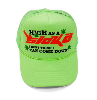
I created some more designs linked to the "Sicko" brand. I attempted to get the vintage, retro look that a lot of their designs have and believe that most of these came out well.
I wanted to use some old designs I had saved to my computer and display them on shirts, however when creating my final designs, I want them to have better colour than these and they look quite dimmed. The reason for this appearance is because I was trying to get a realistic print texture on Photoshop but when exporting the images, the designs would appear much darker. I need to make sure that this isn't a problem with my final product.
This is a puffer jacket concept I created for my friends' brand. This is ready to be sent to a manufacturer as I have used images to show different materials and further describe how I want the garment to look like.
This is a quick sketch of something I may want to elaborate on later and create into a better, more refined design.
Design Concepts
Riot Dust/Smoke Design
I started by sketching out a smoke/dust cloud and then tracing over it neatly.
I then coloured in the line art with a pale blue. I also filled the background in.
Next I traced the brand logo and gave it a stylised effect to match the dust behind it.
The dust/smoke cloud in the back is to symbolise the chaos caused by riots. The smiley face in the "O" is to shown how riots help with getting the publics voice heard and not getting pushed under the rug.
This is my first proper design that I am considering putting on a garment but I am afraid that I won't be able to continue creating more advanced designs as my project time frame isn't big enough.
City on fire oil painting design
I was experimenting with different brushes and colour palettes and then found myself sketching out flames. I painted out some buildings in front of the flames and then water at the bottom of the canvas.
I added the reflections of the buildings in the water to enhance the detail of the design.
I am unsure on whether I will use this on any of my products as I personally don't believe it is a very good design.
Stylised Gothic Text Design
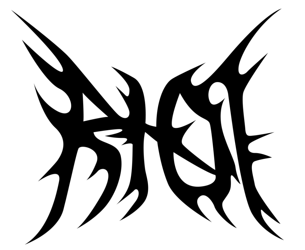
For this next design I wanted to create a moderately complicated but simplistic type logo. I want only the text "RIOT" in the design but I want the typeface to be gothic and symmetrical to an extent.I started off with a rough sketch of the layout of the text placement and base typography.
Then I rearranged the lettering and brought them closer together. I fixed the letter "O" as the shape was wrong and altered the angle of the letter "T" so that it looked more symmetrical.
After I added some spikes and gave the type a bit more personality overall.
I would like to use this design on at least one of the garments as I'm happy with how it came out.
Molotov Design
I started with an image of a rioter throwing a Molotov which I used a threshold layer adjustment on and finetuned it until I achieved the result I wanted. I had to make numerous threshold layers to fix the lighting on the man.
I decided on the font "Alhambra" is the copyright certificate was 100% free use and it was the best fitting for the image out of the ones I tried. The letter "r" in the font looked too much like an "n" so I had to manually tweak it and moved the left side of the letter down so it looked more like an "r".
Next I added two new logos into the composition. I placed the "Riot brand logo" on his back and a circular one in red on his hand. The reason for this logo was the create a vague feeling of it being a warning/stop/caution sign as it is in red. It shows
I applied a chrome effect using layer styles and metallic textures onto the logos I just added.
Then I cleaned the chrome effect up a bit as it looked too detailed for my liking.
Tried out a bandana pattern overlaying the Riot logo but decided to get rid of it as from distance it looked unnecessary and too cluttered.
I also tried making the text chrome but I didn't like how it overcomplicated things so I left it as a solid colour.
Final Product
Finding a name for my clothing brand
Possible primary names:
Luminex
Chroma
Riot
Epoch
Abyss
Divine
Sacred
Secondary names:
Clothing
Apparel
Attire
Garments
After careful consideration I think that I am going to settle with Riot Clothing as I it links in with todays society and the problems out there. I also have lots of ideas with the designs and think that the names flows well.
The name "Riot" was inspired by the idea that clothing can be a type of rebellion against formality. I wanted to create a brand which encourages people to stray away from the ordinary and create a declaration through their style. "Riot" represents the overall energy and pride of standing out and being unapologetic in the sense of your unique style. The brand turns fashion into a form of revolution.
I also made sure that usernames on social media platforms were available for Riot Clothing. Below are the usernames I managed to get hold of:
Instagram: @riotclothing
Twitter/X: @RiotClothingg
TikTok: @riotclothingg
Gmail: riotclothingcontact@gmail.com
Brand Logo Development
I created some concept designs based for the main "RIOT" brand logo. I wasn't too sure on these so I created something new and simplistic. Below is the logo which I have chosen to represent my clothing brand with.
The reason I wanted to use this as my logo is because I think that the most successful clothing businesses have simple, recognisable branding which this logo will hopefully emulate. The "R" in the square is supposed to replicate the restricted logo shown below.
I wanted to make the link between rioting and the restricted/illegal/prohibited actions which often come with it.
I further experimented with the logo but I am confident that the original option is the best out of the selection.
Garment mock-ups
I will need a base shirt design mock-up to use for my final designs so I drew this out on my drawing pad. I will now refine this and make it ready to be used for the final products.
I used the line tool, pen tool and ellipse tool to help me refine the line art of my shirt mock-up. I completed half of this so that I could duplicate what I have already done and get symmetrical results after flipping it horizontally.
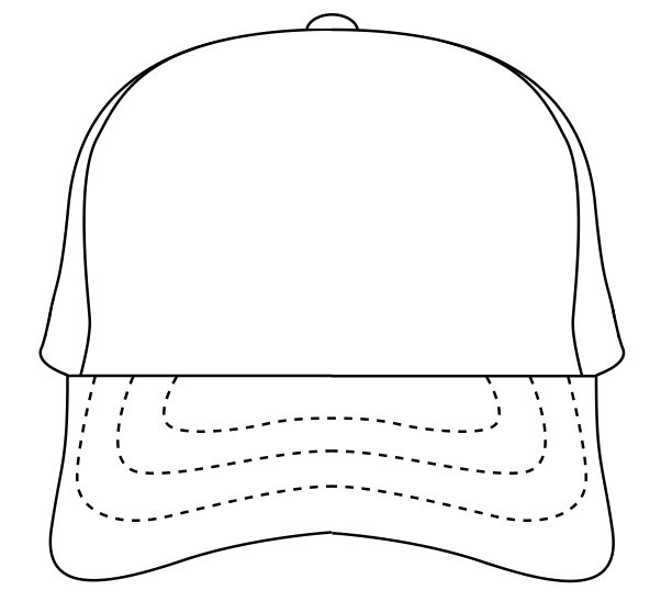
Trucker cap
I sketched out different angles of a trucker hat and then went over them with my drawing tablet.I repeated the same process as before by completing half of the line art, duplicating it and flipping it horizontally to complete the first angle of the trucker cap.
I used the same method for the back of the cap but had to do the closure of the cap separately as that part isn't symmetrical.
Finally I completed the sides of the trucker cap. I created the right side of the cap and that allowed me to flip it and use it as the left side as well.
I won't explain the process of design for the next few mock-ups as they consist of the same principals.
Women's Tank Top
My Women's Cropped Tank Top sketch using my drawing tablet.
Hoodie
The front of my finalised Hoodie mock-up.
Final garments
T-Shirt
These were the final t-shirt concept designs. I would like the print on these shirts to be slightly embossed to give a nice feel and stand out for other t-shirts. I really like the colour palette used in them as it is original and different from the usual blacks/whites/greys used in lots of garments.
I then designed a trucker cap based on the shirt design I already created, I wanted the theme to be repeated throughout the collection so I added the same shade of beige as the primary colour on the cap. The small stars on the cap represent the mesh material. I want the logo to be embossed like the print on the shirt except this time I want a bigger emboss so that it looks more 3D.
I wanted to display this design on a women's cropped tank top as I have seen similar garments before and they have inspired me. I like how simple this is but is still effective with the colours used, I would say this is quite a gothic piece as it consists of mainly black and uses a metal themed logo design. If these were made into a real-life product I would want the type logo to be embraided and have a rich red material to do so.
Joggers/Sweatpants
Trucker Cap
The other trucker cap I designed had a slight error in the meshing. I fixed this for this cap by moving the circle shapes closer to each other.
Hoodie
Here is the final hoodie design concept displayed on my custom mock-up. The design on the back of the hoodie wasn't shown in my idea generation section because I created it whilst showcasing the primary design on the garment.
Neck tag
Front
I removed the corner borders and created a rectangle shape around the "-iot" text. I still wasn't happy with how this looked so I am going to something new.
This is my favourite concept as of now but I still think I need to consider other ideas.
Back
I didn't want to decide on the first design straight away so I tried out some more typefaces and quite liked how this looked, except I didn't like the capital letters.
Real-life mock-ups
I wanted to see how a couple of my designs would look like on their respective piece of clothing, however an actual real-life mock-up instead of digitally created.
Evaluation
I am generally quite pleased with how this project has gone but would have loved to extend the catalogue of my final products as I do feel like it is lacking a bit. I have had to do all of this project from home due to having to focus on my website whilst in college as I do not have Adobe XD at home. This disrupted my usual workflow and I feel like I didn't demonstrate the best of my skills and abilities in this project.
I have been looking into different ways to promote my clothing brand and I've found that TikTok is one of the best options as it is very easy to make a video which goes viral. On average TikTok users spend 95 minutes every day on the app which means there are always potential customers on the app at all times.
However, I am excited to move onto the next brief and further develop my clothing concepts as well as create a website for these products to be displayed upon.














Comments
Post a Comment