Introduction
During my last project I used a blog to keep track of my work as it gave me a lot of flexibility in terms of being able to work from any device whenever I want and enabled an ongoing record of the development of my final major project. My current task is to create a new layout for one of the three listed websites, these are:
- https://www.therighttoshower.com/
- https://blancliving.co/
- https://www.phbethicalbeauty.co.uk/
I begin the project by exploring basic principles of effective design, analysing existing websites and identifying good and bad practices. Afterwards I should compose an evaluation of my findings as an essay, this will consist of 1800-2200 words and should be submitted on OneNote and Turnitin. I will then be introduced to Adobe XD before creating a number of design ideas for various layouts.
I am expected to evidence all research, analysis, idea generation, development and reflective practices and ready for submission on the deadline date.
Brief Analysis
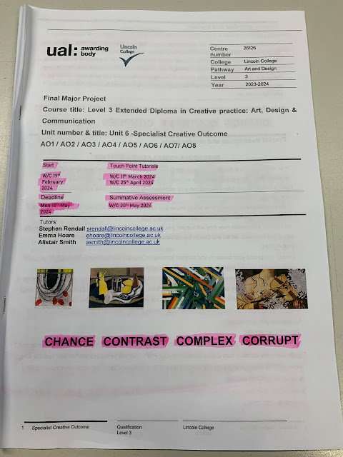
For this project I need to revamp an existing website. My deadline is 19th October and I need to make sure to tick off the learning outcomes as I advance in the project so that I can stay on schedule. It is not mandatory to blog about your project but could be a creative way to document work. The final submission can be submitted in Sketchbooks or Digitally.
Effective Website Principles
1. Create a plan before starting any final product. Research target audience, what information they require and how the website will provide this information
2. Appearance keeps the audience engaged. Graphics located on websites should balance out text to allow the eyes to take a rest from reading.
3. Consistency. A website layout should be cohesive and maintain a theme throughout. For example, a bright orange button should not be placed in the middle of a monochrome themed website.
4. Typography is key. The typography located on a website determines the theme and design, the typography should match the rest of the elements.
5. Colours set the tone. Colours help to further enhance the product you are selling. For example the colour brown could be used when advertising a chocolate bar.
6. Don't make the viewer think. Websites should be self-explanatory and able to navigate easily, the website user shouldn't have to figure out a website.
Purpose
The main purpose of websites are to present and share content for people to view online. They are usually used as a way to bring in new clients and customers to a business. An example of a purpose of a website is a portfolio, portfolios are used to showcase work when searching for a new job. Most businesses are going online and obtaining websites as it allows for much more profit to be made. Consumers are constantly looking for new things to buy and doing it over the internet is a much easier and faster way than physically going shopping.
Websites today are very easy and cheap to create potentially leading to extremely high return rates. This makes it vital for small businesses to create websites as they are likely missing out on many sales from eager consumers on the internet.
F-Shaped Reading Pattern
The F-Shaped Pattern was popularised by NNGroup's eye-tracking study, this consisted of 200 people viewing thousands of websites. The group then collected the results and found that the users behavior was quite consistent and the pattern roughly shaped the letter F, hence the name.
I found some good information about the F-Shaped Pattern at https://digital-freelancer.org/blog/f-shaped-pattern-explained , the text and image below were copied from the website.
Users first read in a horizontal movement—usually across the upper part of the content area. This initial element forms the F’s top bar.
Next, they scanned a vertical line down the left side of the screen, looking for points of interest in the paragraph’s initial sentences. When they found something interesting, they read across in a second horizontal movement that typically covers a shorter area than the previous movement. This additional element forms the F’s lower bar.
Finally, users scan the content’s left side in a vertical movement:
Visual Hierarchy
Designers use Visual Hierarchy to show the importance of different elements/contents on a web page. Altering these characteristics below changes how likely a user is to notice them:
- Size
- Colour
- Contrast
- Alignment
- Repetition
- Proximity
- Whitespace
- Texture and Style
In website design hierarchy is important to keep the consumer interested, as well as directing their eyes towards a part of the website you want them to view. This is why when creating a website you have to be very careful with the placement, sizing and colours of different elements, because of this a well thought out plan is essential to making a website where visual hierarchy is important.
Content
Website content refers to different creative elements located on the web page, these include:
- Images
- Text
- Data
- Audio
- Videos
There are two types of web content, Text and Multimedia. The difference between the two is that text is added onto the website in blocks and within images. Multimedia refers to any other content which is not text such as Images, Videos, Audio and Animations.
Content on a website should be well presented and organised in a strategical way to increase engagement and make it easy for the consumer to navigate.
Grid-Based Layout
Grid layouts help to organise content and allow margins for accessing the website on different devices and screen sizes. The grid is made up of horizontal and vertical rulers which help to guide the web designer on where to place the contents of the website. Grids also help not just practically but they also help with appearance of the website, contents are evenly spaced out which makes it easier for users eyes to scan through information.
(
https://www.mockplus.com/blog/post/ui-grid-layout-design)
Above is an example on how grid-layouts work and shows how different elements are evenly spread out following the grid lines.
Load Time
Load time is how long it takes for a user to enter a website. Most good websites have a fast loading time, this is so that viewer doesn't quit out of the website straight away. Load time can either depend on your internet and network speed or the browser itself, if it it the browser itself it is usually because the website creator has overloaded it with assets and content. Long load times are bad for engagement and sales, below is some information about how load times impact sales:
"a one-second delay in page load time has been shown to cause a 7 percent loss in conversion and 11 percent fewer page views. For an online store earning $50,000 a day, that one-second delay adds up to more than $1 million in lost sales each year"
https://www.bigcommerce.co.uk/ecommerce-answers/what-page-load-time-and-why-it-important/Mobile Friendly
Mobile friendly website design is when a site is optimized and altered so that mobile users can access them. Mobile website design is essential in todays society as smartphones/iPads/tablets are more common than ever before. Most successful mobile websites contain large buttons and aren't cluttered with lots of unnecessary text and assets.
(https://www.theioutlet.com/)
I don't believe the iOutlet website is especially bad but one thing I do think is that the graphics shown in the middle are too bright and cluttered, therefore meaning they don't contrast as well with the rest of the website. However, if we ignore this area then they have a pretty decent user interface overall.
Primary Research - Website Design User Experience
User experience should be one of the first things a website designer thinks about, when creating websites you need to constantly be improving the websites usability and thinking about how well the user will be able to navigate the site with speed and the least hassle possible.
Another extremely important thing to think about when creating a website is to make sure the website is responsive and can adapt well to different screen sizes and devices. This means that no matter which device the user is using they will always have a consistent experience throughout the entire period of using the website.
When a user first enters your website their first impression determines whether they leave or stay. In this case I want to talk a bit about page load speed but other reasons to why people may leave instantly from your website could very well be due to appearance. Page load speed should be almost instant after you put the request to enter the site through, this improves engine rankings as well so your website is more likely to be found on Google, Bing, Yahoo, etc. A way to fix your website load time is by optimising images and refrain from using assets which require a lot of server requests.
Consistency throughout a website helps with making the user transition through different pages without feeling like they've entered a new website every time. Visual hierarchy is important when it comes to consistency as it is key to guiding users through a website. Strategic use of visual hierarchy is necessary when doing this, such as sizes, fonts, colour, etc.
User feedback is helpful for website designers who need to know where the weak points of the site are and how they could be improved. The feedback from users is usually gathered via surveys and analytics.
Evaluate Website Design Research (2000 word essay)
In today's age the digital world
is extremely important to businesses all around the world. The internet brings
in huge amounts of new customers to sellers compared to 60 years ago when all
business would be done in person. Websites have become the primary way to display
your services and products to the online world, they not only help you with
selling but help to transfer information to the user allowing for further
engagement and repeat purchases from customers. In this essay I will talk about
the importance of website design, trends in website design, user experience,
user interface.
First impressions in website
design are critical as a user decides if they leave or stay after they take a
brief look at the homepage of the site they just entered. A well-designed website
should leave the user with a positive impression of your brand, while a poorly
designed website will leave negative impressions on your brand and ultimately
drive users away. This is makes a very large impact on sales and engagement, which is definitely not what your brand wants.
One of the main factors leading
up to first impressions is user experience, a user-friendly design will enhance
the overall experience for a user leading to a larger amount of time spent on
the website and a better user satisfaction. When you are creating a website,
you need to constantly be checking whether what you are currently working on
will be easy for the user to use and navigate through without encountering any
issues.
A website should also look
trustworthy and credible as this could be the deciding element when a user is
choosing to engage with the website or not. When entering a website, the first
thing you do is inspect the general layout and the elements presented to you,
if these look messy and unreliable then you are more likely to be cautious when
handing over any personal information. Where as if you enter a website with a
clean, professional layout then you feel more confident handing this information
over when making purchases, signing up for accounts, etc.
Furthermore, branding plays a
huge part in website design. Branding should be consistent and not look like
you have entered a different website each time you switch to a different page.
This means that the same fonts, colours and general website theme. However, your
branding shouldn’t be boring in the sense that your design layout looks like
every other website. There should be areas of your website that break free from
the crowd and elevate above the average existing websites.
A mobile-friendly website is
exceedingly necessary in the world today as 96.6% of internet users use a smart-phone
and 67.5% of the world population owns a smart-phone. Creating a mobile-friendly
website leads to much higher search engine rankings which overall increase
conversion rates as more visitors to your website equals more sales. A website shouldn't just accommodate mobile devices but different monitor screen sizes as well, the more screen sizes you adapt to, the higher rankings your website receives.
Search engines heavily come into
play with website design, a well-optimised website is more likely to increase
its search engine rankings and widen its discoverability. A well-optimised
website consists of all of the principals I have already talked about. It is extremely
important to keep track of your search engine results and rankings as it is one
of the main sources for bringing in new visitors and customers to your website.
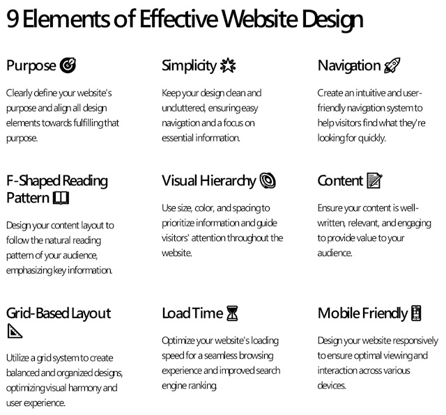
The nine elements of website design are important to take note of when creating a website. They consist of Purpose, Simplicity, Navigation, F-Shaped Reading Pattern, Visual Hierarchy, Content, Grid-Based Layout, Load Time, Mobile Friendly. A lot of these I have already written about as they are key things to account for when creating a wesbite.
In conclusion, website design is
much more than just a visually appealing layout but instead a strategical
asset. It heavily influences a user’s experience whilst navigating a well-designed,
aesthetically pleasing site but more importantly the design should reflect
credibility and trust onto your brand. Today’s website design isn’t just to
provide the luxury of an attractive design but in fact it’s a necessity when
deciding whether users stay or leave instantly.
Introduction to Adobe XD
Since I started learning Adobe XD I have picked up many new skills and I feel more confident with the software. A lot of the controls translate from Photoshop and Illustrator which I know how to use better so that helps with the process of learning Adobe XD.
As of now I am learning how to use the prototype tab as this is necessary to link different buttons to pages and helps with the overall flow of the website.
After watching the XD tutorials provided by Adobe I feel like I am confident in starting to experiment by myself on the software.
Idea Generation for Website Layout
Font/Type
The font I am thinking of using on my website is "Nexa". The font is clean and legible and includes a light and heavy option so that I can switch between them depending on the text I want the user to look at first. The copyright license for this font is "Free for personal use" which means I am able to use it as I am not profiting from the font or claiming it as my own work during this project.
Final Website
I started off by creating a rough layout of how I want the home page of the website to look, hopefully I will be able to compare this concept layout with the final website and see the similarities in one another.
Here are the icons I created using a base image and Photoshop. The icons have been modified from the base image by me so that all of the icons fit the same theme and style. I created the person icon from scratch. The URL links to the base images are below:
Heart - https://thenounproject.com/icon/heart-1158552/
Cart - https://thenounproject.com/icon/cart-1053304/
I want to make the website green and lush to attempt to convince the user that the products being sold are natural and 100% organic.
Home page
This is the final banner for the home page. It will be placed underneath the navigation bar and shown to new users the moment they enter the site.
Here is an update on how my website homepage is coming along so far. The navigation bar is now fully functional and the buttons link back to their unique pages. The PHB logo links back to the home page. The large lipstick panel links to the lipstick product page to demonstrate how the entire website would function if we had a longer timeframe to work on our project. Certain assets also visually react to the mouse hovering over them on this page, such as zooming in/out.
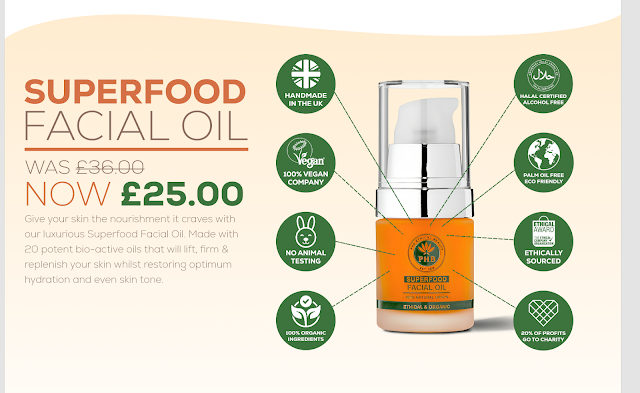
I created some icons to be placed on an advertisement for PHB 's SUPERFOOD Facial Oil. I created the halal award myself in Photoshop, for the rest of the icons some have been taken from the PHB website and others have been found on the www.thenounproject.com such as the:
Rabbit symbol - https://thenounproject.com/icon/rabbit-1036133/
Organic symbol - https://thenounproject.com/icon/organic-5537048/
World symbol - https://thenounproject.com/icon/world-2194348/
UK symbol - https://thenounproject.com/icon/union-jack-760041/
These were the icons already on the PHB website.
I cut out the Facial Oil from the original image I had and then organised the different icons I created around it. This advertisement is used to help the user identify how the product is created.
This was the final design for the advertisement, I'm not 100% sure on the colours but I will attempt to carry out this green and orange/brown theme throughout the rest of the site.
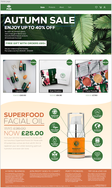
This is my final home page layout, I'm proud of how my first website is coming along so far.
Products page
I started building up my products page by creating a base layout and functional 'sorting' drop down menus.
I created the first product and made it functional, I then duplicated this product 11 times. I then altered all of the information and images on the duplicated assets to match their correct product.
I then repeated this process for the 'Makeup' products.
This is the full final products page. I would've added every product but as of now I do not have enough time to complete this.
About us page
I started off the 'About' page with big shapes and images to give it a good visual appearance for the user, I also tried to make this page so that it wasn't overwhelming as there is quite a lot of text in it.
I copied these images from the PHB website except the middle one which I found online at:
www.unsplash.com
I copied the text from the PHB website and highlighted the most important areas in green. I wanted to justify the text format but in Adobe XD there currently isn't an option to do so.
This is my final 'About' page. I added the contact area at the bottom of the page and used another image from www.unsplash.com in the background of this box.
Wishlist page
I built a clean layout for the products located within the 'Wishlist' page.
I copied what I previously created and changed the information and image so that it was correct.
This is my final 'Wishlist' page. I created the "You may also be interested in" scroll feature and I'm happy with the outcome.
Cart page
I wanted to create a clean 'Cart' area so I made sure to try and stay simplistic whilst creating this asset.
I duplicated the original product layout three times, changed the information and images and then created a 'Summary' area.
I removed the faint grey borders on the images as I believe it looks cleaner without it.
This is my final 'Cart' page. I copied the "You may also be interested in" scroll feature from the 'Wishlist page'.
Profile page
This page didn't take long and is just made up of a few rectangles and text boxes.
Facial Oil product example page
I started off this page by adding the necessary text and buttons. I gave them functionality and then saved these as assets for later.
Then I added the images and the rest of the text into the canvas.
Lipstick product example page
I wanted to create a option box so that you could select which shade of lipstick you want to purchase. Unfortunately I didn't have time to make this a functional feature in my website but I will attempt to do so next time.
These were the layers from the option selector asset I created above.
I like how this page looks however I do feel like it's missing something as it is quite empty.
Prototype mode
This is what my website pages look like when I select the entire document and switch to prototype mode. It shows all of the different buttons leading to different destinations.
Evaluation
Overall I am satisfied with my final website as it is the first one I have ever created and think it came out pretty well. I am aware that it is far from perfect and it needs a lot more time spent on it if I wanted to compete with a modern day site. Something I excelled in whilst creating my website was the graphics created in Adobe Photoshop, I am passionate towards this software so I was confident when putting them together. Something I wasn't so good at was creating in depth elements such as adding items to the cart, I will attempt to learn these things next project.






Comments
Post a Comment