Pick 10 words from the brief.
Nostalgic
Powerful
Advertising
Exciting
Evolution
Engaging
Unique
Surprise
Quirky
Humour
Reorder the 10 chosen words so that the most important is at the top and least important is at the bottom.
Nostalgic
Quirky
Unique
Powerful
Evolution
Advertising
Exciting
Engaging
Surprise
Humour
Compress the 10 chosen words down to 5 words (in order from most important to least important).
Nostalgic
Quirky
Unique
Powerful
Evolution
Compress the 5 chosen words down to 3 words (in order from most important to least important).
Create a sentence or two describing the brief task and using the 3 chosen words.
Create a 'Unique' marketing campaign which also has a 'Quirky' and 'Nostalgic' nature to it.
Coca Cola
Pick 10 words from the brief.
Elevate
Iconic
Authentically
Exciting
Refreshing
Creative
Engagement
Extraordinary
Salience
Wealth
Reorder the 10 chosen words so that the most important is at the top and least important is at the bottom.
Iconic
Elevate
Salience
Authentically
Exciting
Extraordinary
Refreshing
Creative
Engagement
Wealth
Compress the 10 chosen words down to 5 words (in order from most important to least important).
Iconic
Elevate
Salience
Authentically
Exciting
Compress the 5 chosen words down to 3 words (in order from most important to least important).
Create a sentence or two describing the brief task and using the 3 chosen words.
Come up with an 'Iconic' idea which 'Elevates' Gen Z to the 'Salient' world of Coca-Cola.
Conclusion
After completing this activity for each chosen brief I have decided that I will be using the "Universal Music UK" brief as it fits my liking the most, I have done some further underlining and circling on this brief to help me when I start my final design products.
Researching into target audience and brand identity
Target Audience
The brief I picked doesn't give an exact age range for the people attending the music festival, however it does tell me that they are the staff who work at Universal Music in London. This means that the age range is most likely from 18 years old up to around 70 years old, this is a very wide age range and I think that gives me quite a lot of freedom. It may also stand as a slight problem as I have to take all of these ages into consideration and create design products which appeal to this large age range.
Here is a poster advertising the event in 2019, I think that this works well with capturing the eye of this age range as it isn't too flashy or complicated, or too simplistic and boring. I personally, being 18 years old, would appreciate this poster however it isn't my style so if I was to make a poster I most likely wouldn't take this artistic approach.
Brand Identity
When looking at existing posters used for the 'UMUSIC AUTUMN' festival I noticed a common factor within them, they were all simplistic and shared a similar style. The two I have decided to display below consist of a lot of straight edges, with limited curved edges.
This poster above is using an extremely minimal colour palette, which mainly consists of:
- Rose Bud - #FAB991
- Tarawera - #063757
These colours are used in different shades throughout the piece as gradients are constantly used transitioning the two main colours into each other. The moon above the roadhouse looks to be a white colour but is just a very light shade of Rose Bud.
If I had to pick a style to link with this artwork it would be abstract, the shapes used really give off the 'abstracty' feel from them. The colours also back up this style as the gradient effect used is commonly used in similar abstract designs. The perspective of the image is very interesting and original, the artist has kept realistic proportions whilst altering the main appearance of the graphic.
There are also small details which you most likely won't notice at first glace such as these stars and the shoe attached to the wall.
This poster shares a similar art style to the first poster however this one uses a wider variety of colours, the colours used are:
- Grape - #3A2050
- Meteorite - #49267F
- Azure - #2F57A5
- Cerulean - #00ACDD
- Mulberry - #CD5299
- Bright Sun - #FDCC47
- Flamingo - #E9521C
The other colours not shown on this list are mixes between two displayed colours. Due to these colours I think that this poster is more eye catching and reinforces the festival feeling further rather than the other one which doesn't emphasise that it is advertising a festival as much.
Conclusion
From analysing both of these posters I can infer that the brand has a minimalistic aesthetic surrounding it. They are both created in the same abstract style so may possibly be made by the same artist.
Website
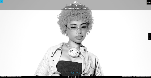
When viewing the Universal Music Group's official website you're instantly struck with a music artist on the home page. The website is very monotone with two blue coloured elements, the icon in the top left corner and the artist name at the bottom of the screen, these provide a nice contrast to the rest of the website.
When opening the sidebar in the website you are met with some pages you're able to click on. The typography used for these pages is clean and easy to read, another small detail is when you hover over a piece of text it turns blue.
On all of the other pages the theme is kept up (the typeface is kept the same, the blue accent colour is maintained, and the monotone palette is also kept).
Primary Research
This is a photograph I took of the Lincoln Cathedral, I wanted to encapsulate the shear size of the building but it was quite hard to do so without including something to measure the scale with, such as a person or car. I think the picture still looks visually pleasing, with the blue sky in the background and sun shining onto the right side of the towers. The image shows the huge amount of detail on the religious building fairly well but I want to share another image which hopefully displays the carvings better.
Here is the other photograph of the Lincoln Cathedral which I believe shows more carving detail on the walls of the building. All of these intricate carvings were done by hand and took around 20 years to fully complete the construction of the building.
These were bricks laid down on the floor outside of the Lincoln Cathedral. I liked how they looked and realised that I could use them as reference for texture on bricks and walls if necessary in my final designs. The bricks are all different shapes and sizes which makes the photo more unique.
Here is a view of the ceiling as you walk into one of the entrances. It is very interesting to think that all the symmetrical designs on the building were all handmade 952 years ago in 1072.
Here is an image of the inside of the cathedral, I wanted to explore it further and take more pictures but that is as far as I could go without paying the entry fee.
Here is a round bollard I found just outside of 'The Collection' I thought this was good reference for the top of the roundhouse as the shapes are similar.
Here is an image of the top of the roundhouse for reference, they do look different but nothing is stopping me from making it more stylised and incorporating a more spherical top to the building.
Primary Experimentation - Week 1
To start off my primary experimentation I wanted to research into possible colour palettes. I found a new website which generates a palette based off of an inputted word.
This is the homepage to the website (photochrome.io)
These were the colours generated for the word "music".
You can alter the saturation slider to enhance the colours and make them appear more vibrant, you can also bring the slider down and achieve more washed out colours.
Here are some more of the prompts I gave the generator. I like how this website works but I feel as if more often than not it gives you low saturation colour palettes which may not be as useful.
I want to try and make these palettes better using a website I have been using for the past few projects,
www.coolors.io.
I entered in the "neon music" hex codes into
www.coolors.co, and locked the lightest and darkest shades into place.
These were some of the new palettes I generated, I found that a common correlation was that it would choose cold colours such as blues and greens to be displayed between the colours which were locked in place.
I spent some more time generating and discovering palettes and these were my favourite colours palettes which I felt encapsulated the music festival vibe.
I now applied these colour palettes onto the official Universal Music Group's logo. I found the logo available for download on their website homepage -
https://www.universalmusic.com.
My personal favourites in this collage are:
- #1 (Cerise on White Rock)
- #6 (Yellow on Bittersweet)
- #8 (Yellow on Ship Cove)
- #11 (White on Royal Blue)
I want to try out some of these colours on this image I found on Unplash.
I altered the colours of this image eight times and then presented them in a collage. I was able to achieve this recolouring effect by making a solid colour fill and setting it to the blend mode, 'Color', then setting this as a clipping mask onto the original image.
Artist Research
Tracy Chahwan
Tracy is an illustrator and cartoonist from Lebanon. Since 2016 she has collaborated closely with the music scene in Beirut, designing different posters and visuals surrounding various venues, festivals and concerts. Tracy is also a member of the Lebanese comics collective, Samandal. her most recent project was the collective book "Guantanmo Voices", which was published in 2020 by Abrams Books.
The reason why I chose to research Tracy Chahwan is because of her distinct art style and professionalism. When you take a glimpse at one of her posters you automatically think of partying and music, which is extremely important when advertising a festival or concert as the poster is usually the thing potential goers will see first. The vibrant colours used in this poster emit an atmosphere full of life. It also appears as if the chosen colours have the potential to glow under UV lighting, adding an extra unique element to the overall visual impact of the graphic.
Here is another bright and eye-catching poster. The warm colour palette chosen for this poster seems to be a deliberate acknowledgement to the event's location in the Middle East.
I attempted to find out Tracy's work flow, but I couldn't find any information about it. If I were to speculate, it seems as if she may begin by sketching her work on paper with pencils, creating the foundations, followed by painting over the line art. Afterward, she might digitalise it using Illustrator, which would explain the rough paint brush style edges visible when zooming in. Alternatively, she could add paint brush edge effects to a path directly in Illustrator, allowing her to replicate this effect accurately and create the artwork digitally without the initial step of painting it on paper.
Studio Moross
Studio Moross, founded in 2012 by Creative Director Aries Moross, is a versatile creative studio who specialise in directing and designing for a large array of clients from all across the arts and entertainment industries. Their skillset is extensive, with work containing mainly live show direction, broadcast design, and brand for festivals, exhibitions and arts institutions.
The team works from home excelling at collaborating with music talent such as Kylie, H.E.R., Disclosure, Sam Smith, London Grammar, and Bimini. Their previous client list features big names such as MTV, Spotify, VH1, Nike, Warner, and BFI. Collaboration is a core part of the studio's work ethic and specialist partners are often invited to contribute additional knowledge if required.

I personally think that what distinguishes this studio apart from other artists is the attention to detail and time invested into each piece. Once again, the art style is very unique which often appeals to a broader audience as they tend to show more interest to iconic stylised artwork rather than more familiar styles they may have seen before. The colours are extremely vibrant just like the last pieces I reviewed, this artwork uses a wider array of colours as the others. Another thing this artwork does great is incorporate the text into the artwork and not just have it slapped onto the top in a 2D font. I love how they have wrapped it around the Earth and extruded it to add depth. If you zoom in you can see how jam packed the canvas is providing a scene full of life.
Within this small cropped square you can notice a balance between a simple yet saturated canvas. Due to the solid colours and low detail on individual objects being used it works very well.
Researching into different topic areas
Potential design products
I want to create a list of graphics which could be created surrounding the given music festival brief.
- Posters (announcement, music artist line-up, etc.)
- Email invitation
- In-venue branding (banners, signs, maps, etc,)
- Social media posts
- Tickets (standard, VIP, etc)
- Stage graphics
- Merchandise
- Website graphics
- Wristbands
- Lanyards
Now I will place these in order of how important they are so that I can prioritise the ones at the top of the list first.
- Posters (announcement, music artist line-up, etc.)
- Email invitation
- In-venue branding (banners, signs, maps, etc,)
- Tickets (standard, VIP, etc)
- Wristbands
- Lanyards
- Merchandise
- Stage graphics
- Social media posts
- Website graphics
Dimensions
Posters
I explored the sizing for festival posters and discovered that there wasn't a set size, however a commonly used dimension among designers for these posters was 27 x 39 inches, this is a very big canvas so I may create it in a canvas half the size and then just scale it up at the end. This method will lose a bit of quality but I think it will only be noticeable when viewing the poster up close.
Email invitations
I explored the sizing for email invites and discovered that there wasn't a set size, however a commonly used dimension among designers for these invitations was 600 x (any value) pixels. The reason for this value being low is because email clients have a limit on how many pixels can be displayed before cutting off the page. Therefore I should settle with a value under around 650 pixels, so 600 should work perfectly.
In-venue branding
Inside the venue there are various different dimensions I will need to know to fully customise the event area. However, a lot of these will be up to me to decide as things like banners and signs don't generally have set sizes to be created as. An item which should be a set size is the day map, I was thinking of creating this on an A4 canvas which is 2480 x 3508 pixels.
Other than the ones I have already addressed, most of the design products don't have set dimensions and allow me to have a bit of freedom when sizing my documents.
Existing festival poster designs
In my research for inspiration, these were some of my favourite visually appealing event posters I could find. They all contain wide and vibrant colour palettes and each contain unique eye-catching art styles. The event posters provide a feeling of the atmosphere and ambiance you can expect when attending each event.
Personally, the "Rock in the Barn" and "Rolling Loud" posters are the two which stand out to me as the most appealing in this collage. Both of them share iconic art styles, especially "Rolling Loud", as they have been developing this style since 2018.
Primary experimentation - Week 2
I want to start off with trying out different typefaces on the title "UMUSIC AUTUMN", as that is the title of the music festival. I have the option to rebrand this name but I am happy building upon the existing previous branding. However, I may remove the "AUTUMN" part and just keep it as "UMUSIC" as it looks more streamline and cleaner.
Here are the results of testing various different fonts/typefaces. I attempted to primarily use quite large, blocky fonts as I feel as if these have a more universal usability on various graphics. My favourite typefaces on this list are:
- #2 (Reservoir Grunge - 100% free)
- #3 (Maverlo - free for personal use)
- #6 (Sister Spray - free for personal use)
I wanted to see how different colours from a palette I generated earlier would work on the Reservoir Grunge typeface, I have demonstrated this above, incorporating the text into a pattern.
Initial sketches and idea development
Poster
This is the original idea I was going for as it keeps detail in the image but still seems quite simplistic. The building is the Roundhouse in London; where the festival is taking place. A change I may make is the floor in front of the Roundhouse, I'm unsure if this disco floor concept would work very well.
This is another idea I sketched out, it is the roundhouse standing solemnly in a mass of water. I was contemplating adding some hills or rocks in the background but thought that simplicity is key in a "UMUSIC" poster. The perspective of the image is slightly wrong so I will need to alter it.
I brought this image into Photoshop so that I could move the skyline down to fix the perspective.
I have started to trace the sketch I did using Illustrator, I want to develop my skills on Illustrator so I thought that this would be a perfect opportunity.
As this is just an experiment I don't want to spend any longer on this piece as I need to get to work on progressing towards my final pieces. However, I'm glad I spent time practicing in this software as I most likely have to use Illustrator later on in this project.
Logo
I sketched out some ideas for the potential event logo presented on graphics I am going to create in the future. The third rough sketch is my favourite as it incorporates Universal Music Group's official logo into it, which allows viewers to easily establish that the event is hosted by them.
I wanted to take the logo further and create it digitally on Photoshop. I think it came out well and I enjoy the colours used on the canvas.
Lineup Poster
Artist names plan:
Friday - Travis Scott
- Ski Mask the Slump God
- Chief Keef
- Rae Sremmurd
- Nas
- Flo Milli
- Clavish
- Jeleel
- 21 Lil Harold
Saturday - Future x Metro Boomin
- Lil Uzi Vert
- J.I.D.
- Lil Tecca
- Quavo
- M Huncho
- 2Rare
- BLP Kosher
- Rob49
- Lola Brooke
- Glorilla
- Digga D
Sunday - Kendrick Lamar
- A$AP Rocky
- Ice Spice
- Lil Tjay
- Yeat
- Lil Yachty
- Latto
- Ken Carson
- Destroy Lonely
- Sheck Wes
- Lucki
- OHGEESY
Special Guests
- Friday - 21 Savage
- Saturday - TBA
- Sunday - Eminem
Reference lineup posters
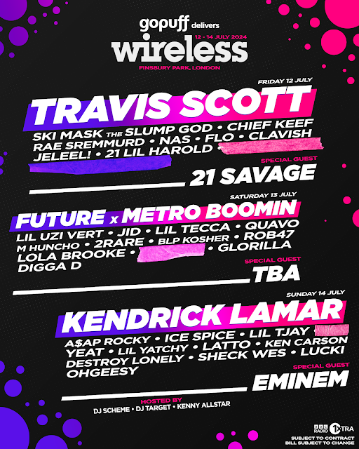
These two posters are the posters I will be using as help when figuring out layout and information I should include in my own concept lineup poster.
I wanted to try and create a concept lineup poster for a real festival I'm personally interested in. One thing which I think I need to change with this graphic is the colours as they don't relate to the brand identity very well.
I much prefer this version as it reflects on the brands colour palette much more, here is their official website below so that you can compare the colours used in my poster to it.
Reflection
As the project progresses, I am pleased with how it is coming along. Progressing onto the third week, I find myself to be further involved in the brief and maintaining a good work ethic. I'm especially happy with my concept Wireless lineup poster as I personally believe it almost looks official. However, I made two mistakes on this poster, I spelt two names wrong 'Rob47' and 'Lil Yatchy'. This was down to me not checking through the spellings of the names after finishing typing everything up on Photoshop, I will make sure to check next time.
Final graphics
Posters
Main Poster
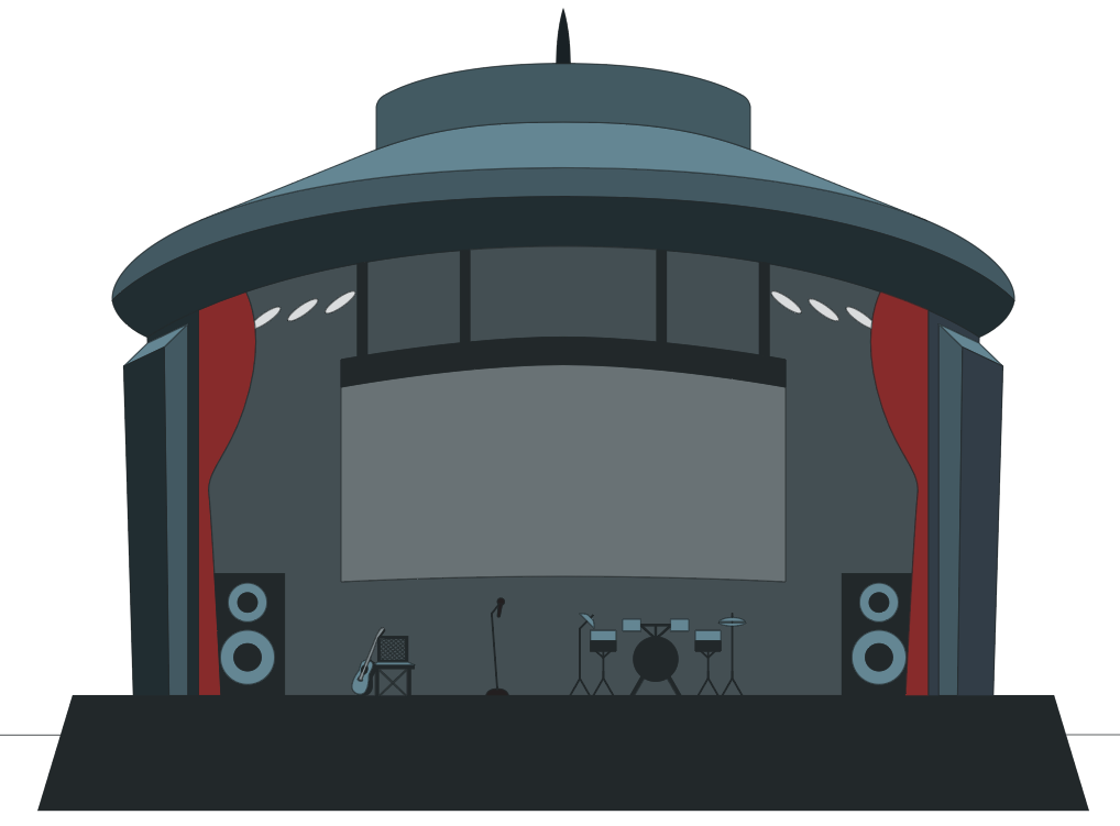
I started the roundhouse design by working upon the sketch I did on paper, I did this in Illustrator as it allowed me to create the line art precisely and cleanly. I also attempted to fix any perspective issues the sketch has beforehand.
I started on the stage contents such as instruments, speakers and a chair, here is the drum set up close.
This is the zoomed out view of the stage contents.
I also added the stage lights as I forgot to place them in earlier.
Now I want to colour the design, the idea I'm going for currently is for the roundhouse to be displayed in a night-time scene with the moon above it.
I finished the base solid colours on the roundhouse, however I'm not much of a fan. I decided to move on to experimenting with something else, as I don't want to spend time on adding gradients and shading to this design if I won't end up using it in my final poster.
I traced the line art I created in Illustrator onto a new canvas in Photoshop using my drawing tablet. I already like how this looks, because of the personality this one has compared to the previous design. This version seems more playful and friendly whereas the one before feels more professional and plain.
I thought that the scene felt too empty so I added rocks on either side of the stage. My light source is the sun and is placed in the middle of the canvas, which is how I've managed to complete the lighting on the rocks.
Here is the light source I spoke about, I want to change how the sun looks at the end of the design so that it looks more fitting to the scene and art style.
I started working on the water as it looked too plain just being a simple gradient, however it isn't finished and I will continue to work on it after I have sorted out the text placement.
I started with the typeface I decided on earlier, Reservoir Grunge, as it is 100% free to use and altered the perspective on both text layers to seem as if it was tilted up towards the camera point.
I now placed it into the space I saved on the canvas. I inverted it so that it was now white and then added wave details to stylise it and blend it in with the scene better.
I added more details to the water and am happy with how it looks for now.
Now I want to start on the primary subject of the poster, the roundhouse. I coloured in the areas where I had planned out previously with the line art.
I added reflections to the rocks in the water.
I added in these steps to the building.
I added further detail to them, I'm currently not sure if its too much but I will come back later and change them if so.
I added in a grey 'stone' backdrop to the inside of the roundhouse, I'm not worried about the bits on the darker grey which aren't coloured in as they will be covered by curtains later.
Now I want make a start on drawing the stage contents, I started off with this guitar leaning on a chair.
Then I moved onto the microphone and drum set.
This logo looks decent on this screen but I want to try out the Universal Music logo to see how it compares.
I prefer this logo, it looks better and also makes more sense as 'UMUSIC' is already written at the bottom of the canvas.
I traced over this logo to make it fit the style of everything else, it fits better now.
I forgot to add speakers along with t=he instruments earlier so did that now instead.
Red curtains reinforced the 'stage' vibe so I thought it would be perfect to add these in.
I spent a long time figuring out how I could texture these pillars and decided to just create a brick effect in the end as it would fit with the brick steps leading up from the water. I'm happy with how the bricks turned out as the perspective was a bit confusing when I was doing it at first. I also filled the bottom of the pillar with more eroded and uneven bricks/rocks, this is a small detail to show how the water level rises in this scene.
I textured this part of the roof and I think it came out pretty well. This time I wanted to make it seem like it was chiseled into the stone rather than a brick layout.
I continued the lengthy process of adding bricks onto the top of the building.
I worked on the middle part of the roof, colouring it red to match the curtains.
I wanted to fill in the sky with something as it looked too empty so I drew out some clouds and added shading onto them. I made them so that they were almost point to the direction of the round house.
I still felt like it was too empty so I added a plane flying with a banner behind it. This felt like a perfect opportunity to display the date of the event on.
Finally I added in a refection of the roundhouse in the water and used displacement maps to distort it accordingly.
I'm happy with how this poster looks as its stylised and isn't overcomplicated. It took me the best part of 15-20 hours and has a file size of 4.63GB, mainly due to the fact the canvas size is 8100 x 11700 pixels. There are 194 layers and 8 groups in this file.
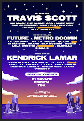
Line-up Poster
I cleared out the scene from the main poster, leaving just the water. I had to fill in the horizon as the roundhouse was originally there so I had not bothered before.
I recoloured the water and rocks manually by editing each shapes colour. I could have just used a 'hue and saturation' adjustment layer but I prefered the results of doing it the other way as I have more control.
I spent a while figuring out what colours the sky should be but ended up settling with a sunset type of gradient.
Next I added in all of the names I previously used for my concept Wireless Festival lineup. I did this so that I could save time on this poster and get more graphics done before my deadline.
I added in the clouds from my main poster, resized and distorted these so that they looked unique to this poster.
I added stars to the sky, I drew this star and converted it into a brush. I then used this brush to decorate the night sky.
For this poster I wanted to keep the same theme whilst changing the scene to sun set. I'm not sure if it worked how I intended it to and maybe I should have just kept the blue tones from the main poster. However, I still think it looks nice and carries a dreamy aesthetic with it. The dimensions were 8100 x 11700 pixels again but this time I tried to conserve the file size by merging layers I already had saved, such as the water, rocks, and clouds. This document size was 755.2MB, which is still large but not as bad.
In-venue branding
Neon sign
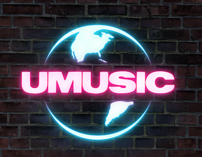
My plan for this design is to use this image as the background to a neon sign. I found this brick wall image on Unplash:
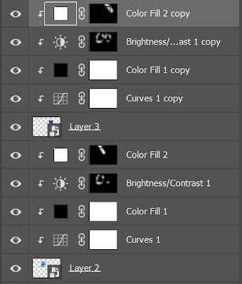
I clipping masked several adjustment layers to my brick image and then positioned the logo I am going to use in place.
I experimented with different blending options for a while and this was the outcome. I also applied a 'Hue and Saturation' adjustment layer to separate the pink and the blue parts of the logo.
I felt like something wasn't right with the neon look and tried whitening the logo a bit, this worked well with helping it look more like a light source.
I darkened the bricks and carried on working on the glows of the neon sign.
I added more glows and a cable connecting to the sign so that it enhances the realism of the graphic. This could possibly be the final design but I want to experiment seeing how a board would look behind the sign before I finish this piece.
I prefer this version with the backboard behind the logo so that it makes more sense and parts of the neon light aren't just floating on the wall.
This is the final neon sign concept with a camera raw filter applied onto it.
Wristbands
To start off this concept design I used a rectangle with a gradient layered on top of it. This resembles the main posters colour palette. I also added the "UMUSIC" logo and "standard ticket" text.
I wanted to add some more features to the wristband such as a QR code, Universal Music Group logo, and an arrows symbol.
Next I moved onto the sticky part of the wristband which was fast and easy to create as all I had to do is duplicate the originally drawn shape five times, add some lines to the left side, and some numbers to the right.
This was placed onto the far left of the wristband.
I added a stylised drop shadow to every graphic element on the wristband.
Here is what the final wristband looks like.
I wanted to create a background for the wristbands to be displayed on.
These are all three different variations of wristbands, depending on the ticket you purchase.
Stage banner
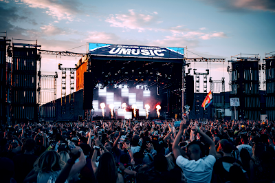
When I saw this image I thought it would be quite good for demonstrating a custom stage banner above the stage. I found this image on Unsplash:
I put this together by carrying on the theme of my main poster.
I put the banner into place, layering it above the existing stage art, then using Blend If to bring some dark colours through the banner.
I used Colour Balance adjustment layers to alter the colouring of the image and shift it to a cooler look, rather than a warm look.
I tried the one of the new neural filters out , the Landscape Mixer. I wanted to change the sky's appearance and I think it worked quite well. The outcome was a bit noisy and blurring if you zoom in but overall the results were decent.
I wanted to test the updated neural filters once again, this time I tried out Depth Blur,
Here is the final concept design after a camera raw filter.
Roundhouse Poster Advertisements
First concept
This is the image I want to start with to display my own posters upon the side of the roundhouse building, where the event is taking place inside. I obtained this image from the official roundhouse website:
I positioned the posters on top of the exiting ones in my image, I did this by using 'Distort' and 'Warp' on the posters. Then I used different adjustment layers to alter the lighting on the posters.
This is the final image, all I need to do now is add a camera raw filter.
I think that the posters really fit in and feel like they're actually displayed on the wall.
Second concept
This is the image I want to start with to display my own posters upon the side of the roundhouse building, where the event is taking place inside. I obtained this image from the official roundhouse website:
I positioned the posters on top of the exiting ones in my image, I did this by using 'Distort' and 'Warp' on the posters. Then I used different adjustment layers to alter the lighting on the posters.
This is the final image, all I need to do now is add a camera raw filter.
I think that the posters really fit in and feel like they're actually displayed on the wall.
Wall Mural Advertisement
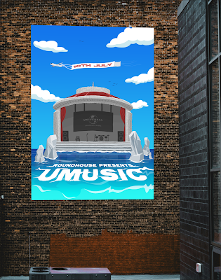
I wanted to create a wall mural advertisement to display how my poster could be used in real life. I found this image on Unsplash:
I cropped the canvas and placed the main poster in place. I used perspective warp to slightly alter the perspective of the poster.
I used "Blend If" to bring the darker areas of the bricks onto the poster. This makes it appear less like an image has just been slapped onto another image of a wall
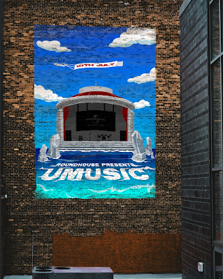
I continued adding texture to the mural by using the mixer brush tool with a textured brush, this helped with blending it into the wall more.
Here is the final wall mural concept artwork.
Lastly I added a camera raw filter to enhance the overall appearance of the image.
Signs
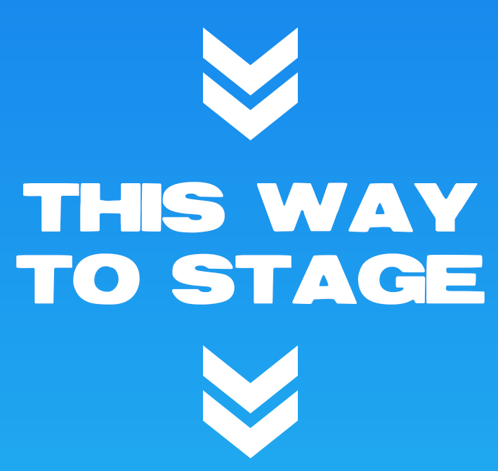
I started with a subtle blue gradient, which I have previously used the for sky in the background of the main poster.
I added the text, I used the same typeface as I have been using for the other graphics, 'Reservoir Grunge'.
Then I added the arrows I was using the the wristbands earlier on in the project. These arrows indicate where about is the main stage.
I also added a slight drop shadow to this text to give it a tiny bit of elevation.
These were all of the different variations I did.
Final Design Collage
Here is a collage of all of the final designs created for the 'UMUSIC' festival.
Evaluation
I am very happy with the final festival designs, and they have progressed much more positively than I thought they might as the brief was quite compact for the given timeframe which made it originally quite daunting. Many new skills were developed and improved on such as:
- Time management.
- Experimentation with a completely new art style.
- Experience with new tools and methods in different software (Photoshop, Illustrator)
- Typography
- Problem solving
- Consistency
I have worked to the brief requirements and completed this project on my own with no help.
In my opinion the most enjoyable part of the project was creating the line-up poster design, I was looking forward to creating it as I knew that it was going to be set at night time opposed to the main poster which was set during the day. The reason I prefer to create graphics with a night time setting is because you can bring out a richer, more eye pleasing colour palette and more elements such as stars in the sky. I was really happy with the final result, one of my favourite parts of this poster is how the sun is setting over the water. I wish I could've spent as long on the line-up poster as I did with the main festival poster but I didn't have the time to continue with this workflow as it wouldn't have allowed me to finish before the deadline, therefore I had to cut down on the time spent on each design after creating the main poster. However, I don't think any of the design necessarily look rushed or incomplete so overall I am pleased with what I have accomplished in this short, five week brief.
Whilst creating the different festival designs they have allowed me to understand the process of different ways to create specific types of graphics. I have never created any type of festival poster, experimented with this specific hand-drawn style, or even created wristbands before. I am very happy with the results of the various designs and I will make sure to try similar again in the future.
If I had more time then I would focus on developing the existing designs further and making sure that they are up to my standards. For example, I would have created more in venue branding, such as different signs, etc. Something else I could have done if I had more time was fix the sun reflection in the water on the line-up poster, there was a section I missed and it just appears flat and doesn't have the same shape to it like the other parts of the reflection.
I didn't really experience any issues whilst completing this project except from the deadline not allowing me to be able to fully display my potential on each of the designs. I did lose 3-4 hours worth of work on the main poster after some kind of technical error on my hard drive. I'm not sure if this occurred because I accidentally removed it from the USB socket before it had finished saving or not. Nevertheless, this wasn't too big of a problem as I remade it faster the second time around, and also reminded me to make sure to leave my hard drive plugged into the computer for at least 30 seconds after the document has been displayed as saved.
Overall I think I have done well in this project. I am proud with what I have achieved and the final designs I produced. I have already noted any improvements I think I could have made but on the whole I think that the project has been a success and I have really enjoyed completing it.


























Comments
Post a Comment